This has definitely been the module that I have enjoyed the most this semester. I have always found it fun to create logos and everything to do with branding. Even if I already had some background on branding, I am happy I have learned a few things through the process.
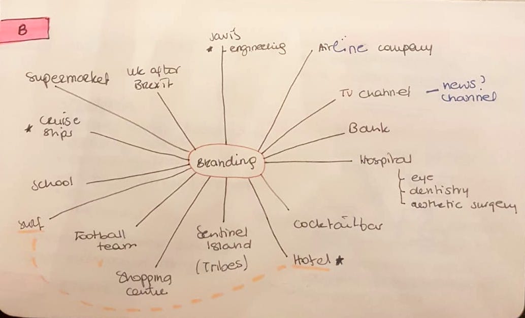
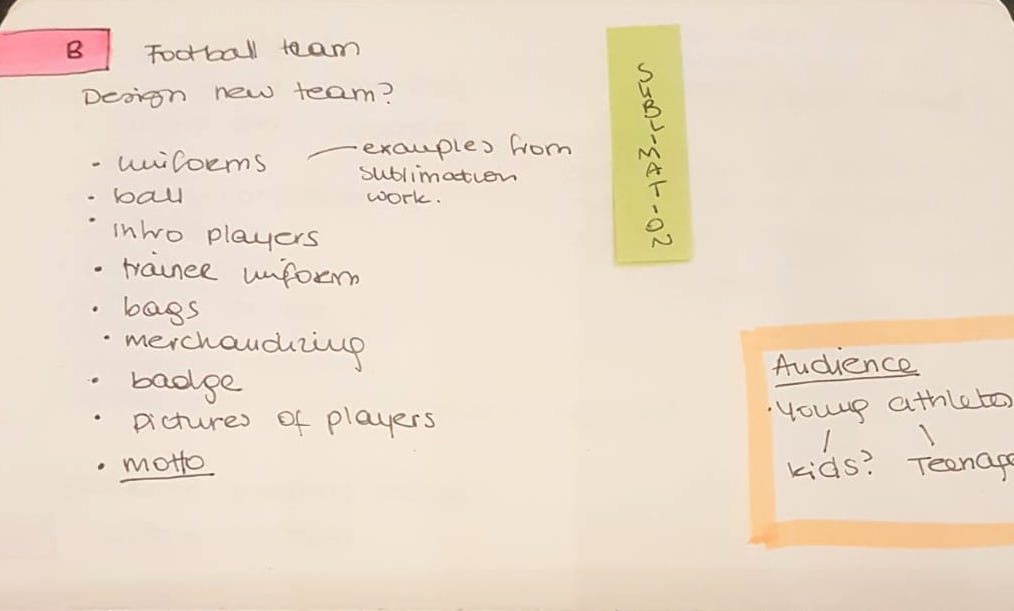
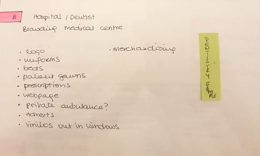
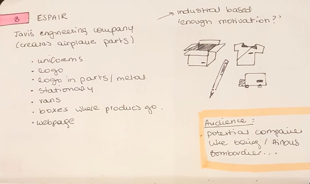
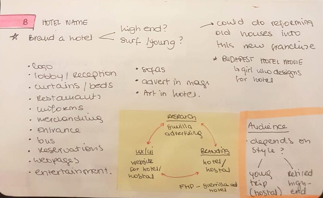
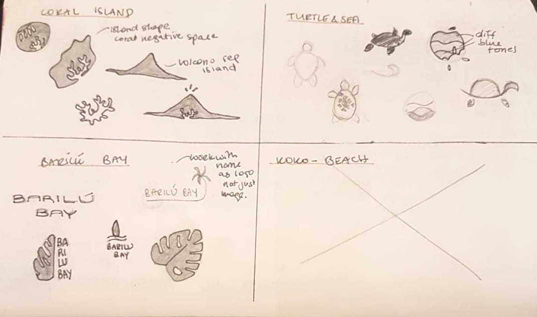
We had an hour in class to sit down with colleagues and think of ideas. I created the following brainstorming map, which shows various ideas of companies which could potentially be branded. I detailed the branding and design possibilities for the ones I liked the best.
I was very interested in a few ideas, especially my partners company, which he is actually planning on starting next year. The problem with this was that, after talking about it we realised there was little space for creativity, since it would be an engineering company mass producing pieces of metal. So very little possibility of generating nice mock-up imagery.
Since this was an initial possibility, I did start designing some logos, but did not develop them any further.
Out of all of them, the idea which motivated me the most was the mixture between a hotel and something to do with surf. So by combining the two, I decided to create a luxury hostel with a surf style/vibe to it. I have already had a bit of experience with the industry from my personal life and the projects I created in semester one, so I thought this would be a really nice company to brand.
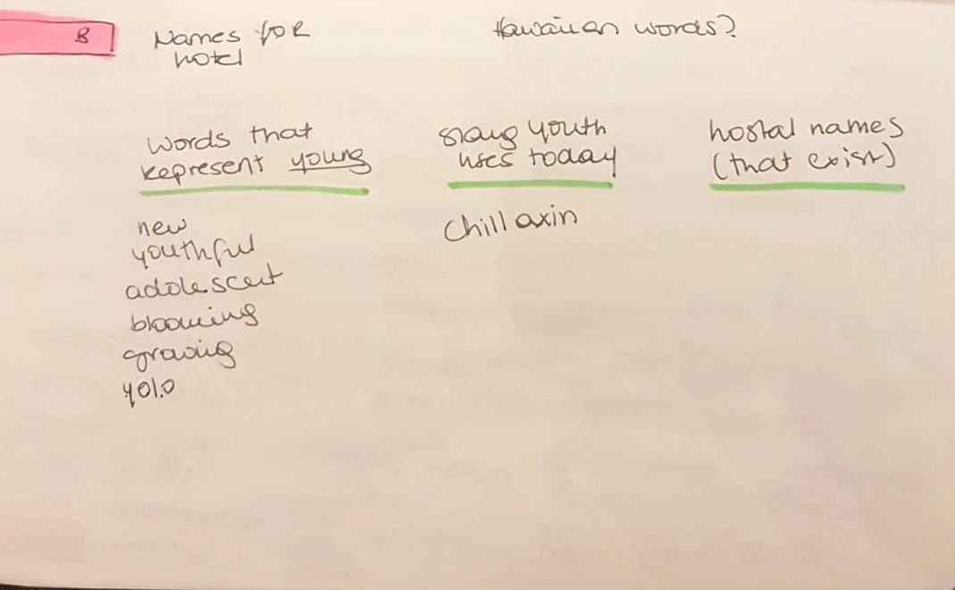
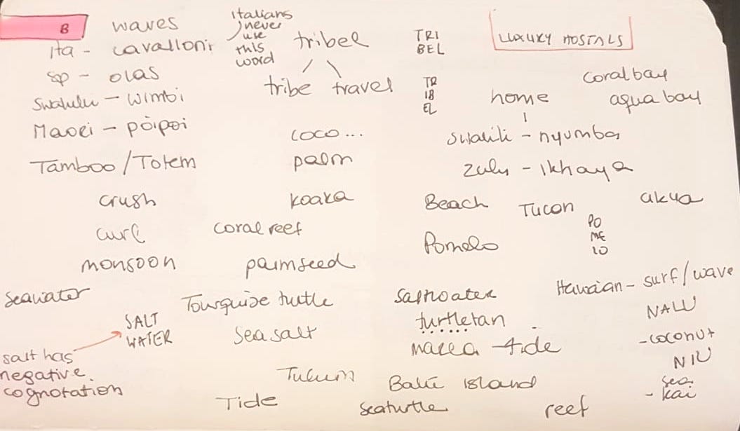
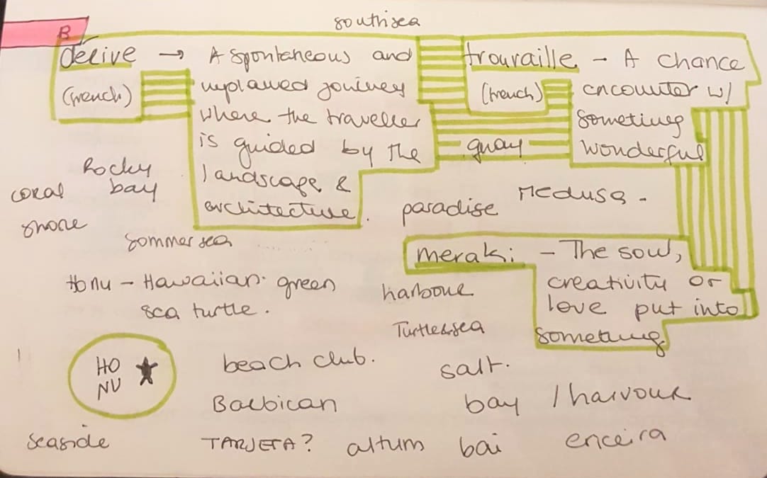
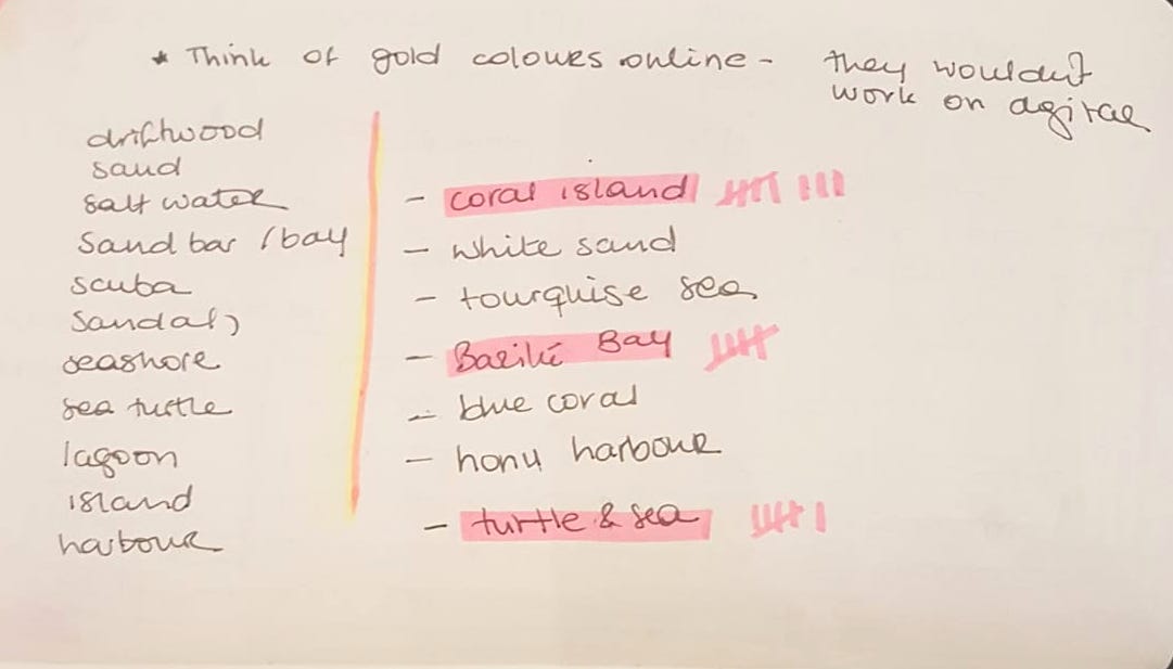
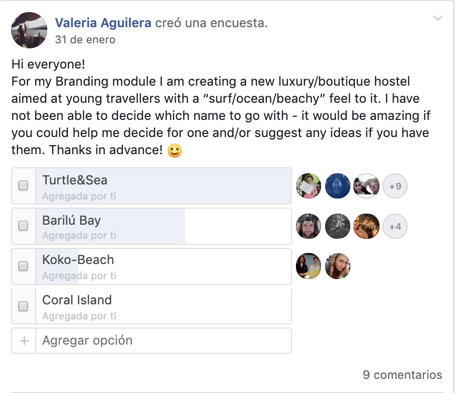
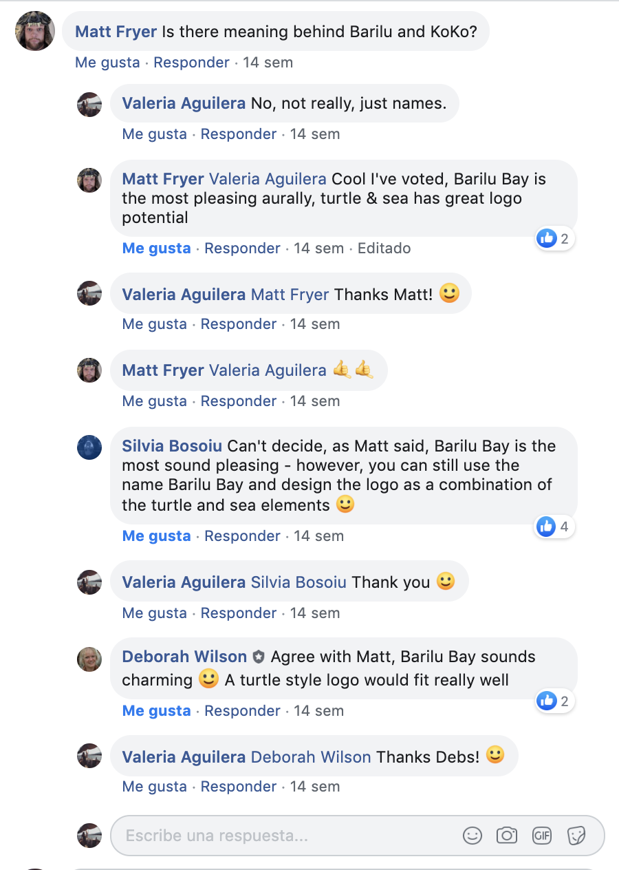
Now I only needed a name to go with my Luxury Hostel. I spent several days thinking and brainstorming for one, but it became very difficult. I finally ended up with 4 different names I really liked, so decided to put them to vote through Facebook.
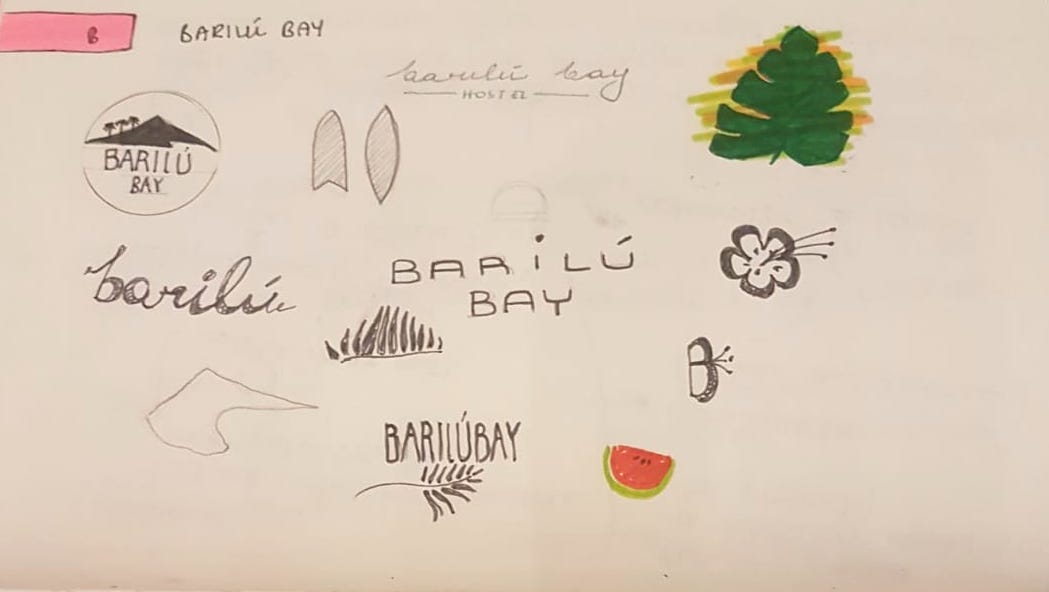
After asking through facebook and whastapp to a few friends and colleagues, I decided that Barilú Bay, would work the best, even it there was no meaning behind it. The way it sounded already suggested something beachy and tropical as I mentioned in the proposal paper, i found an artichle by Aashish Pahwa where she explains that what really matters is the association tha people develop towards the name rather than the meaning of it. Making the name have a phonetic symbolism can describe the brand’s philosophy best. (Pahwa, A, 2018)
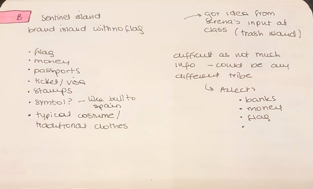
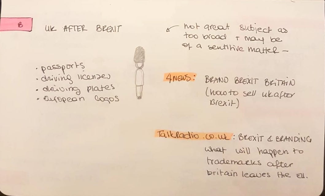
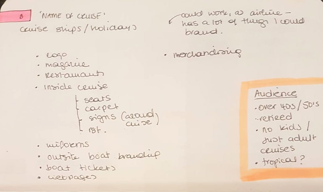
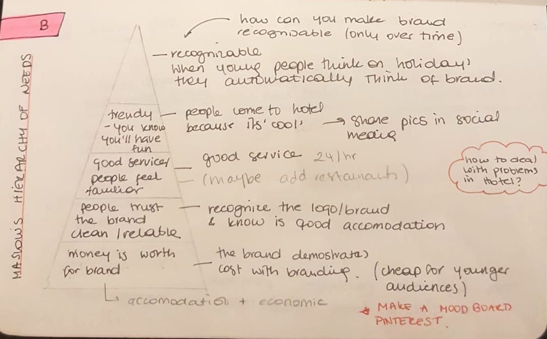
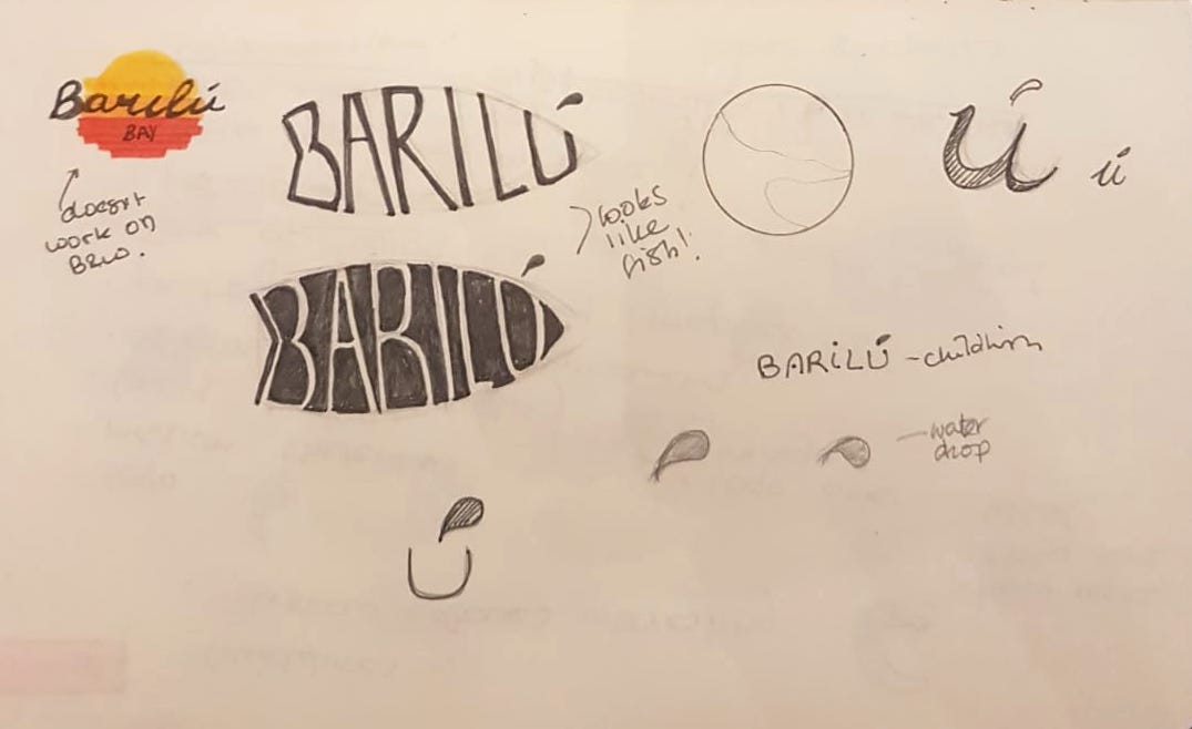
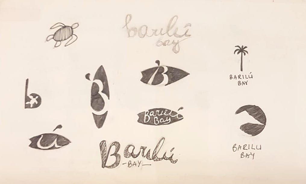
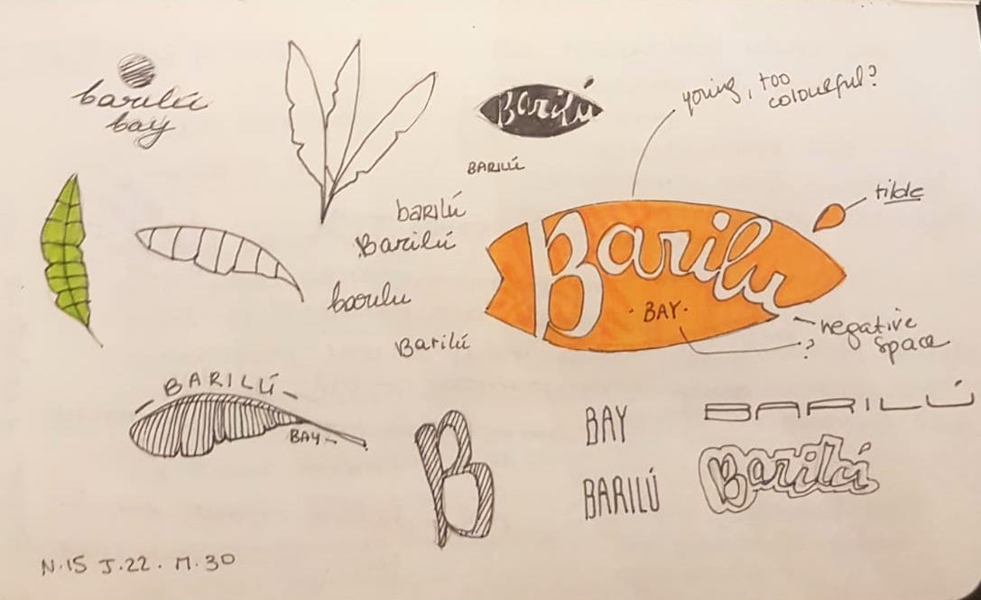
The sketchbook images beneath, show some of the research I did to understand a little more about branding and understand how and what outcomes I should deliver by the end of the module.
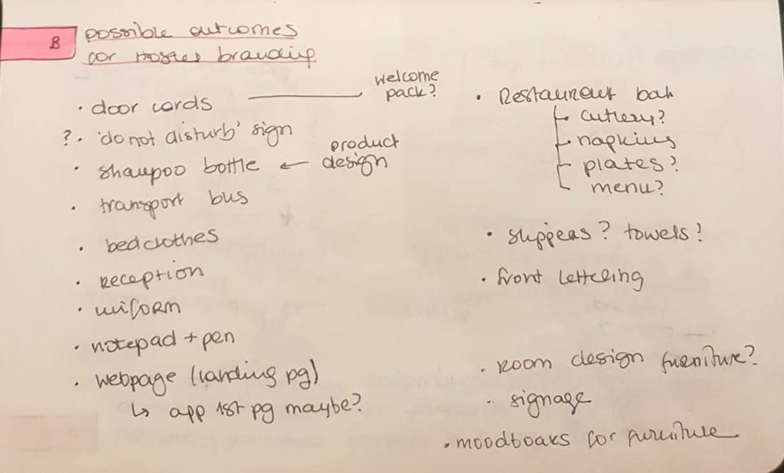
I also came up with a list of possible branding outcomes. I liked the idea of having a variety of different elements I could brand, for example de hostel’s restaurant or some packaging design for the shower gel and soap box.
LOGO design
To get some ideas of how my logo could look like, I created a board in Pinterest. I especially gathered those logos and ideas which I thought would work. They had to be both, visually attractive and represented what I wanted my logo to transmit.
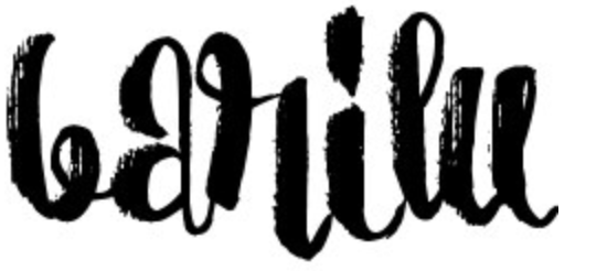
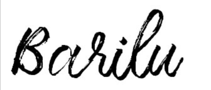
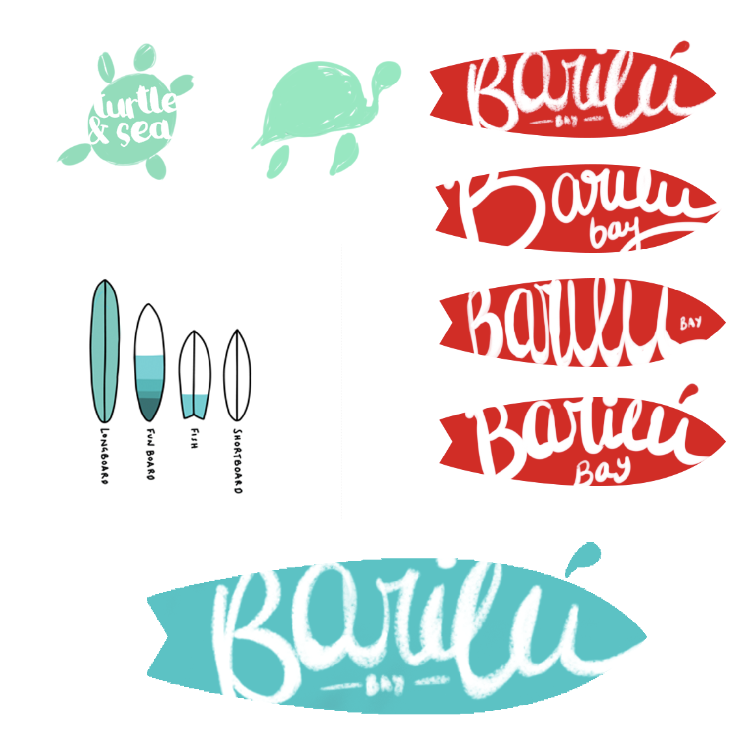
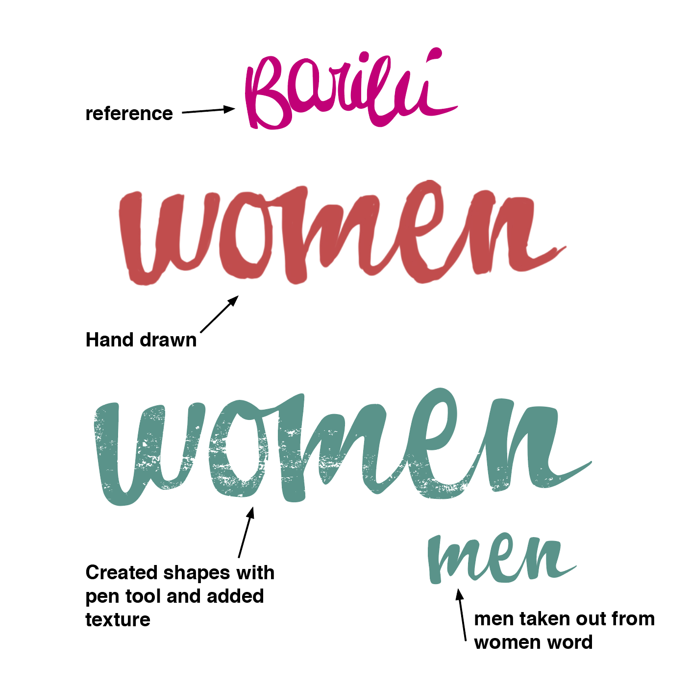
After I looked through all of these I started playing around with ideas on my sketch book. I kept coming back to a surf-board shape to create the logo, I actually liked this idea de best, so once I created a few different versions, with the whole name and just letters, I moved on to Photoshop.
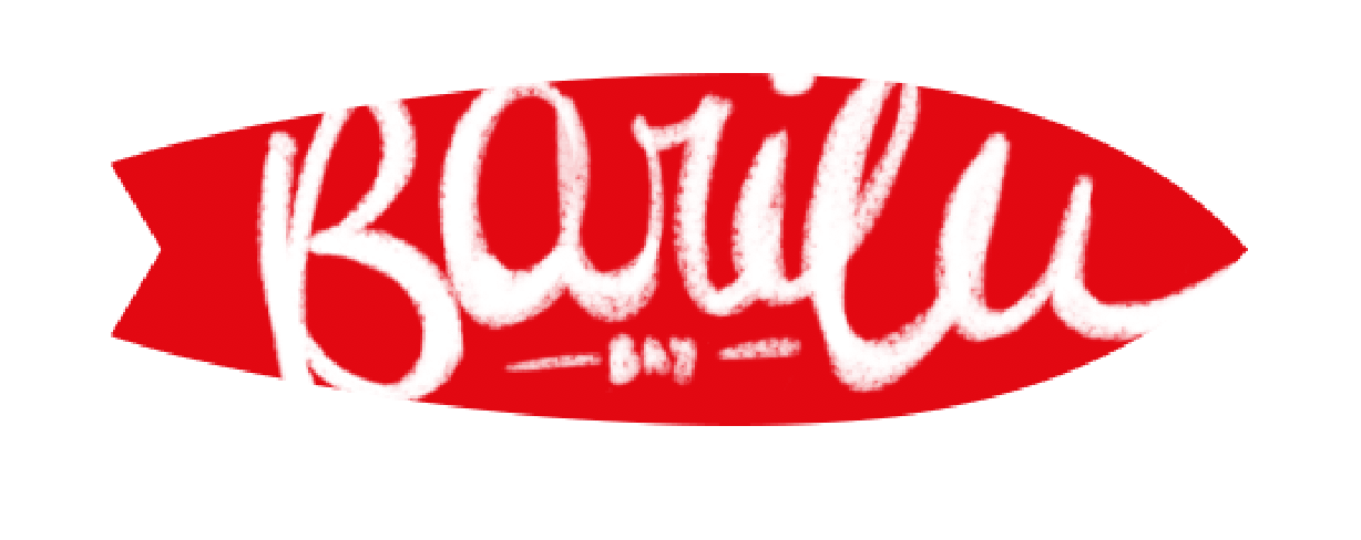
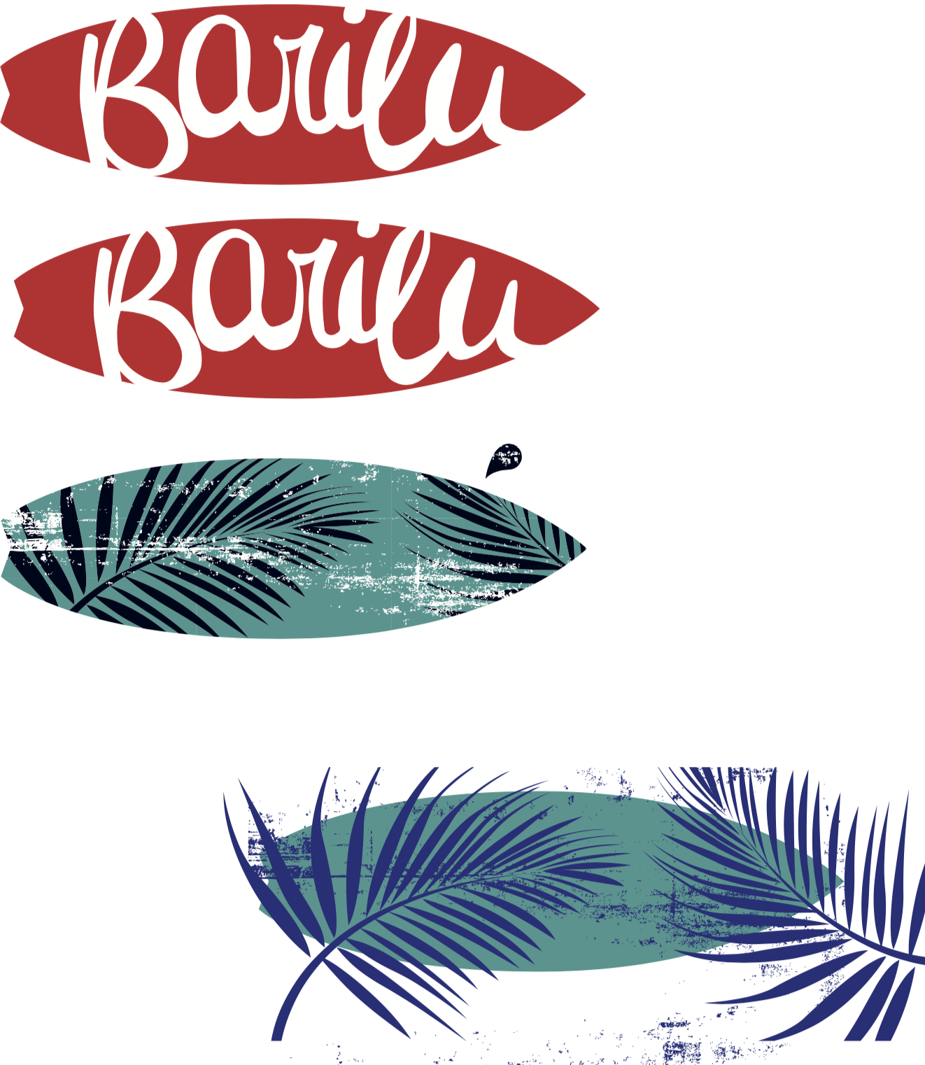
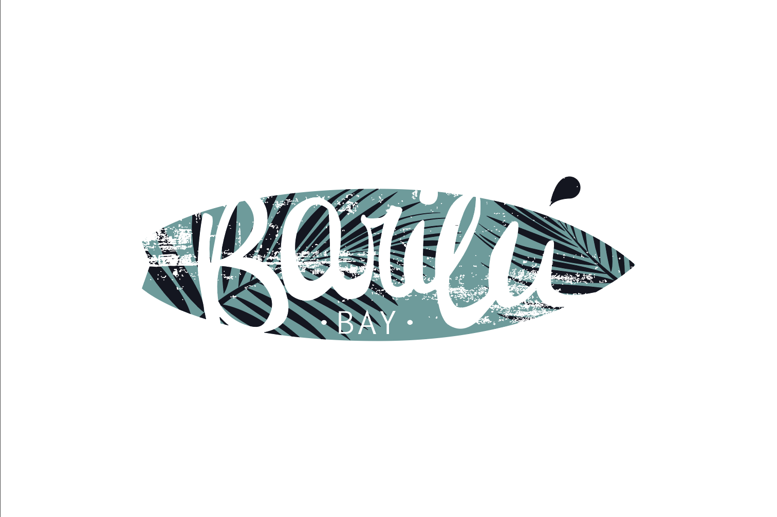
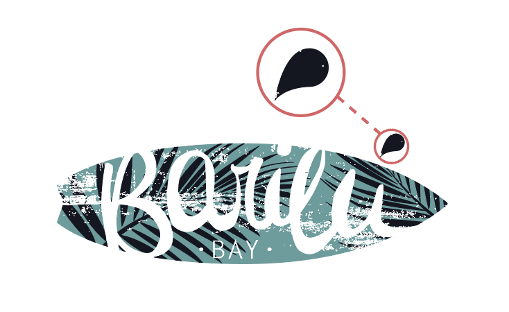
Once I was happy with the hand-drawn font I created for my logo, I went ahead and used the pen tool to convert it into an object. I then shaped the surf board and added colours and some details (palm trees / texture) to the design. I ended up with different versions of the logo so used my project presentation day to ask for some feedback. Many people agreed that the tourquise and dark blue version fitted best with the brand.
*I used the same font technique to create the toilet signs for the hostel.
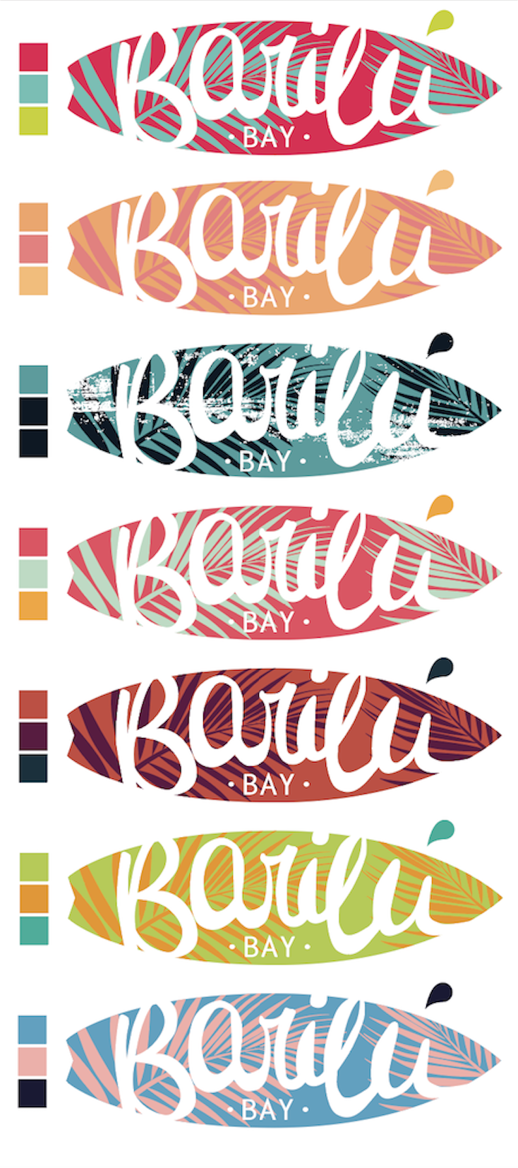
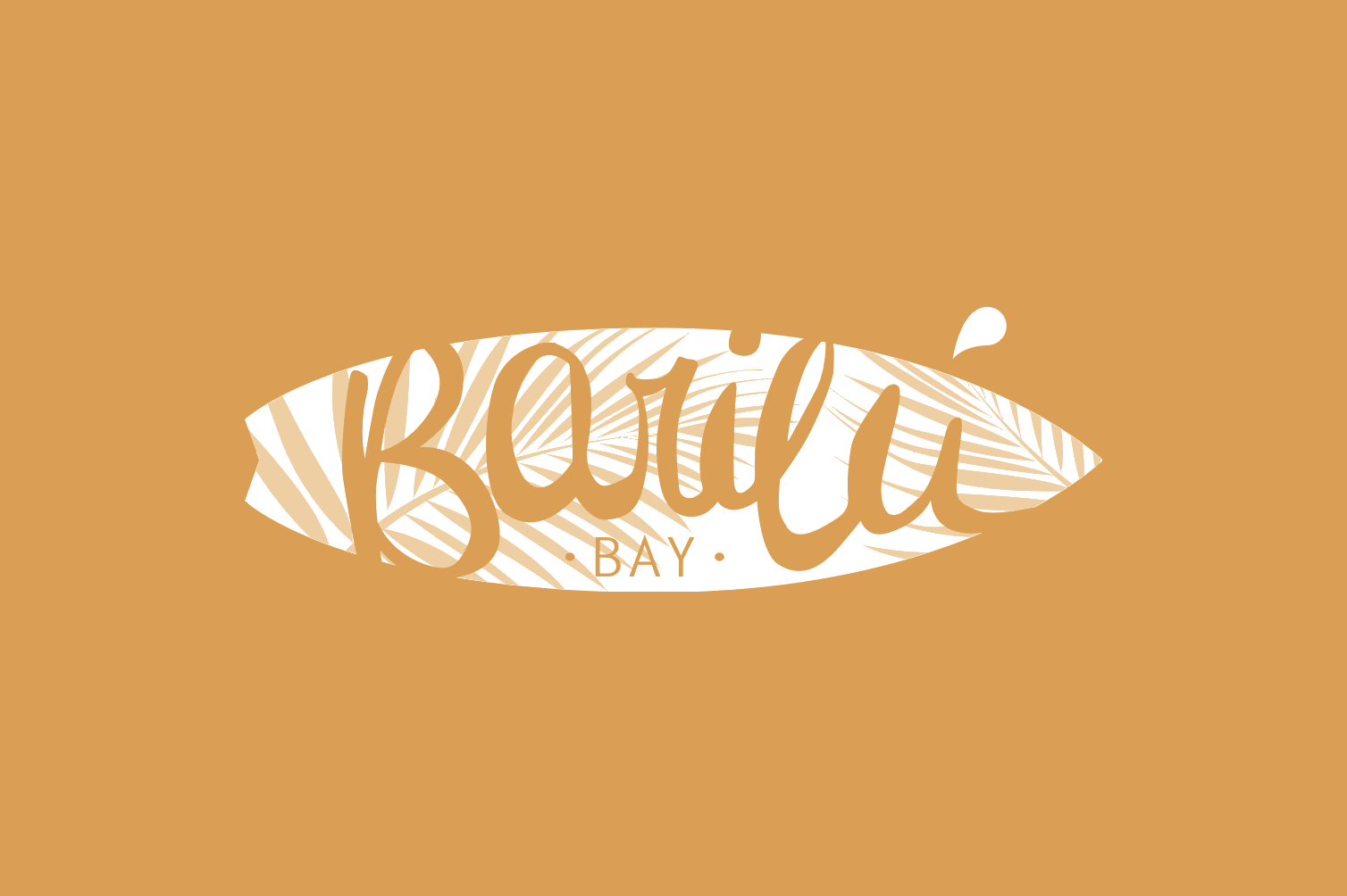
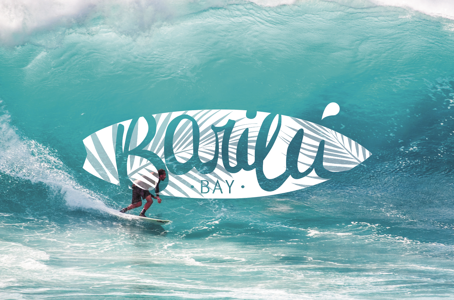
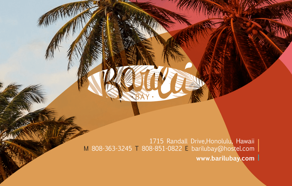
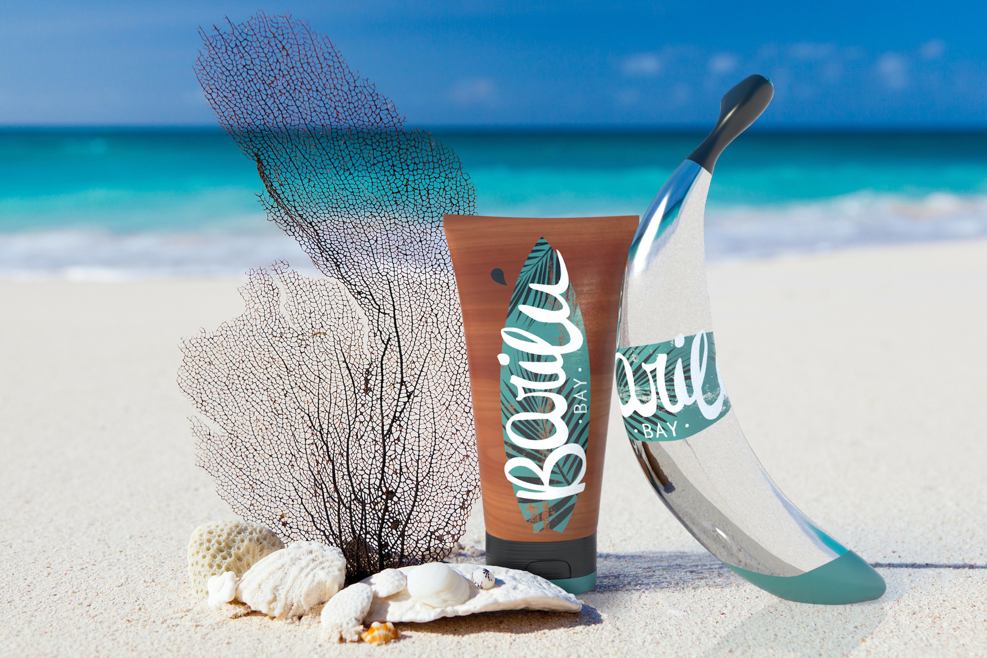
Final version of Barilú Bay´s logo using white background, coloured background and an image as background.
Since I felt like the logo colour´s alone would not transmit that fun and diverse environment I was looking for, I decided to choose a brighter colour palette which would work along with the logo and could be applied to the rest of the designs. The use of the colour palette is explained in the guidelines shown in the previous webpage.
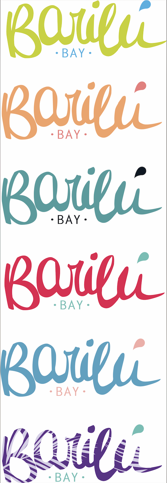
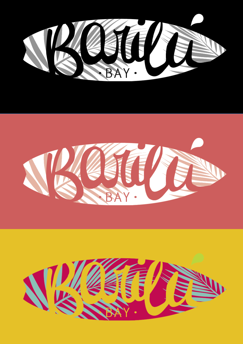
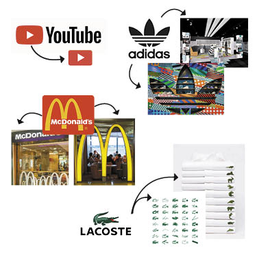
The idea of using part of the logo as a design element had been used previously on different companies. I thought it would be a great and fun idea to use it throughout the designs, this would make it look more interesting and give Barilú Bay a shape it could be recognised by. I find it has given my brand an extra component to its personality and style.
I have done some research on other companies which have also implemented some kind of «accent» into their branding. Some recognisable examples are: Youtube, Adidas, McDonalds or Lacoste
presentation
Bellow is a link to my student directed project presentation, shown to teachers and class mates on the 26th of February 2019.
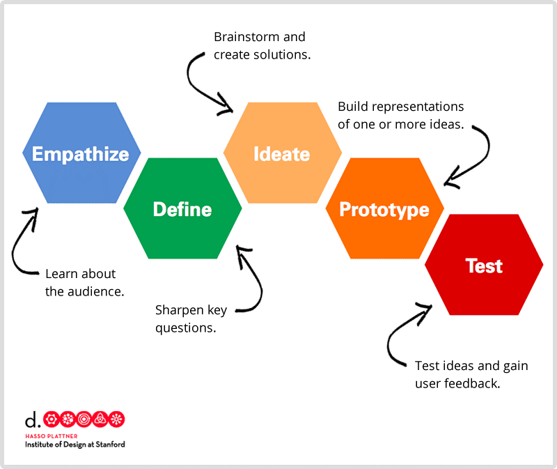
For my design process I used the Standford’s Institute of design thinking methodologies. This method helped me organising my thoughts and planed ahead to avoid leaving anything behind. I will definitely be applying this method to future design projects. (Cooper, M, 2018)
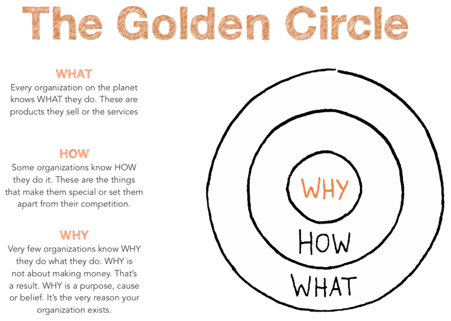
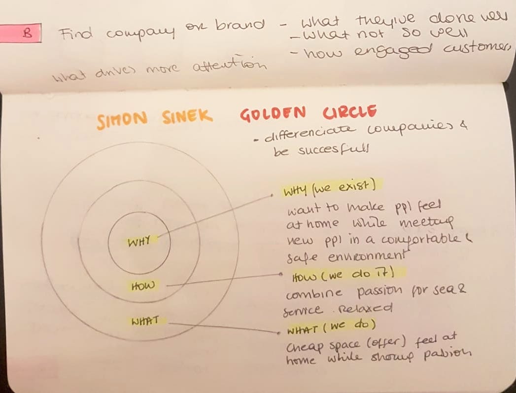
before beginning with the brainstorming and the designing process i did a small excercise created by Simon Sinek called the golden circle. The idea behind this task is to find what part of my company will be inspiring to others and will differentiate it from other companies. (Chaffey, D, 2015) I explained how I used it more thoroughly on my design proposal.
adobe dimension
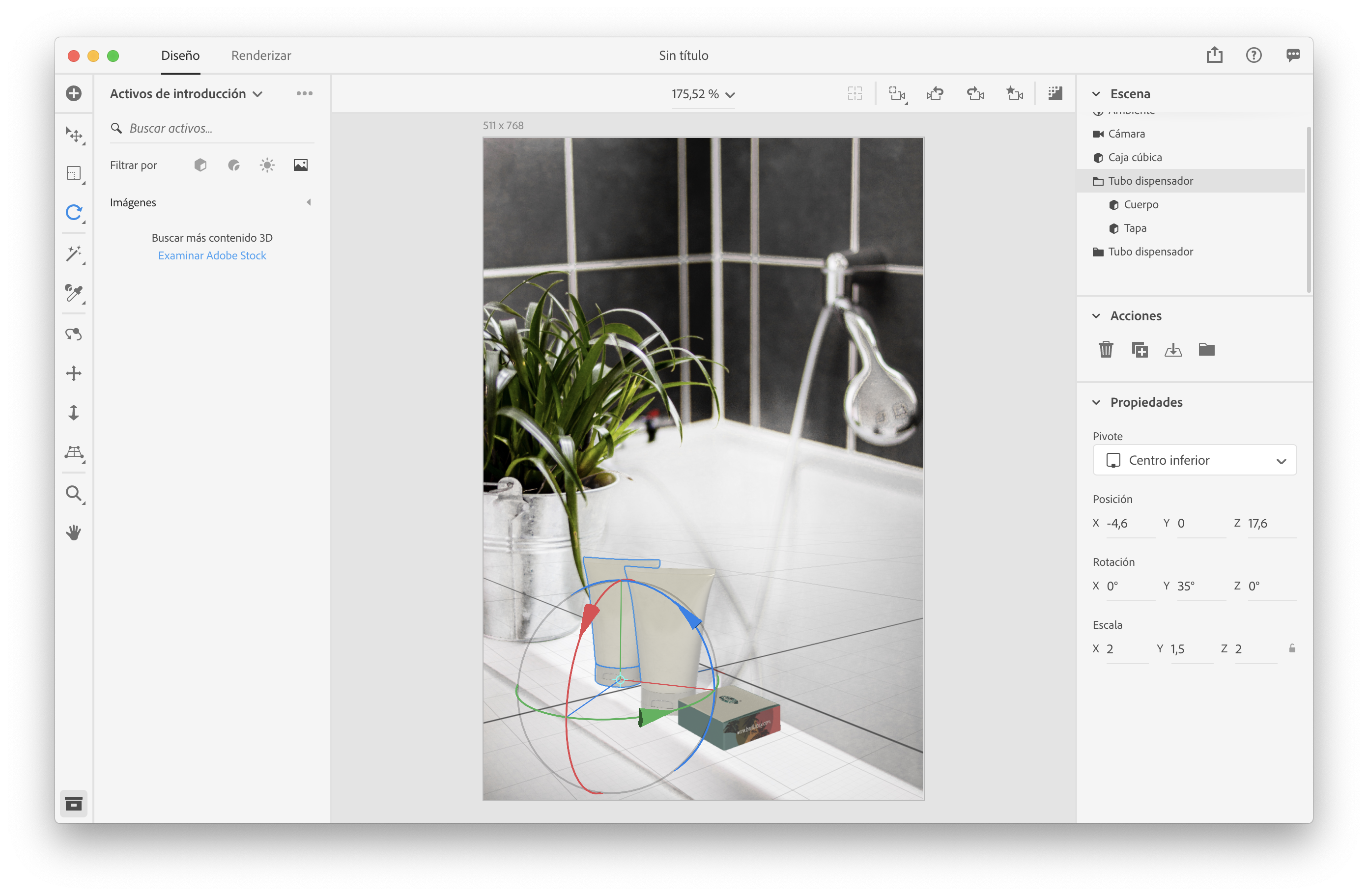
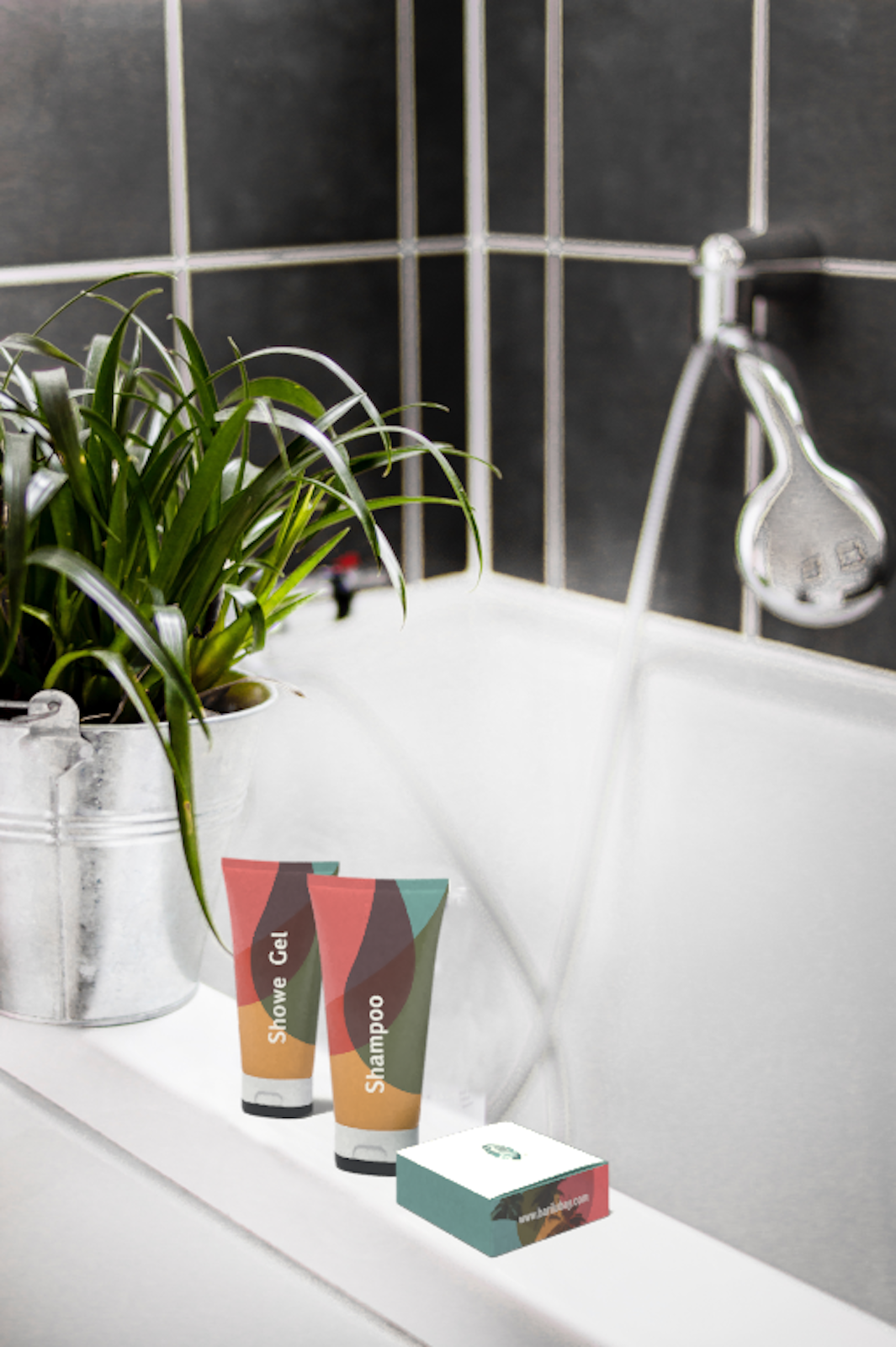
Finding and creating new mock-ups to present artwork is very limited but luckily I was able to find perfect psd files which allowed me to present the designs in a cleaner more realistic way. It was in a lecture that we learned that Adobe had a program called Dimensions which allows the designer to easily create product mockups, brand visualisations, packaging designs with easy 3D tools. This allowed me to compose, adjust and render photorealistic images for my hostel. I did not necesseraly need to create any packaging design, but because I really wanted to learn this skill, I decided to produce a shampoo and gel bottle and soap box for Barilú Bay. For both, I used photoshop to adapt the background and ambiance image. Beneath are the tests, progress and final result…and yes, I was curious to see how a rendered beach-banana looked like.
Pahwa, A. (2018). Why Brand Name Matters? How To Choose A Great Band Name. [online] Feedough. Available at: https://www.feedough.com/why-brand-name-choose-a- good-brand-name/ [Accessed 28 Feb. 2019].
Cooper, M. (2018). Introduction to Design Thinking Workshop – Work In Progress. [online] Lancaster.ac.uk. Available at: https://www.lancaster.ac.uk/work-in-progress/introduction-to-design-thinking-workshop/ [Accessed 10 May 2019].
Chaffey, D. (2015). Creating a value proposition with the Golden Circle Model. [online] Smart Insights. Available at: https://www.smartinsights.com/digital-marketing-strategy/ online-value-proposition/start-with-why-creating-a-value-proposition-with-the-golden-circle- model/ [Accessed 26 Feb. 2019].