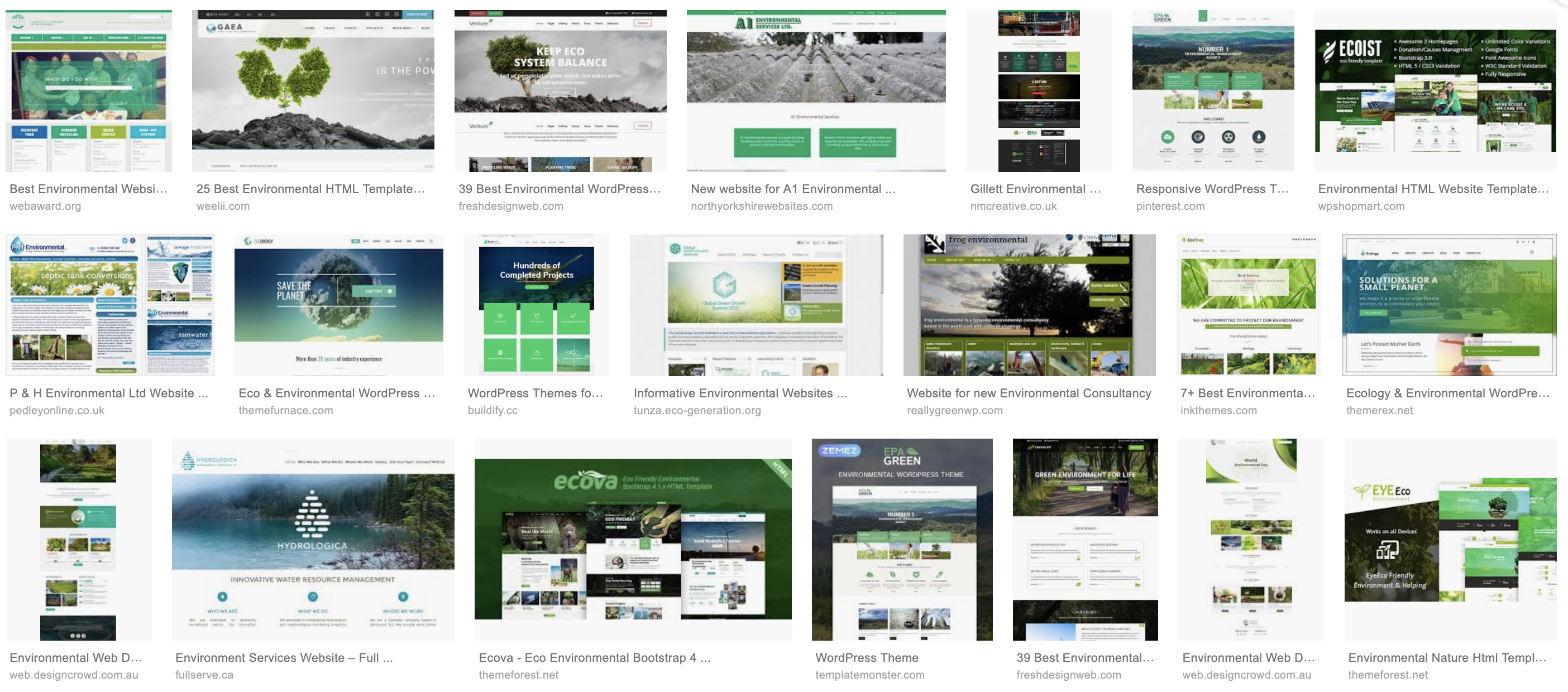
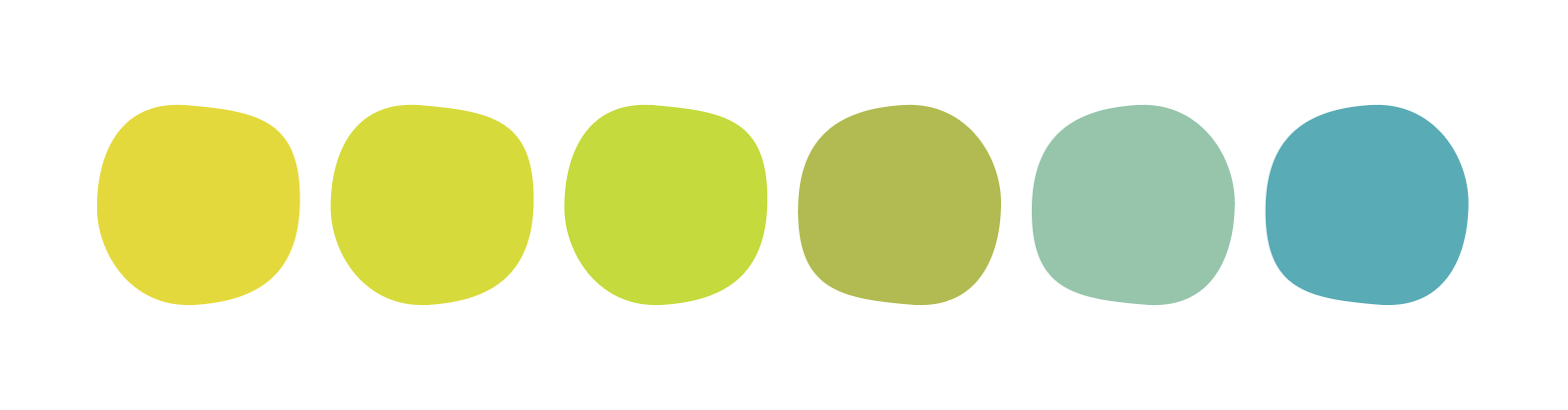
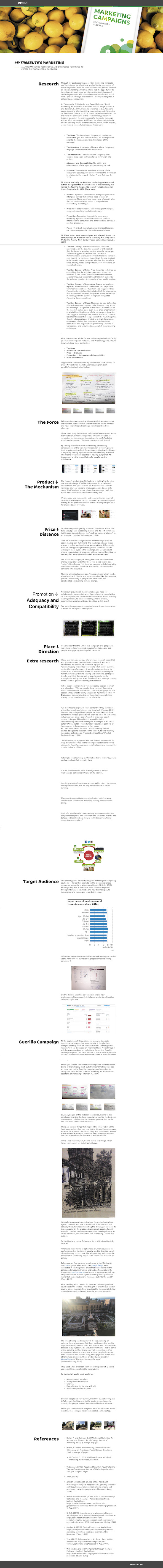
Before starting to design MyTreebute’s website, I started doing a quick google-images search to get the feel of what colours are used for reforestation or tree related webpages. Obviously the predominant colour was green, which matched perfectly with my, already chosen, logo colour scheme.
Apart of this generalised search, I also created a pinterest board where I gathered different examples of webpage designs. It’s a collection of environmental-related webpages as well as other subjects which I felt could be inspirational for the creation of MyTreebute’s website. Please find the link on the buttom below.
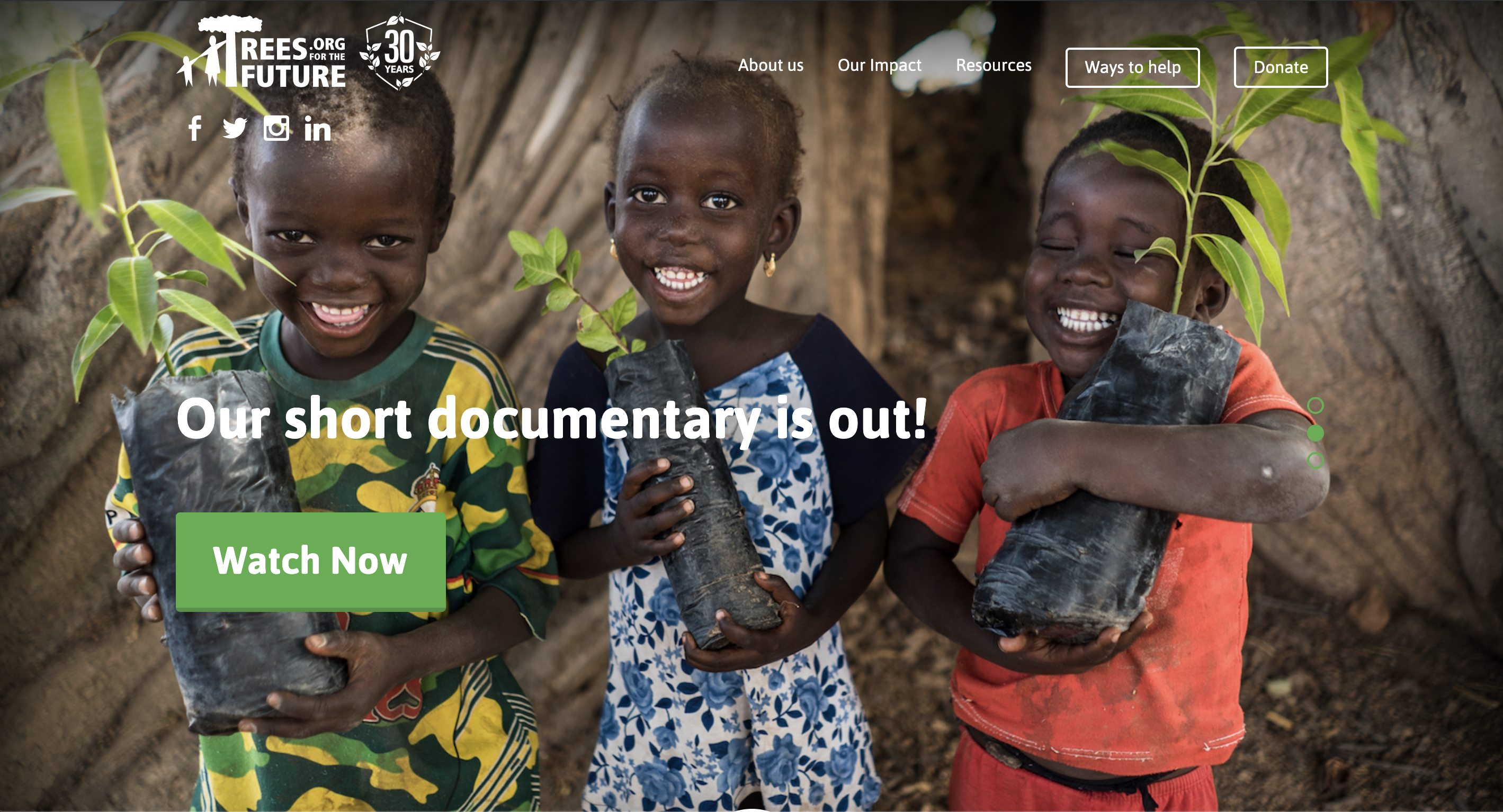
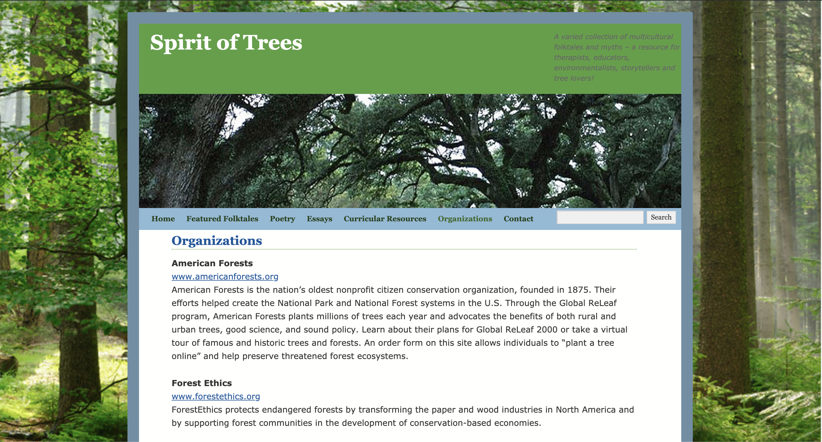
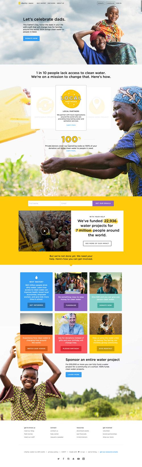
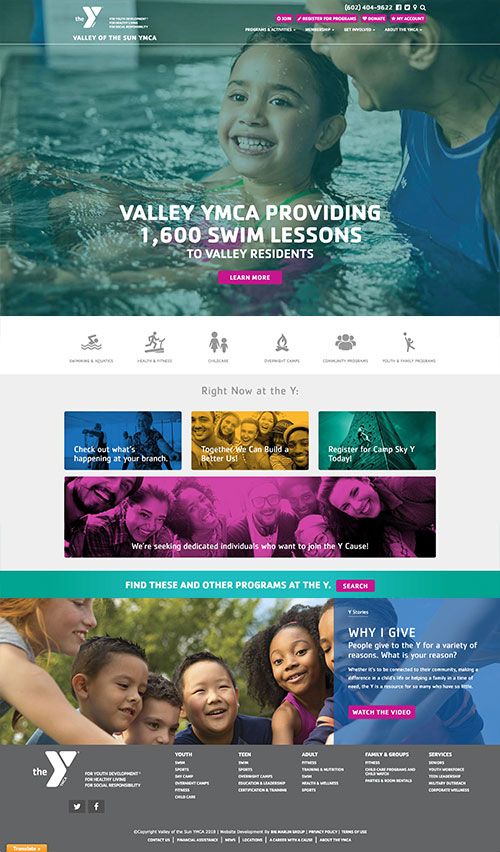
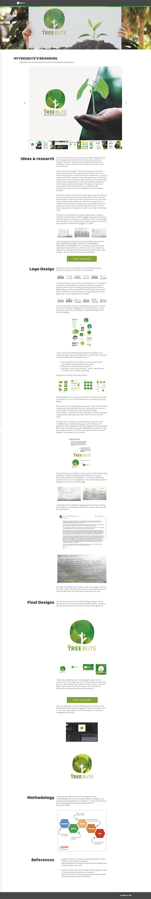
I also went ahead and researched for some reforestation-related organisations outside of pinterest, to see what kind landing-page imagery they used. I found that at least 90% of the webapages use a screen-size image as their «home-page introduction». I feel like this is what will «firstly» engage the viewer into finding more about the organisations, and even donate later on. The first one of the examples below definitely uses this technique, since it makes you feel very empathic towards the kids holding the trees. (Specially the cute one with his eyes closed on the right! :D)
Here are the links to all of the websites above in order or appearance:
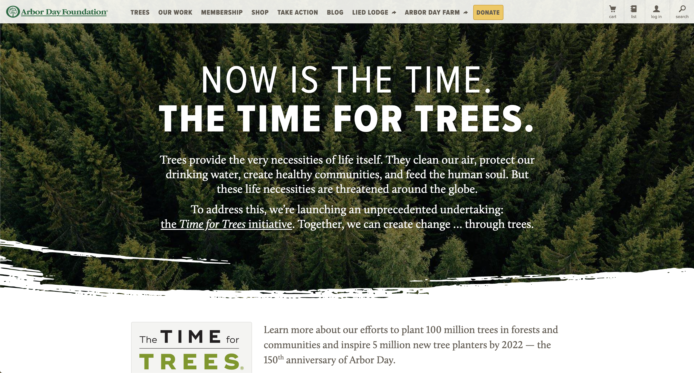
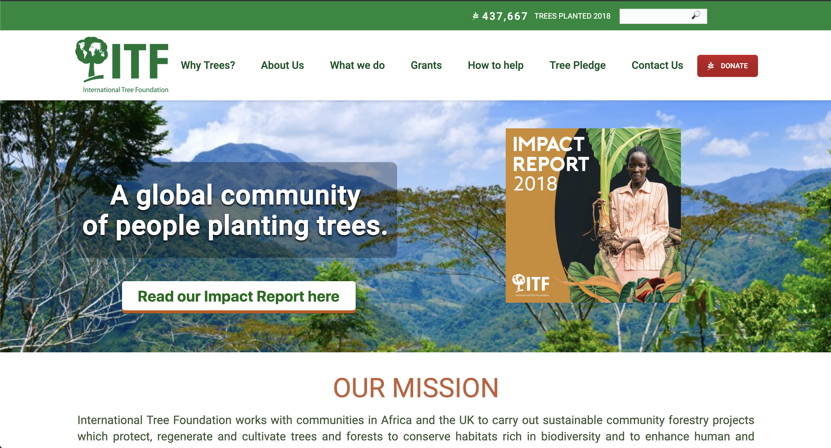
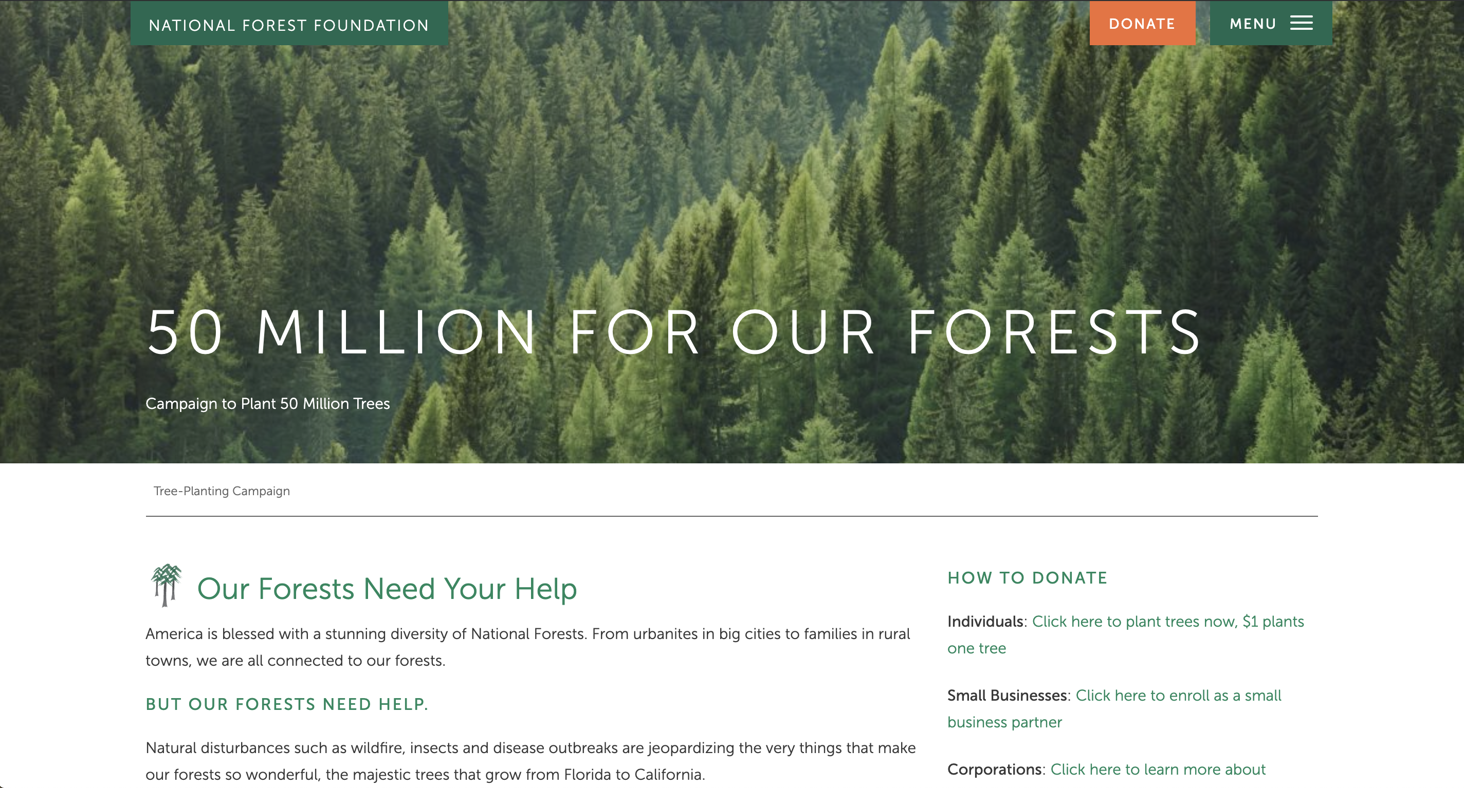
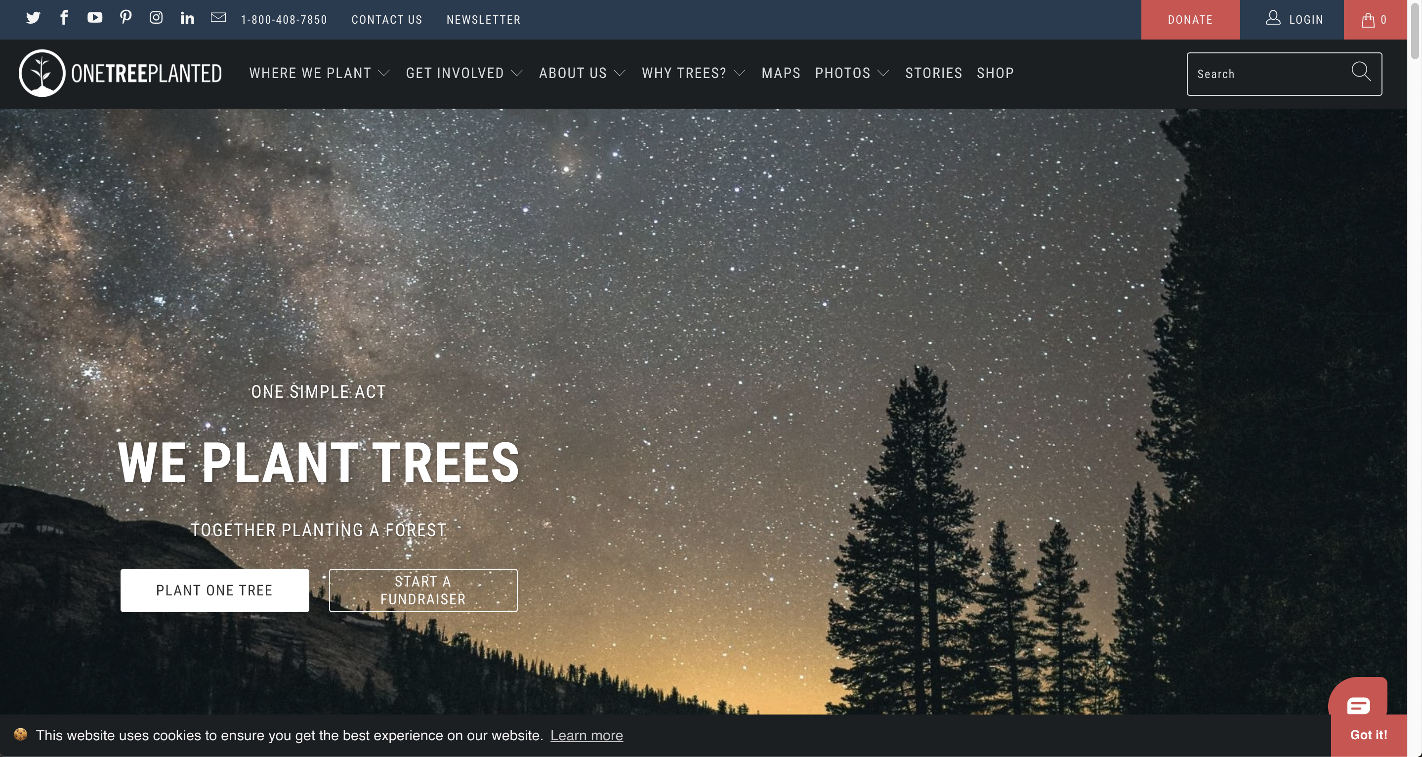
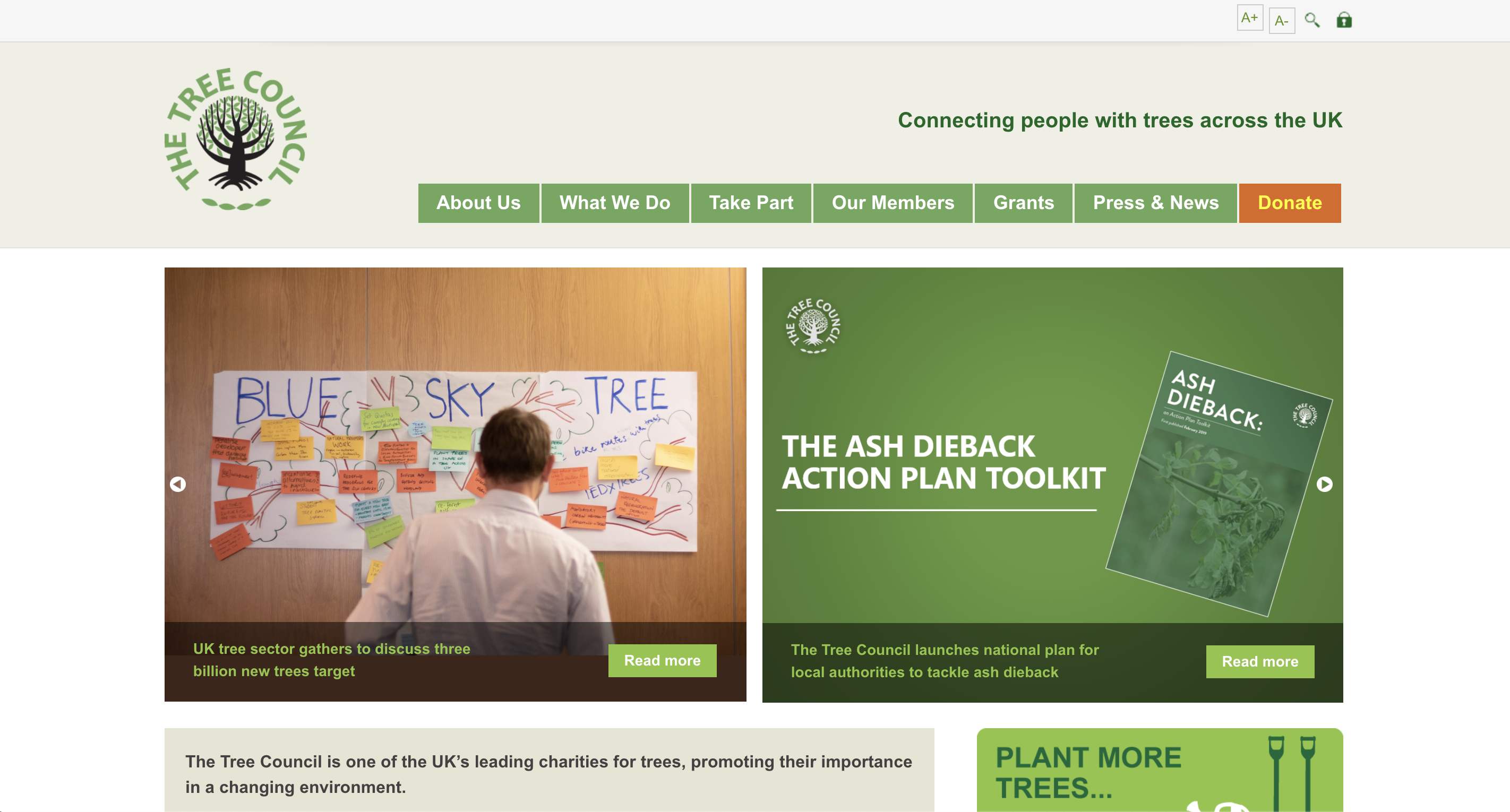
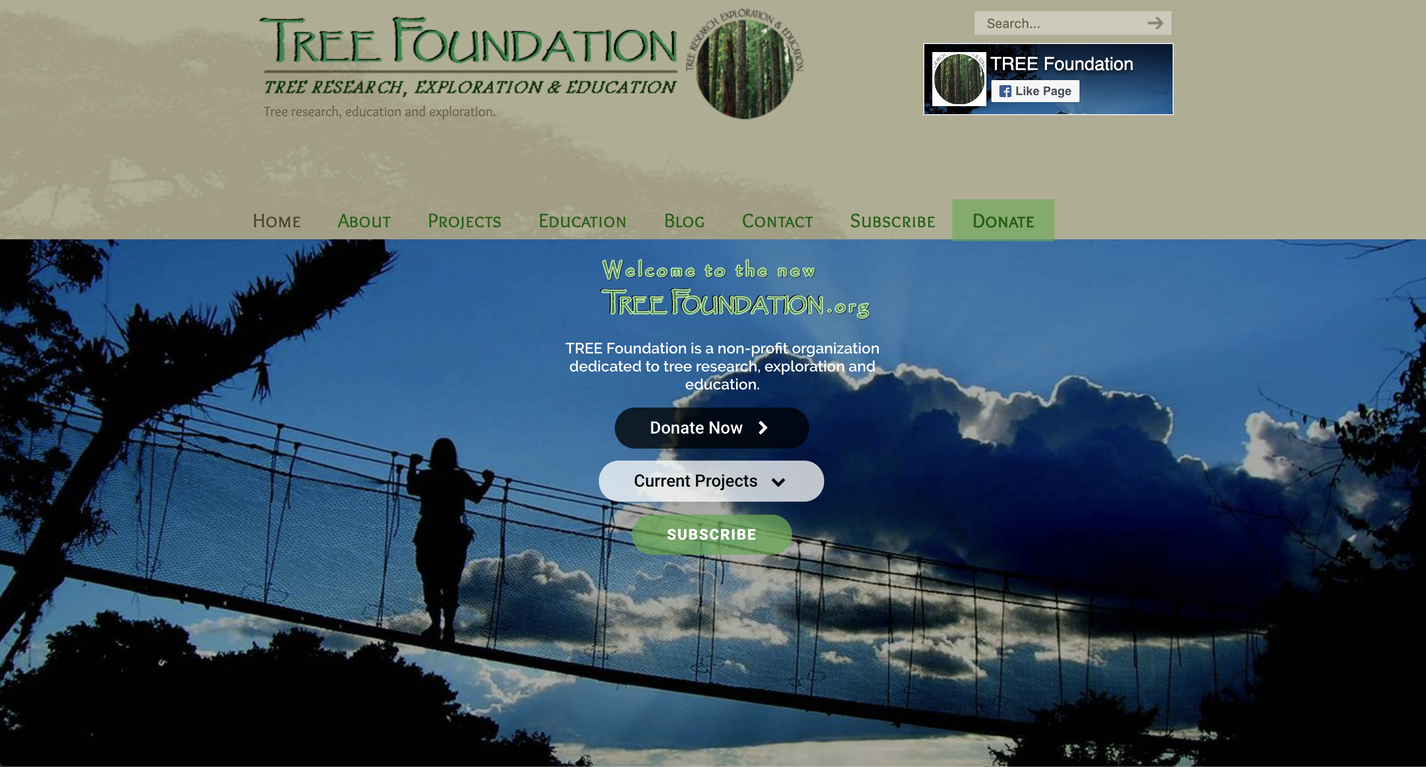
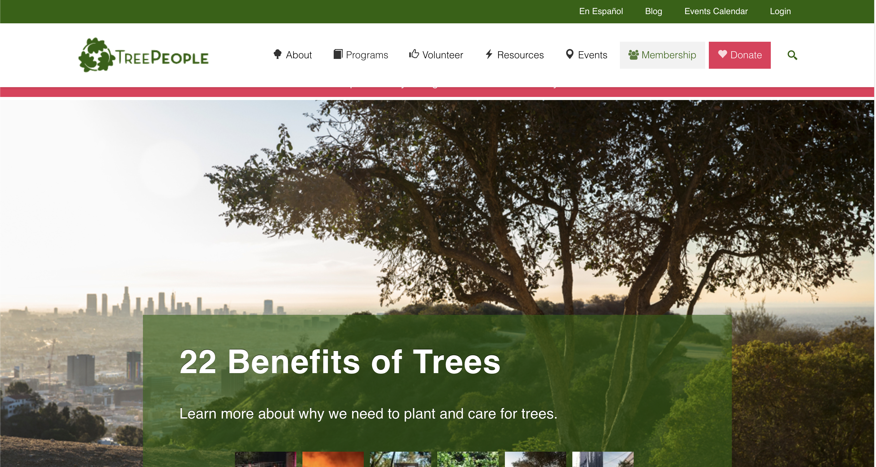
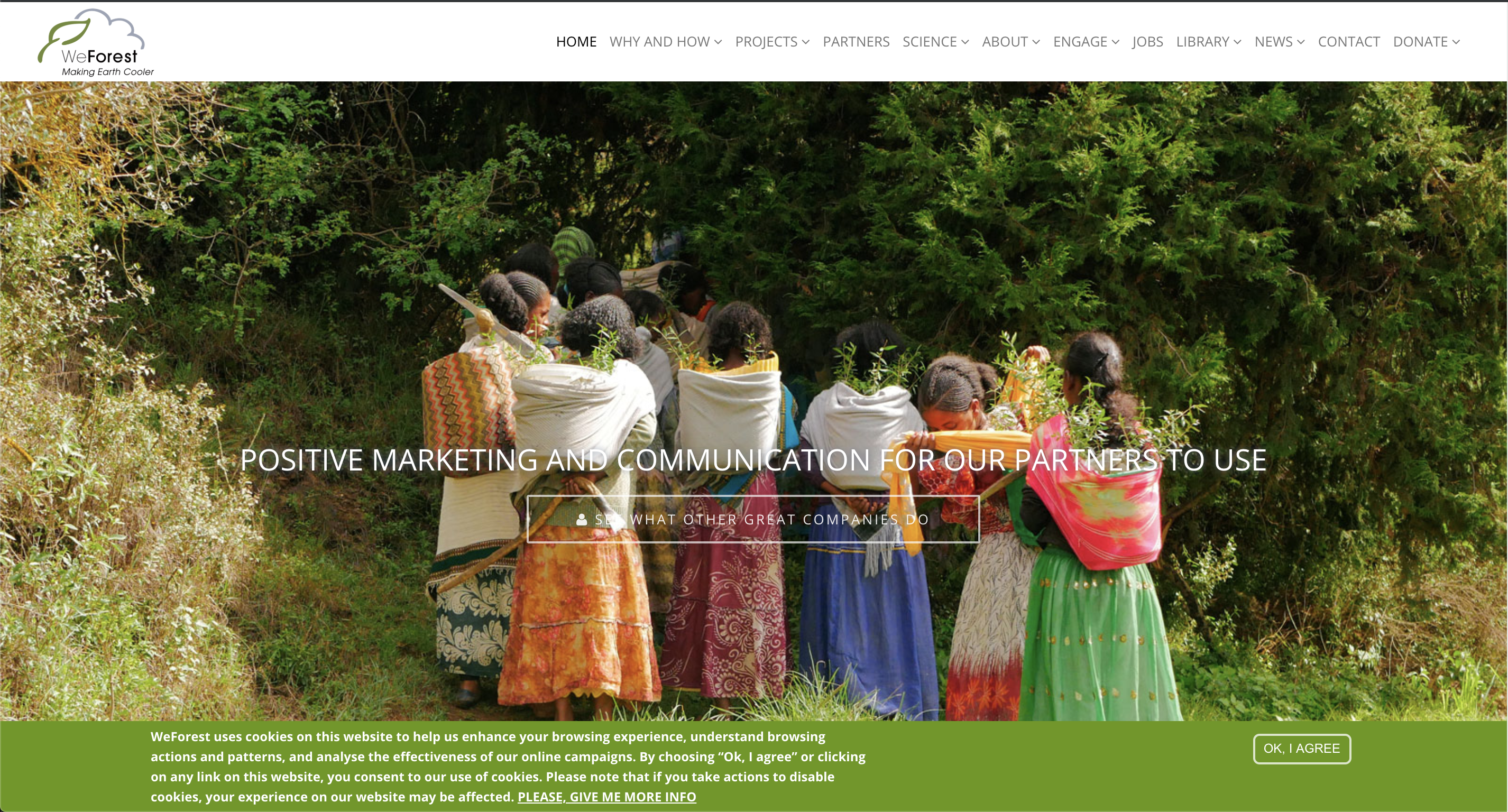
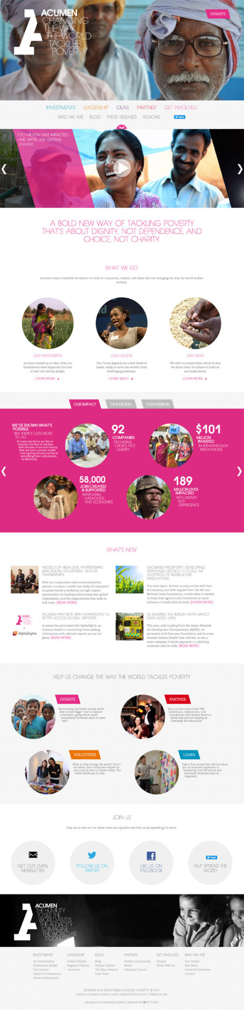
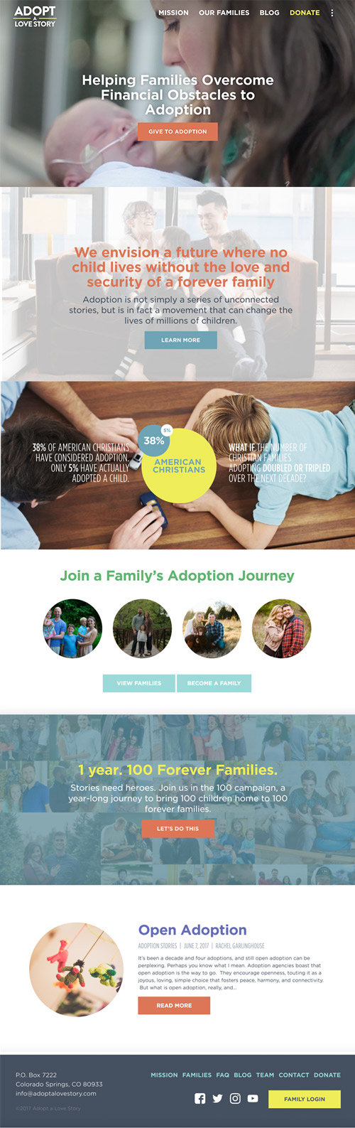
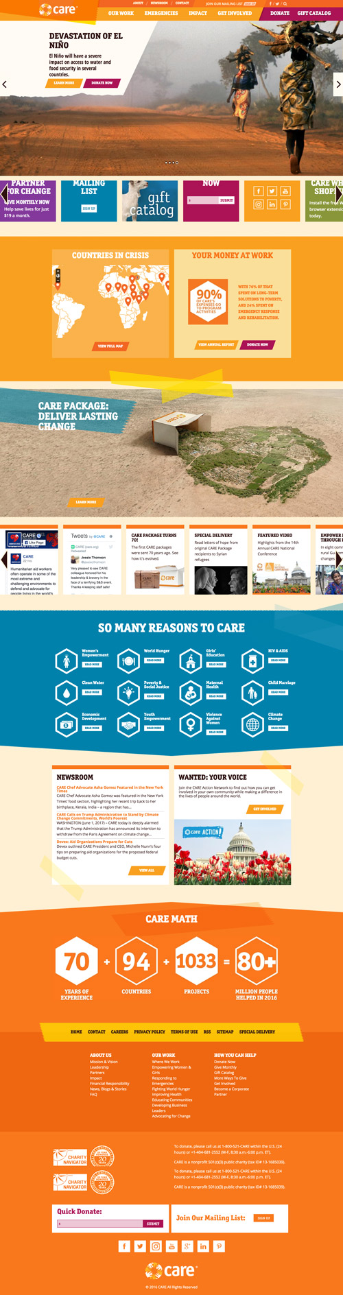
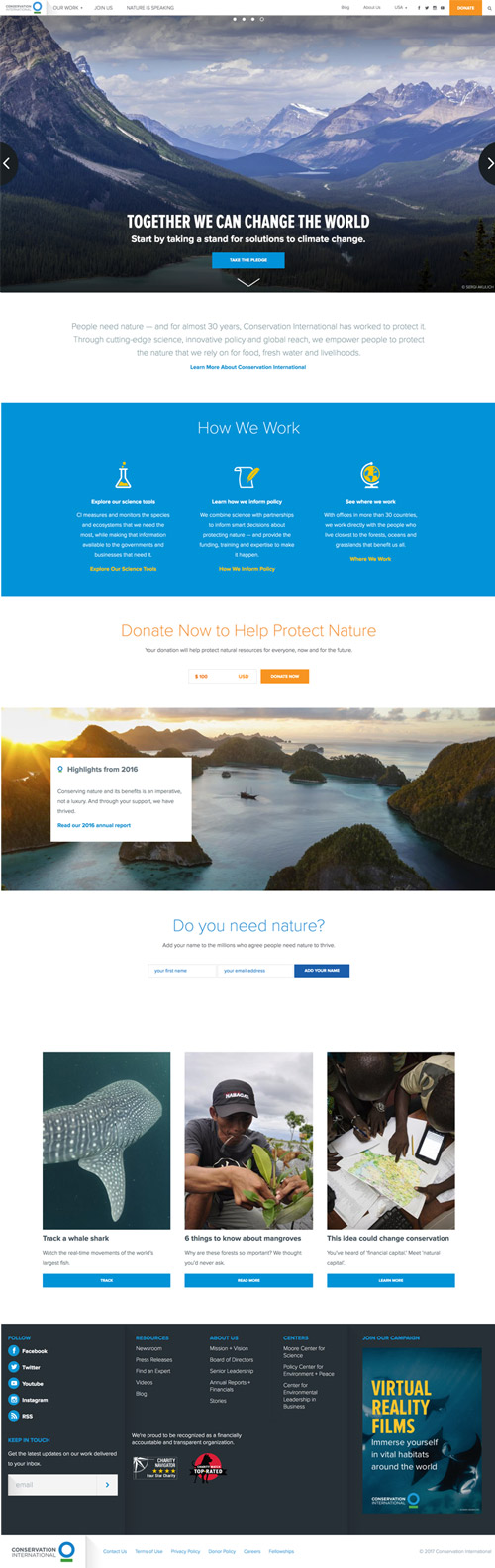
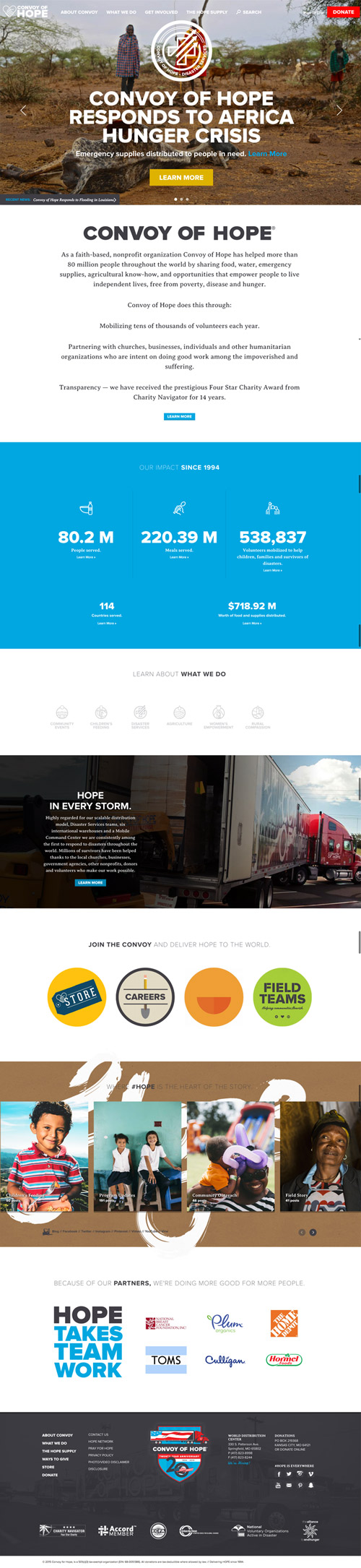
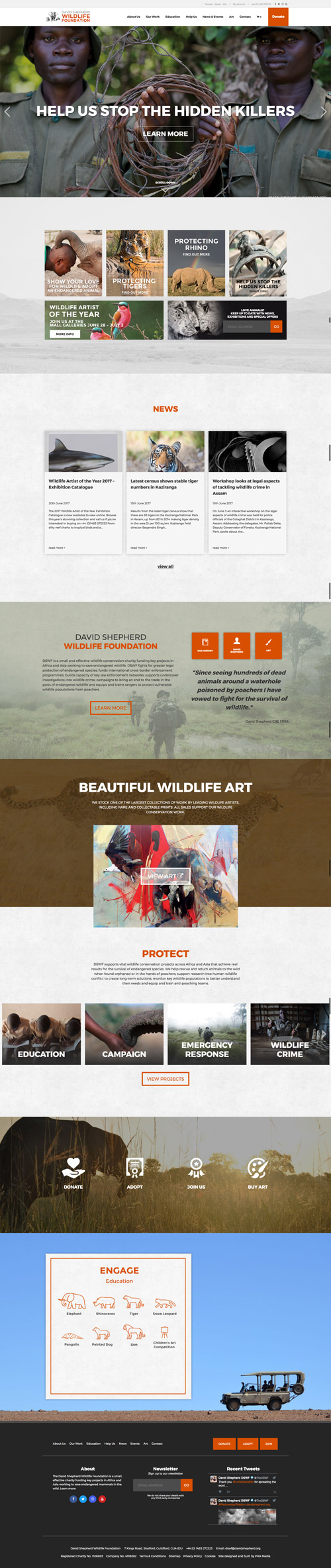
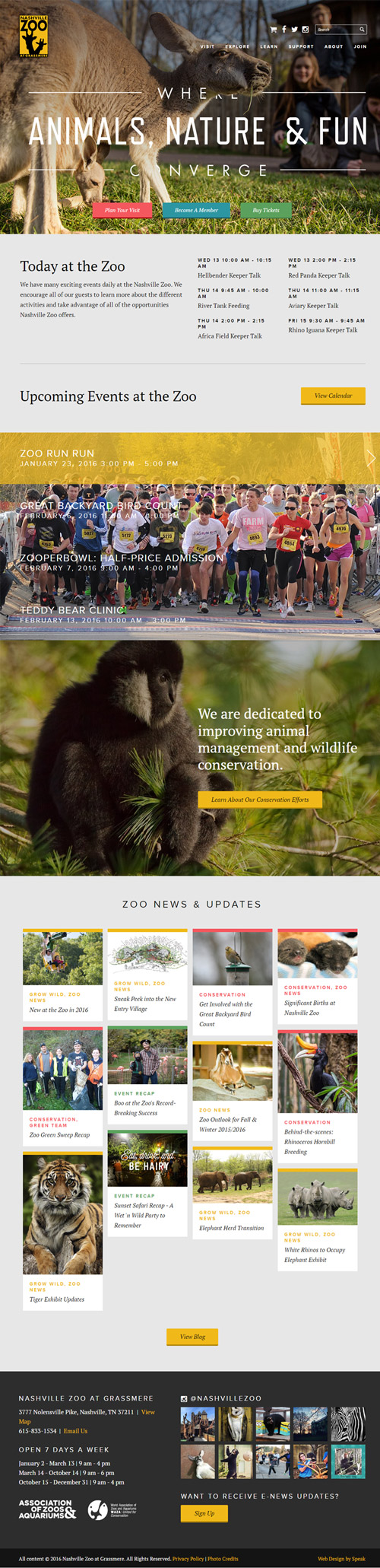
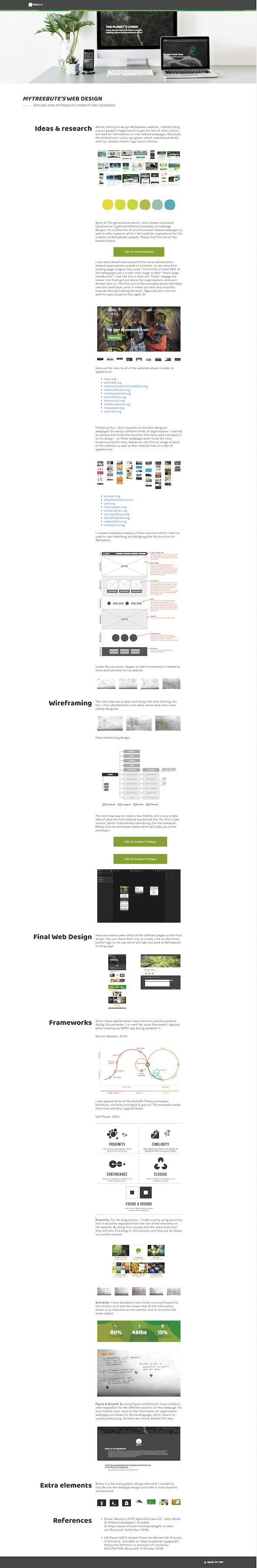
Following this, I did a research on the best designed webpages for various different kinds of organisations. I wanted to analyse and study the structure they have used and apply it to my design – as these webpages seem to be the most known/successful ones. Below you can find an image of each of the websites as well as their website links (in order of appearance).
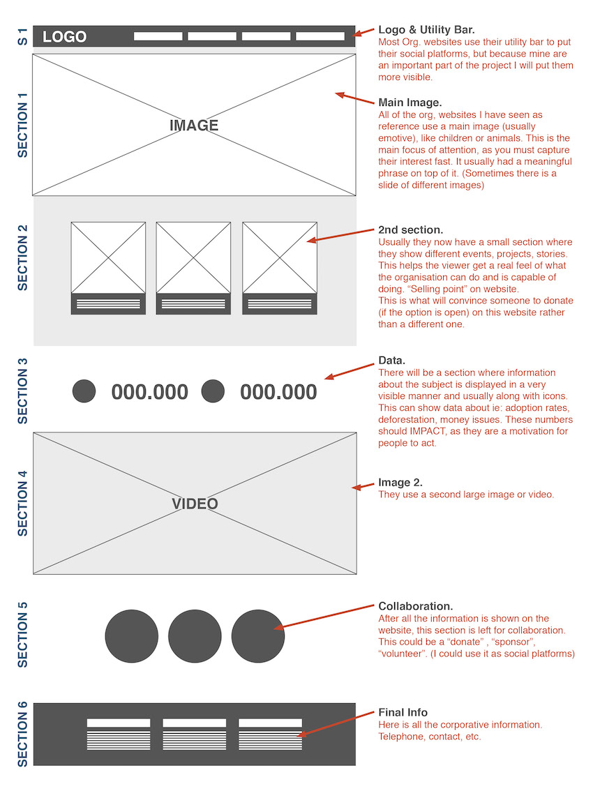
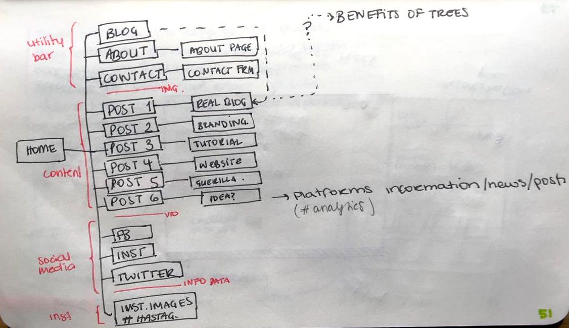
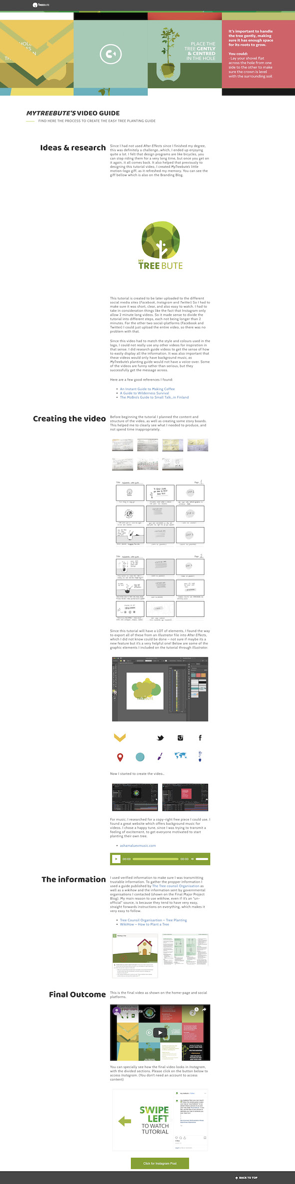
I created a detailed analysis of their structure which I later on used to start sketching and designing the UX structure for MyTreebute.
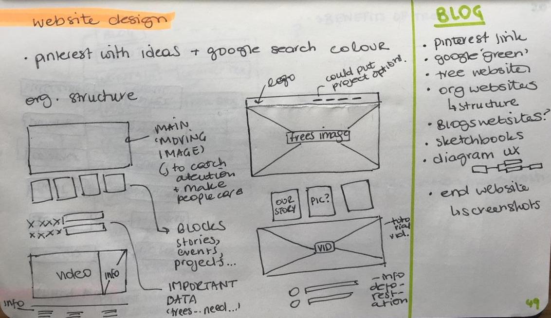
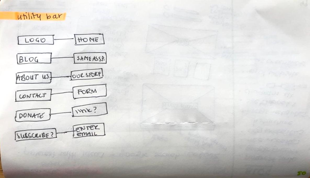
Under this structure, I began to add the elements I needed to show and link them to my website.
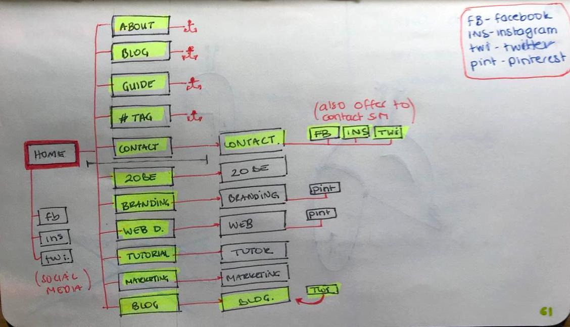
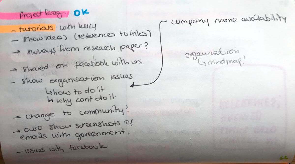
Wireframing
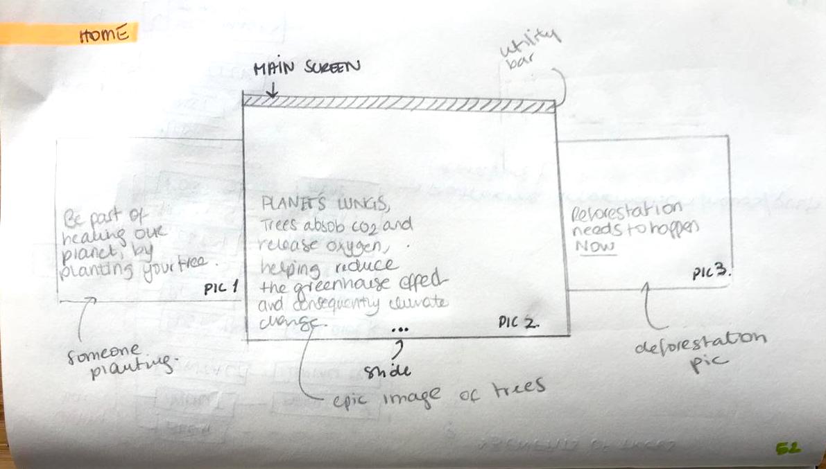
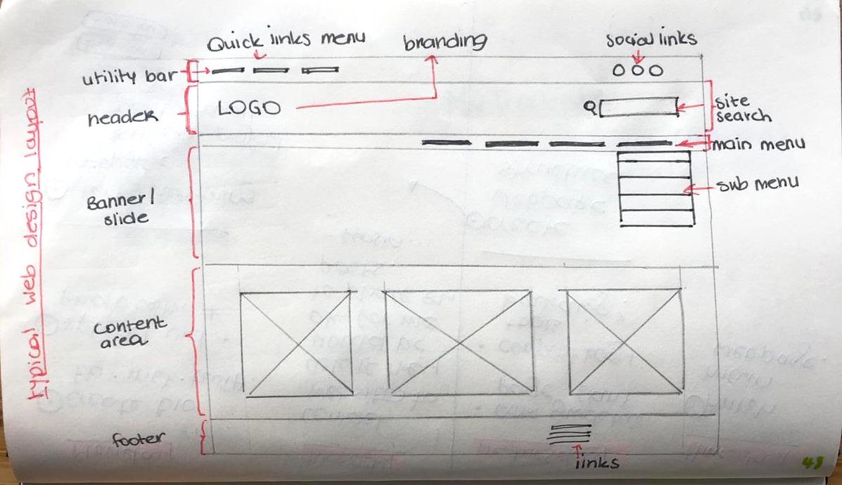
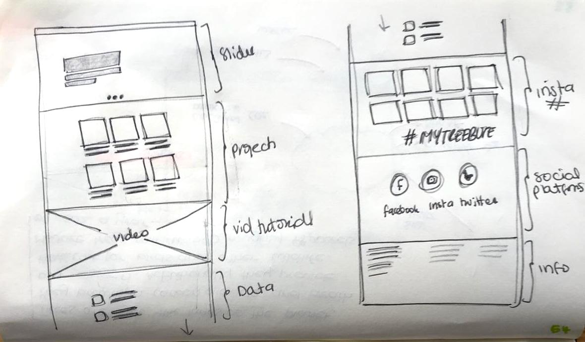
The next step was to plan and design the wire-framing. For this, I first sketched the initial ideas which were later more clearly designed.
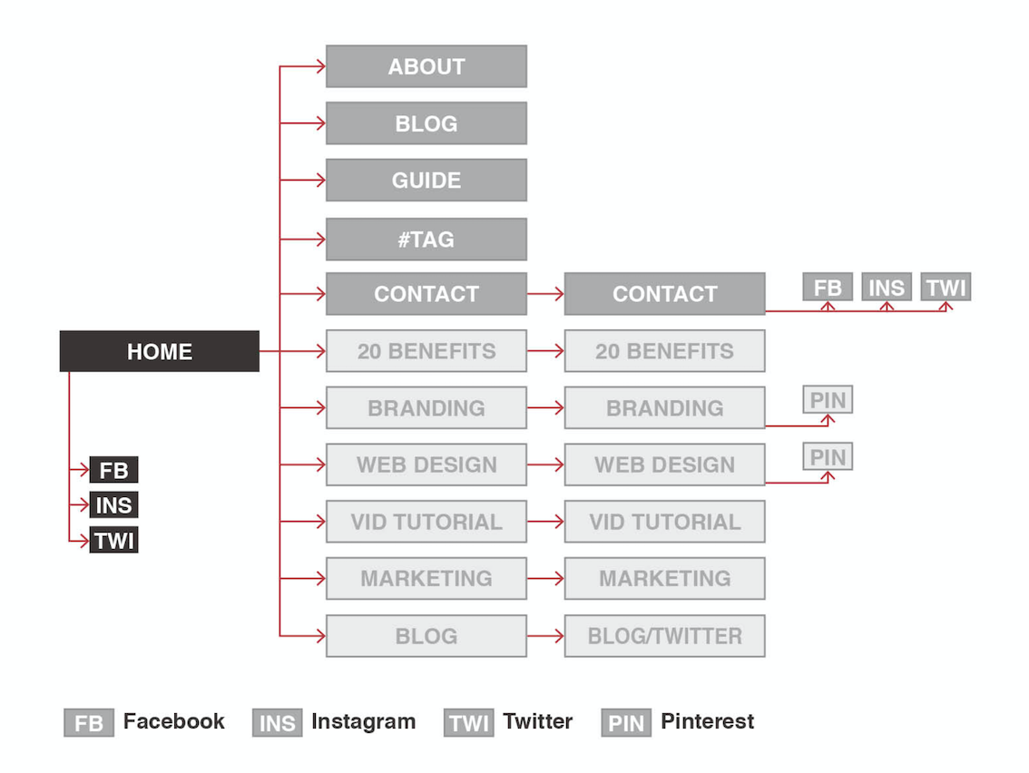
Final wireframing design:
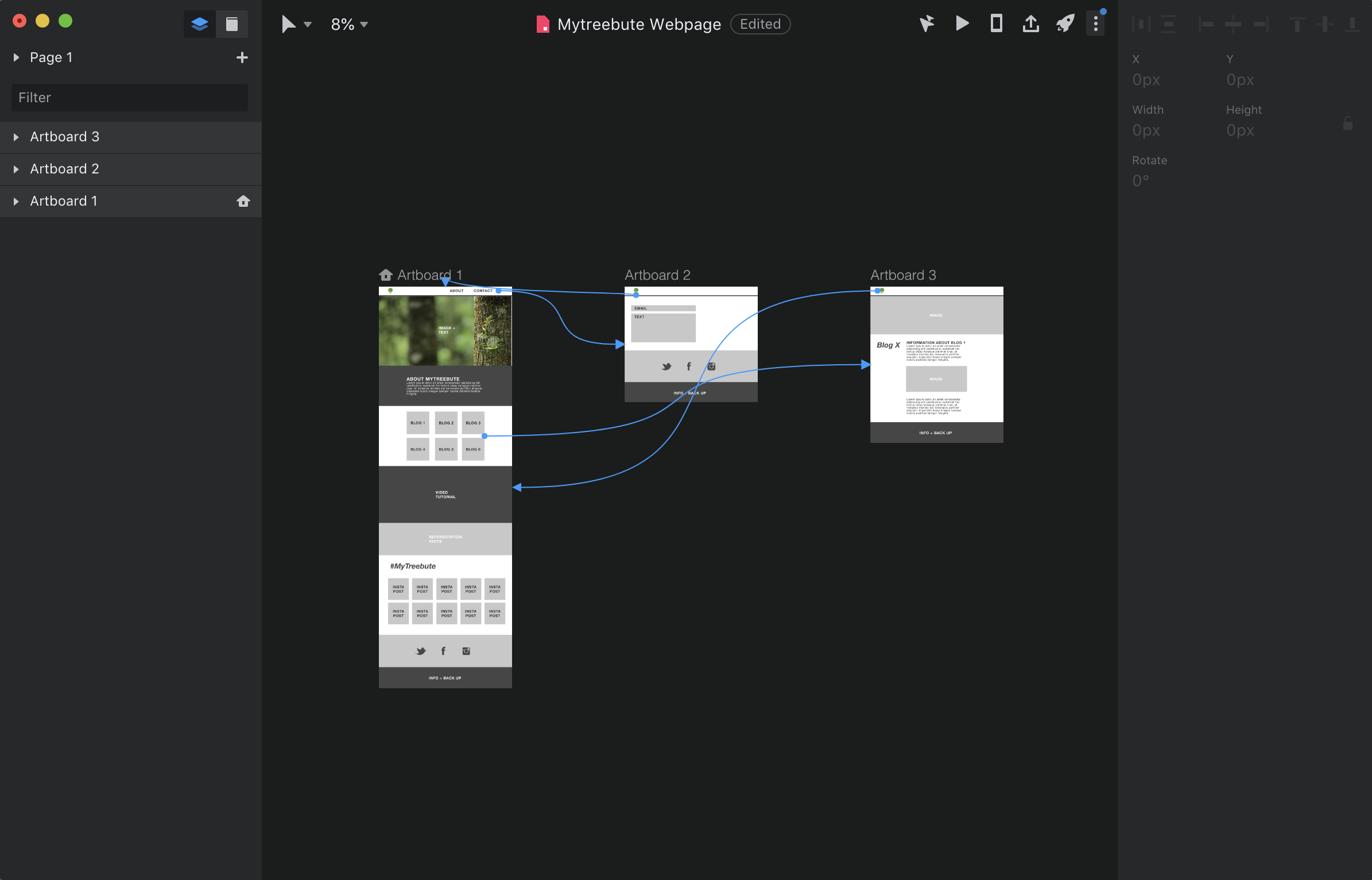
The next step was to create a low-fidelity and a very simple idea of what the final website would look like. For this I used invision, which I had already used during the first semester. Please click on the button below which will take you to the prototype.
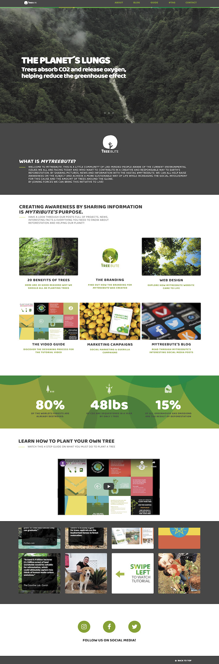
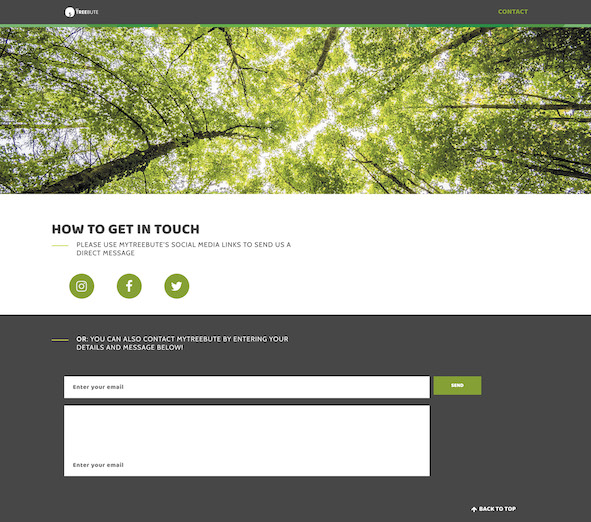
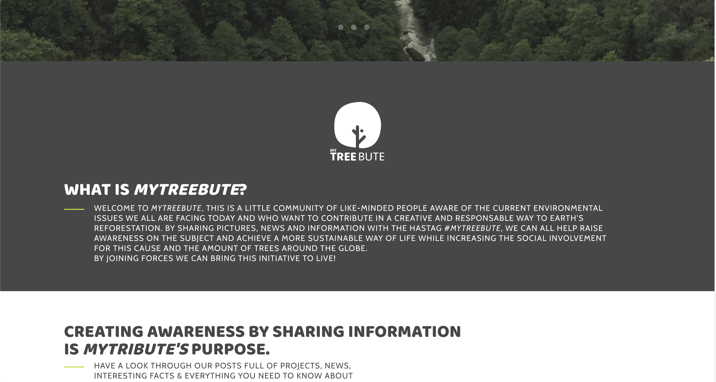
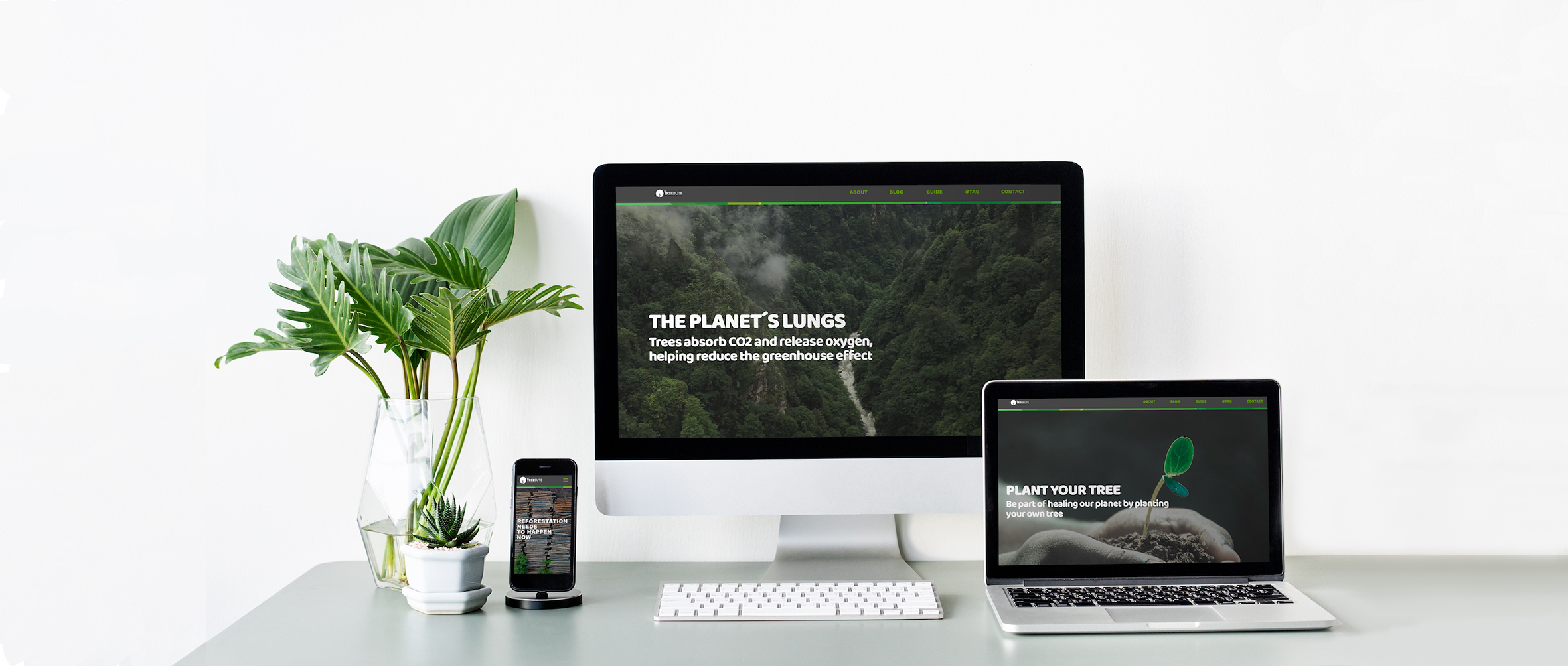
Here are some screen-shots of the different pages on the final design. You can check them out, or simply click on the home-button logo at the top which will take you back to MyTreebute’s landing page.
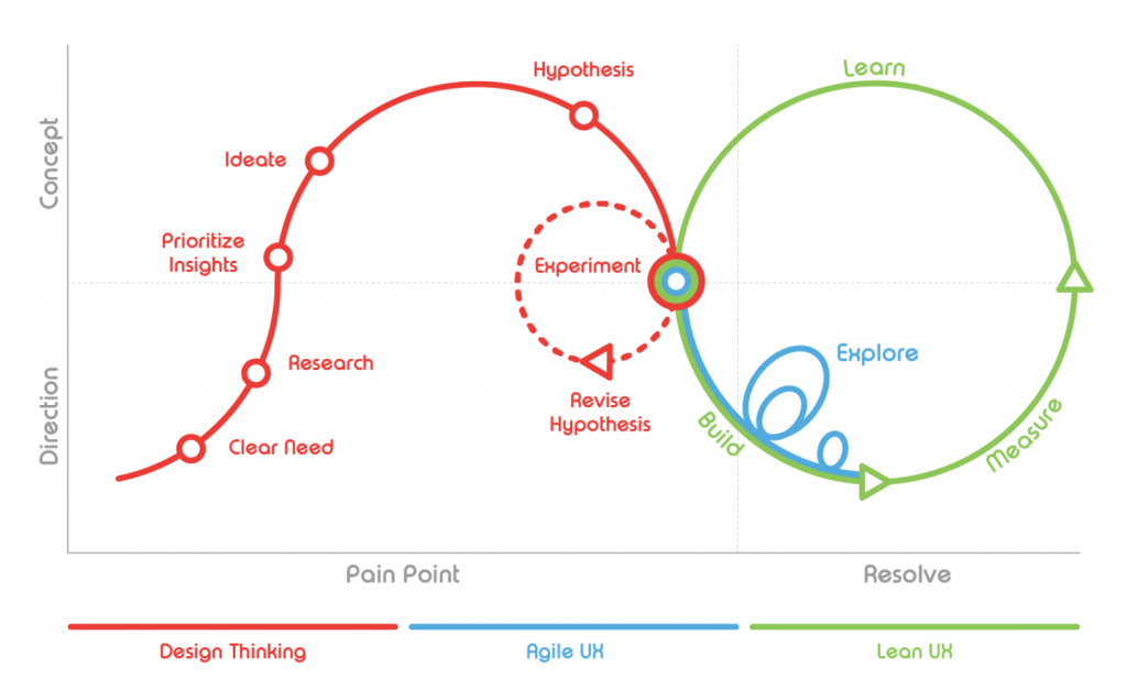
Frameworks
Since I have applied what I have learnt in previous projects during this semester, I re-used the same framework I applied when creating my NATIV app during semester 1.
(Olivier Wouters, 2017)
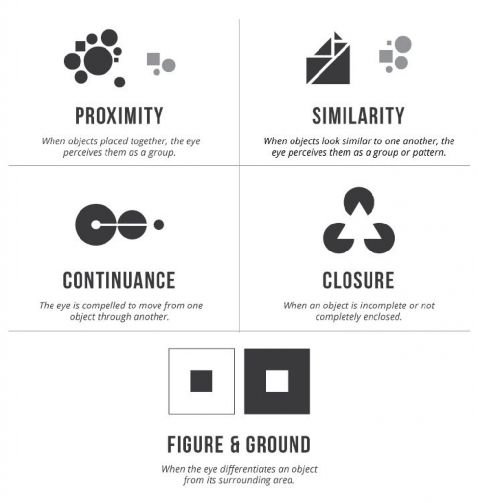
I also applied three of the Gestalth Theory principles; Proximity, similarity and figure & ground. The examples below show how and why I applied these.
(UX Planet, 2017)
Proximity: For the blog section, I made sure by using proximity that it would be separated from the rest of the elements on the website. By doing this I ensure that the users know that they will only find blogs in this sections and they are all shown in a similar manner.
Similarity: I have decided to use similar icons and layout for this section, as it tells the viewer that all the information shown is as important as one another and its all within the same subject.
Figure & Ground: By using Figure and Ground I have created a clear separation for the different sections on this webpage. It’s very helpful since, most of the information on organisation webpages are shown on the landingpage, which means its usually pretty long. Sections are clearly divided this way.
Extra elements
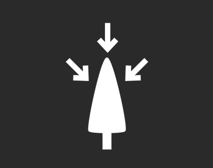
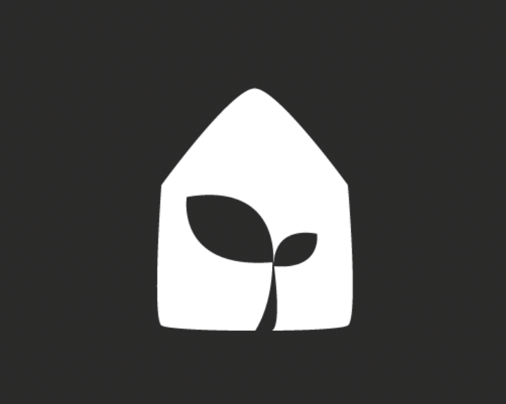
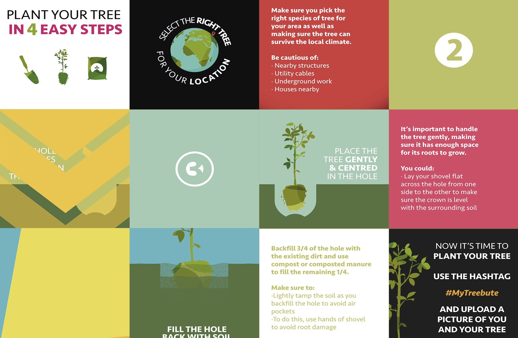
Below is a few extra graphic design elements I created to include into the webpage design and make it more dynamic and personal.
References
Olivier Wouters (2017) Agile UX & Lean UX – Buzz Words Or Different Strategies?, Available at: https://www.innotain.me/tutorial/agile-ux-lean-ux/ (Accessed: 16 October 2018).
UX Planet (2017) Gestalt Theory for Efficient UX: Principle of Similarity., Available at: https://uxplanet.org/gestalt-theory-for-efficient-ux-principle-of-similarity-827c20c175f5 (Accessed: 15 October 2018).