Explore THE DESIGN PROCESS FOR MYTREEBUTE’S BRANDING.
Ideas & research
As I have mentioned in past semesters, the branding side of every project has been one that I really enjoy, and even though I feel like I already know the basics to design the branding, I realise, with each new project, there is so much more to learn!
In this case, for example, I had never created a brand for a social related issue. This meant the brand had to transmit a clear message which could not be miss-understood – since the whole point of this project is to create awareness. It had to be transparent, direct and universally understood. This brand also carries certain responsibility, since it’s created to direct and inform about reforestation issues. This meant it had to be serious while still familiar and «fun», so MyTreebute’s community is able to reach the highest amount of people possible.
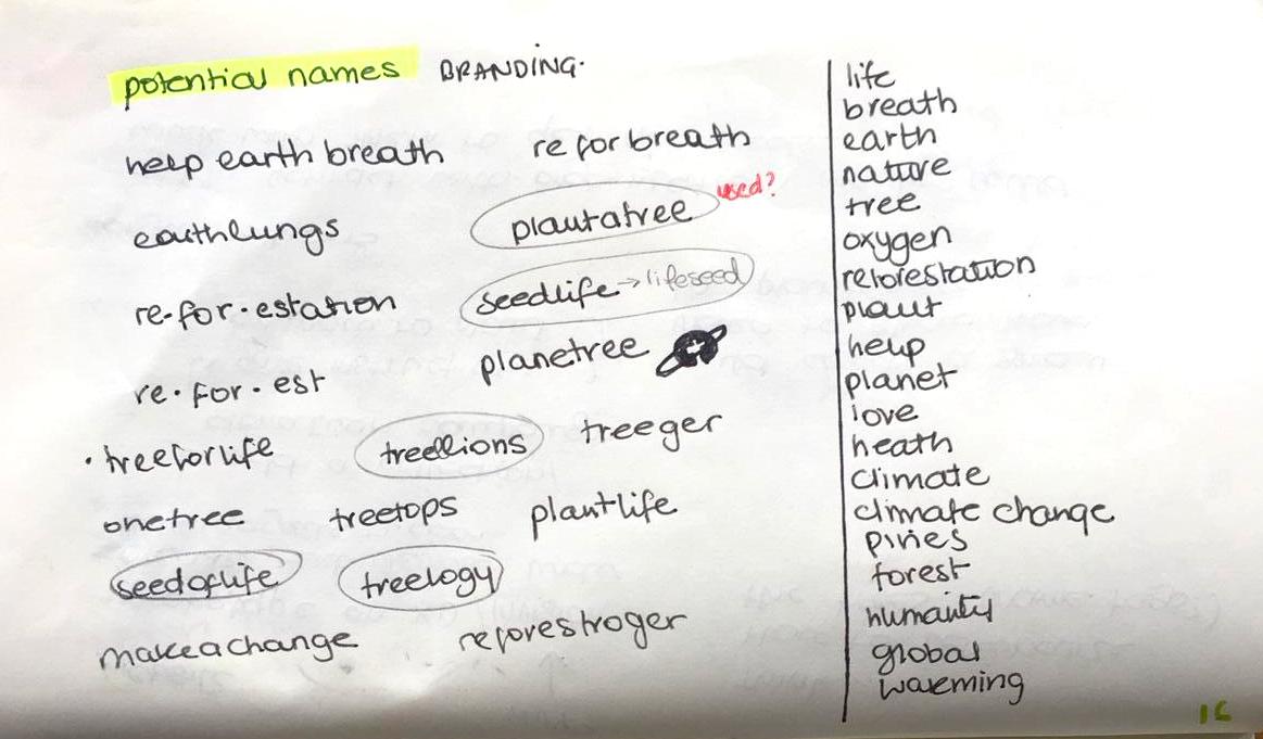
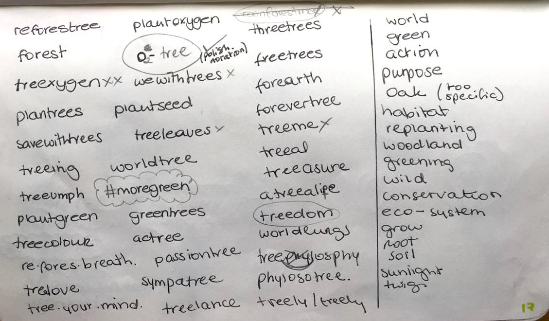
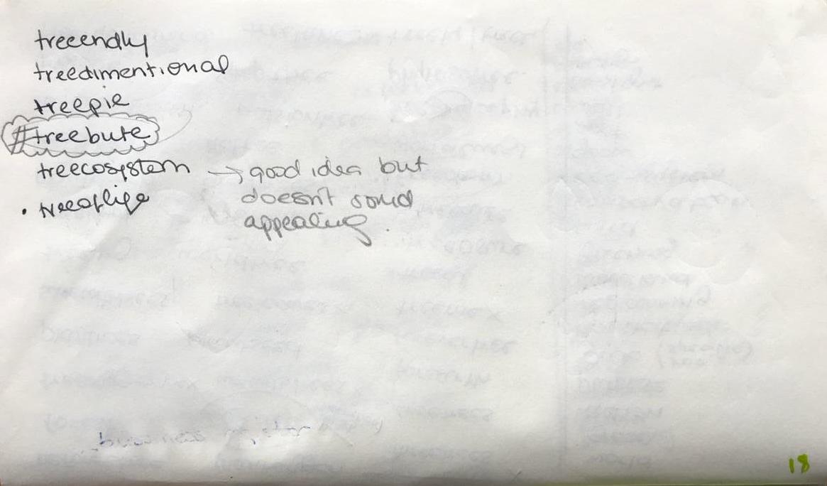
Finding the right name for this social project was very difficult since the name had to directly portray that it had to do with reforestation and there are many organisations out there with every possible name related to trees. So I created a list of different names which I thought could potentially work, then picked which ones had more potential and search for them online. Specially on instagram to make sure it had no hashtag used.
To help me understand more about organisation naming, I read this article written by Ollie Leggett, where he talks about why the name of a charity is so important. «One in two people interviewed for a job at Macmillan cited the brand as a reason they wanted to work there»(Leggett, O, 2019).
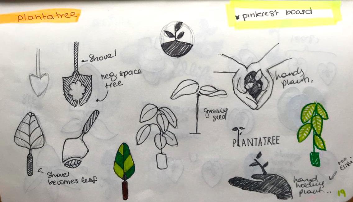
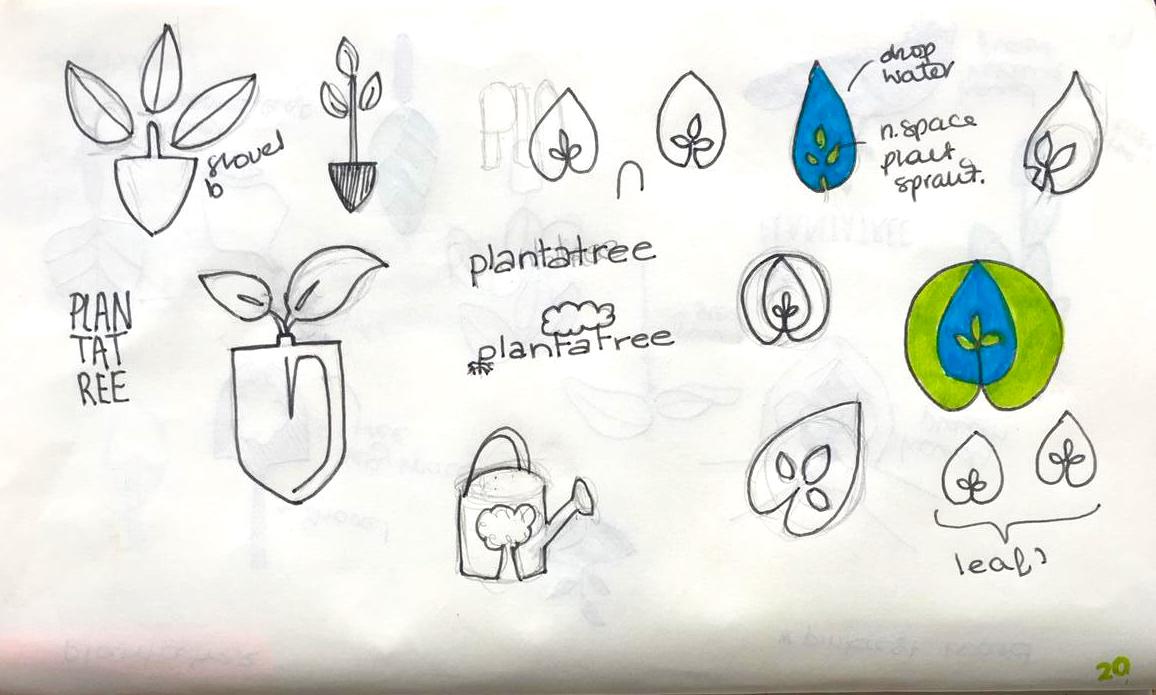
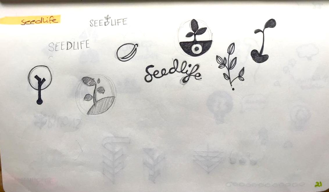
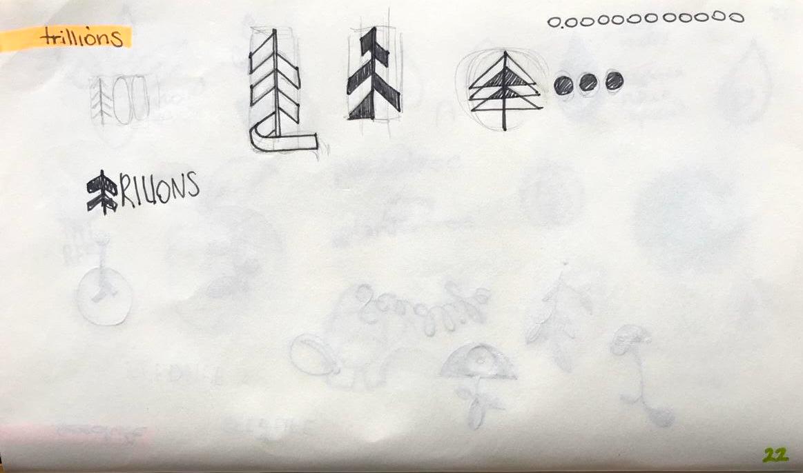
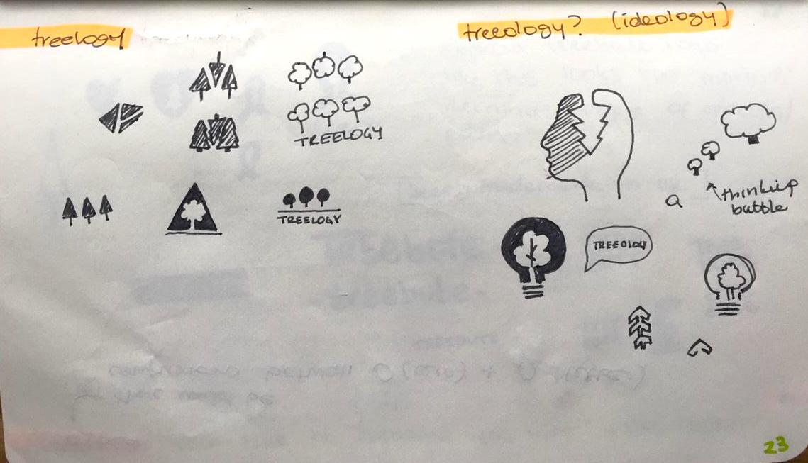
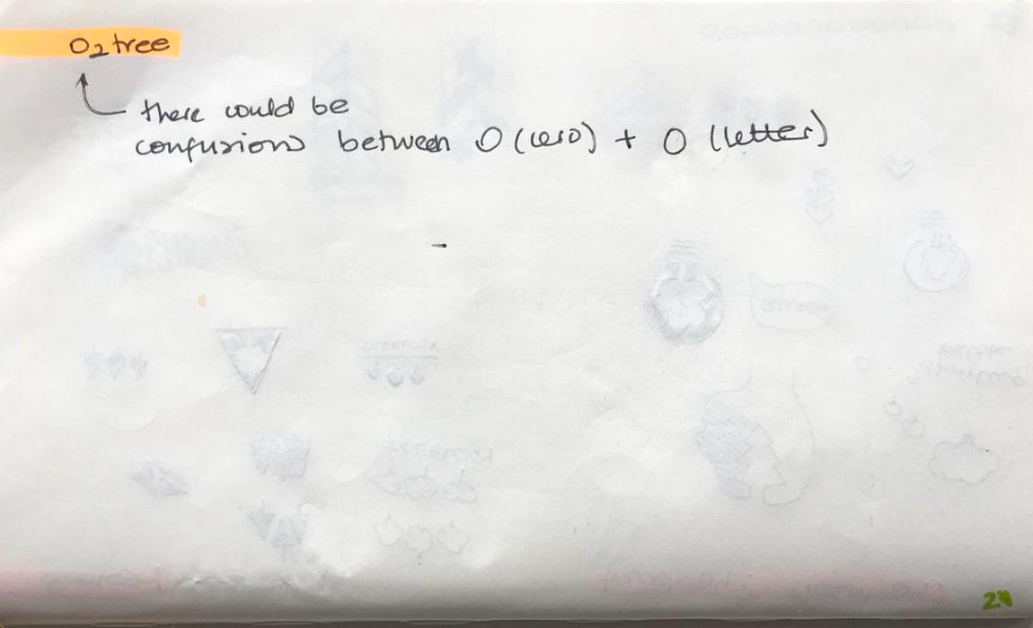
I went a head and circled the ones that had more potential like: TREELIONS, O2TREE, SEEDLIFE, PLANTATREE, TREELOGY and TREEBUTE. It was worth trying out how the logos would work with some of these ideas, so I started my research on existing eco-friendly, environmental, green logo designs. You can find the pinterest board below.
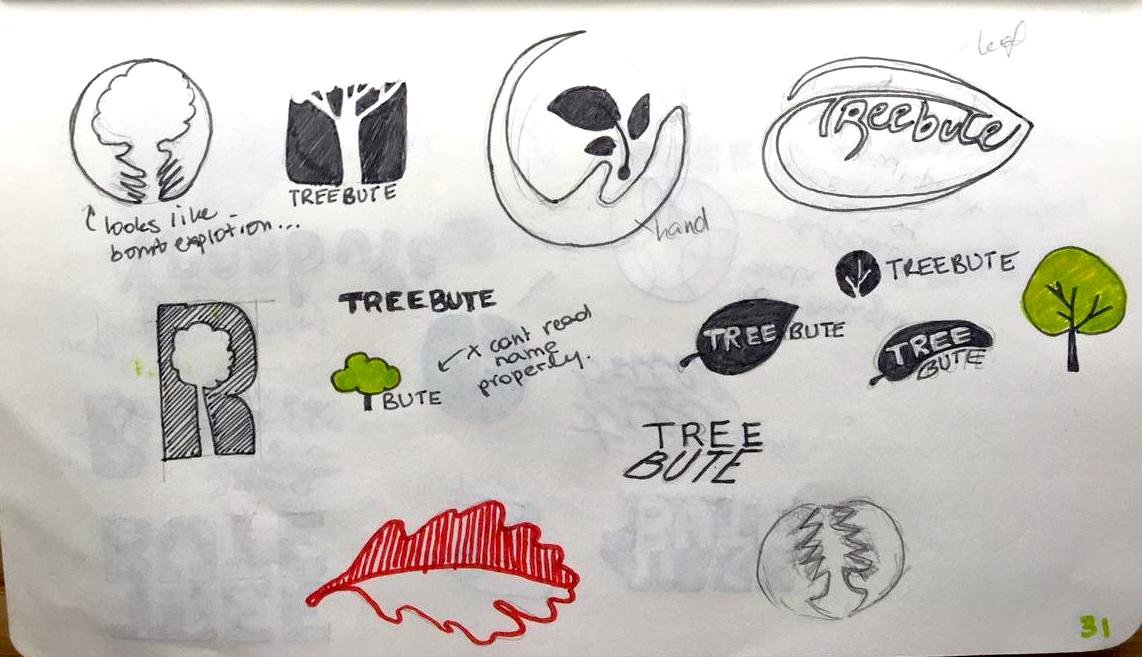
Below you can see a collection of the different designs I started creating for the names I had selected.
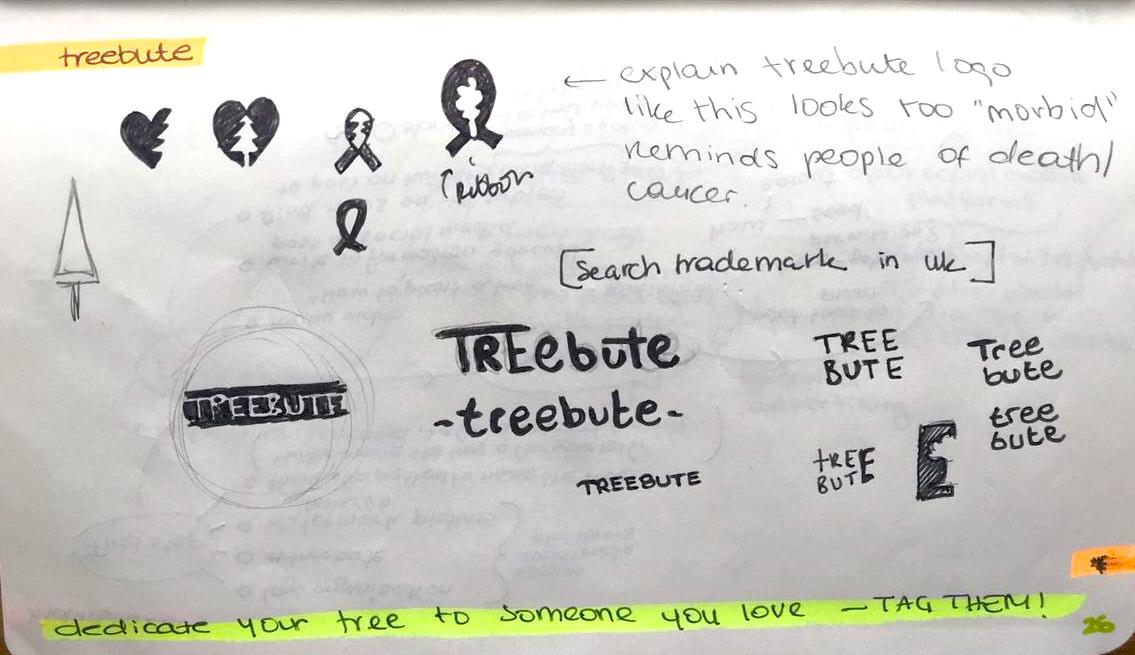
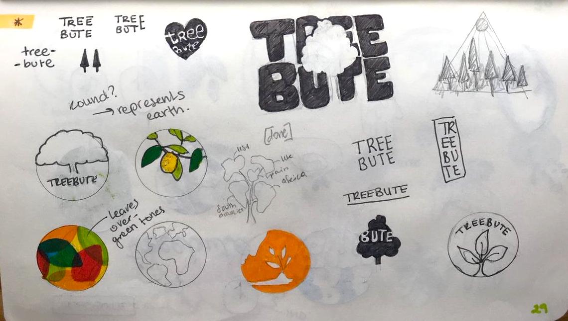
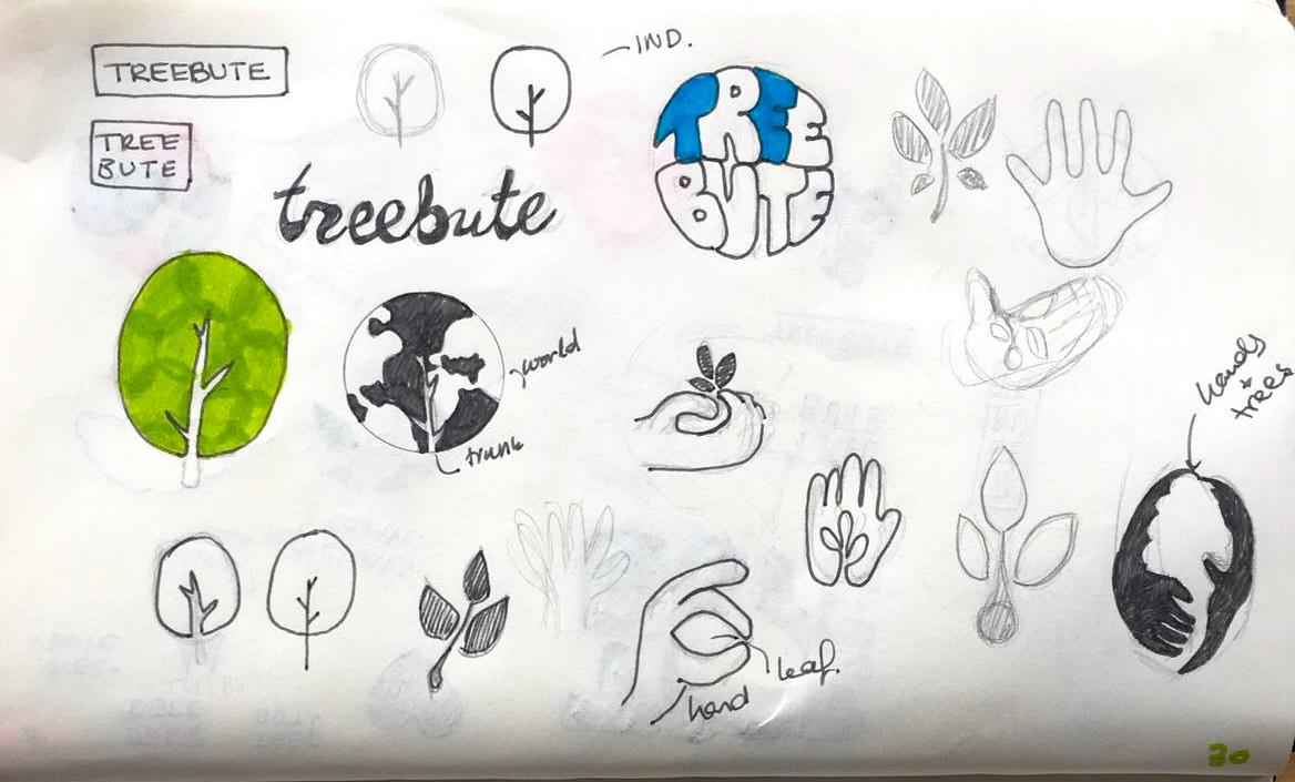
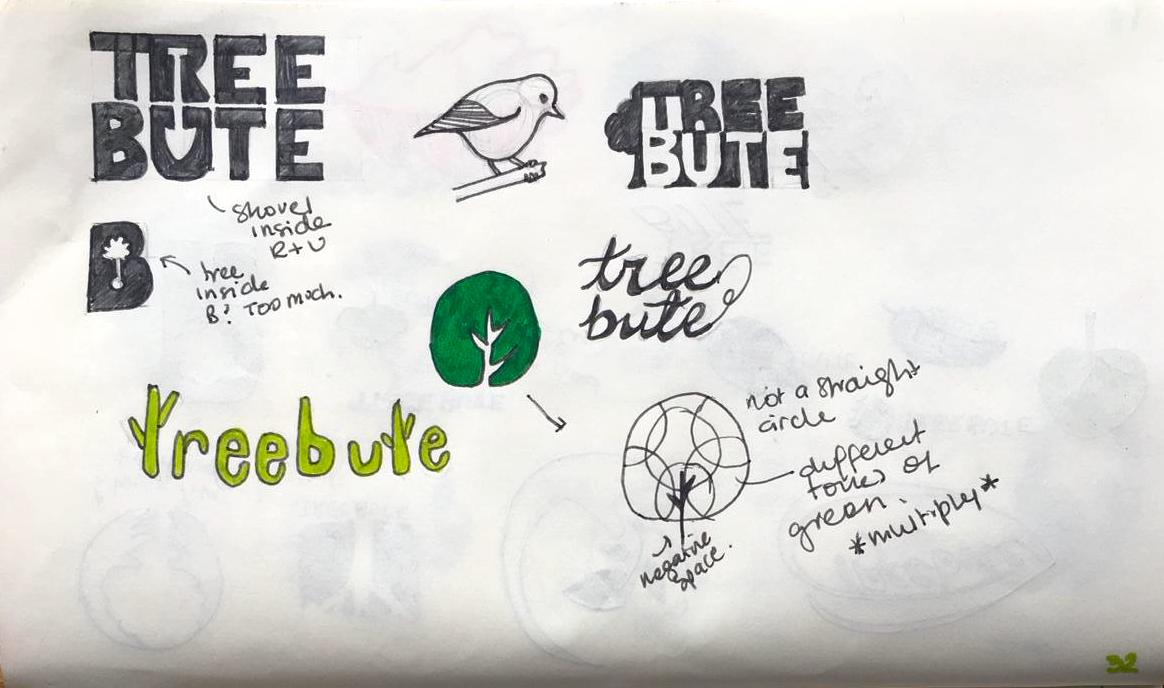
I finally decided to go with the name Treebute – as I thought it would be a beautiful play of words to tribute the earth by planting trees as well as working perfectly with the idea of dedicating your tree to someone loved through social media- which would be one of the ways to instigate people to do it. Below you can see sketches for the logo.
Once I had an idea of what I wanted the logo to be, I moved on to the computer to digitalise the artwork. With a mix of photoshop, illustrator and Indesign I started playing around with the designs.
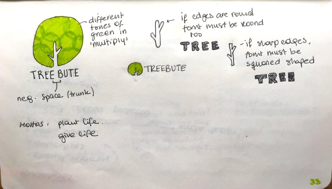
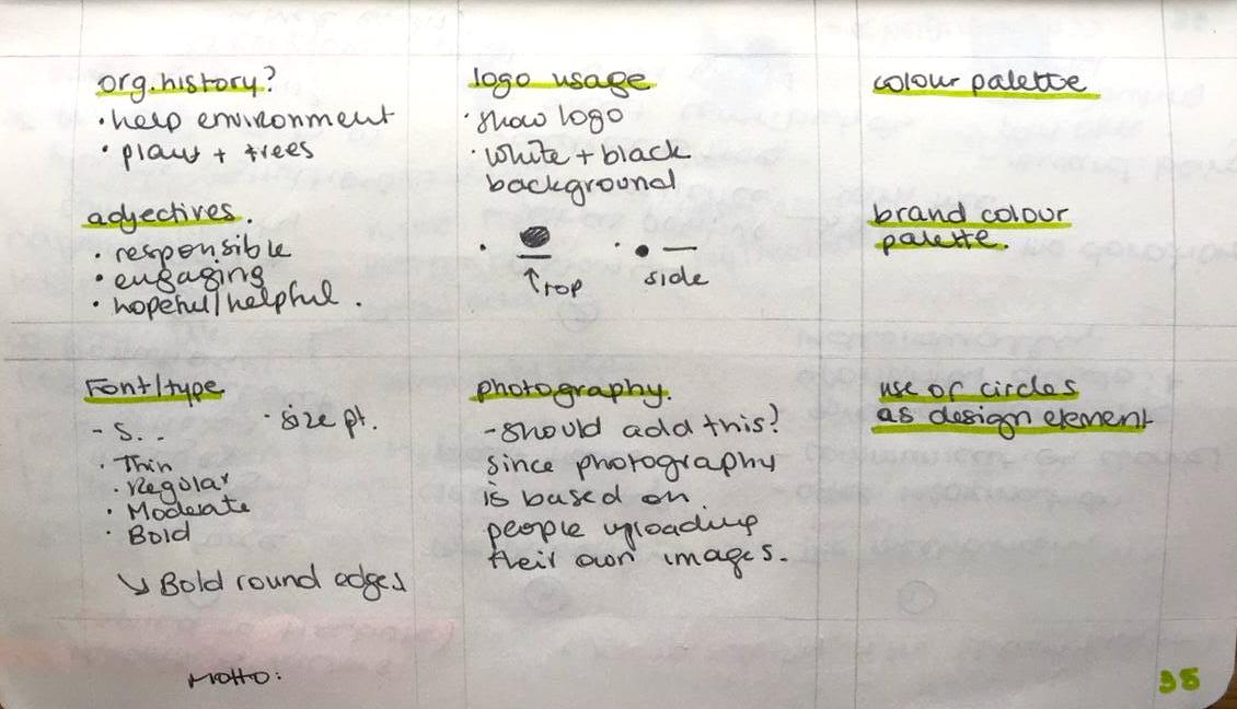
I then started consolidating the details of the design and ended up with a logo I was happy with. I payed close attention to certain details on the designs such as:
The roundness of the letters – as this would match much better aesthetically with the logo.
The position of the colourful pattern.
Testing on which were the best ¨branch¨positions, to chose the most visually appealing.
Process of this detail-decisions below:
Unfortunately I came across a set-back and I was unsure what to do about it, since I had already almost completed my logo design.
Previously to start the designing process I made sure the name «mytreebute» was available to use as hashtag and account on social media. At that point, they were all available, nevertheless, I searched for the name again to find it had been already been used! (Not sure how I did not find it the first time)
To begin with, I thought I would have to change the name completely and start designing again, after asking some people for their feedback, someone suggested to add a simple MY on top of Treebute and call it MyTreebute instead. This was the perfect solution, as it did not disrupt all the process and designs I had worked on for a while.
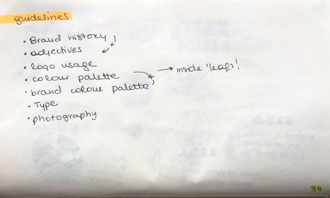
Once the issue was «solved», I continued to create the branding guidelines. I based the guidelines information on a plan previously done on my sketchbook – in which it stated the sections to cover on the guidelines. You can find the Guideline presentation at the top of this page.
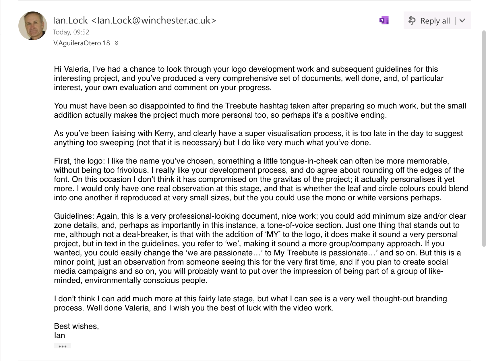
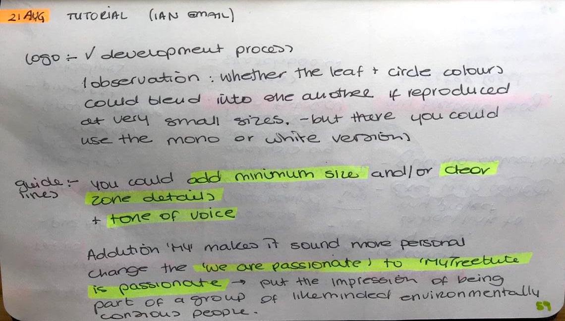
I asked Ian for his feedback regarding the branding including the problem I encountered related to the name. You can read his email below.
This left me feeling much at ease, since I was happy to know it the ¨MY¨ made the name seem even more personal. Ian was overall happy with the work I had created up until now.
Final Designs
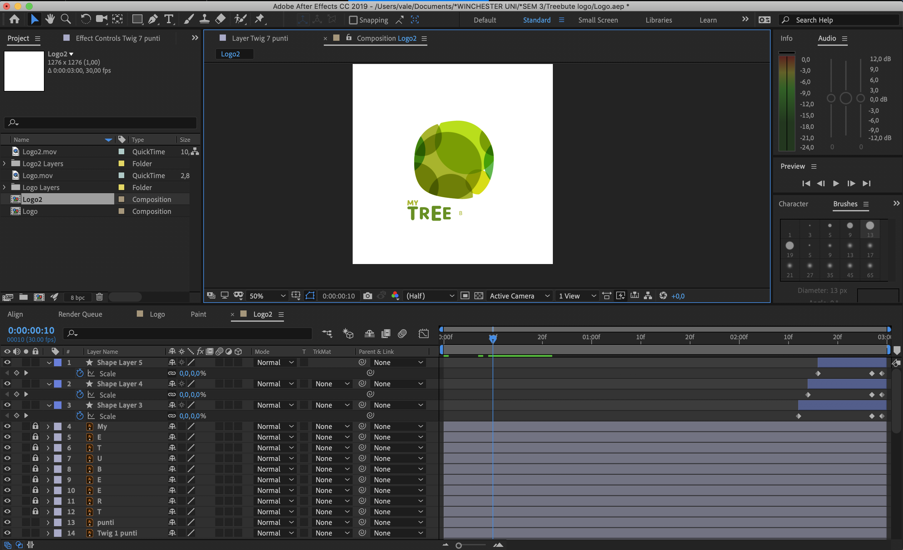
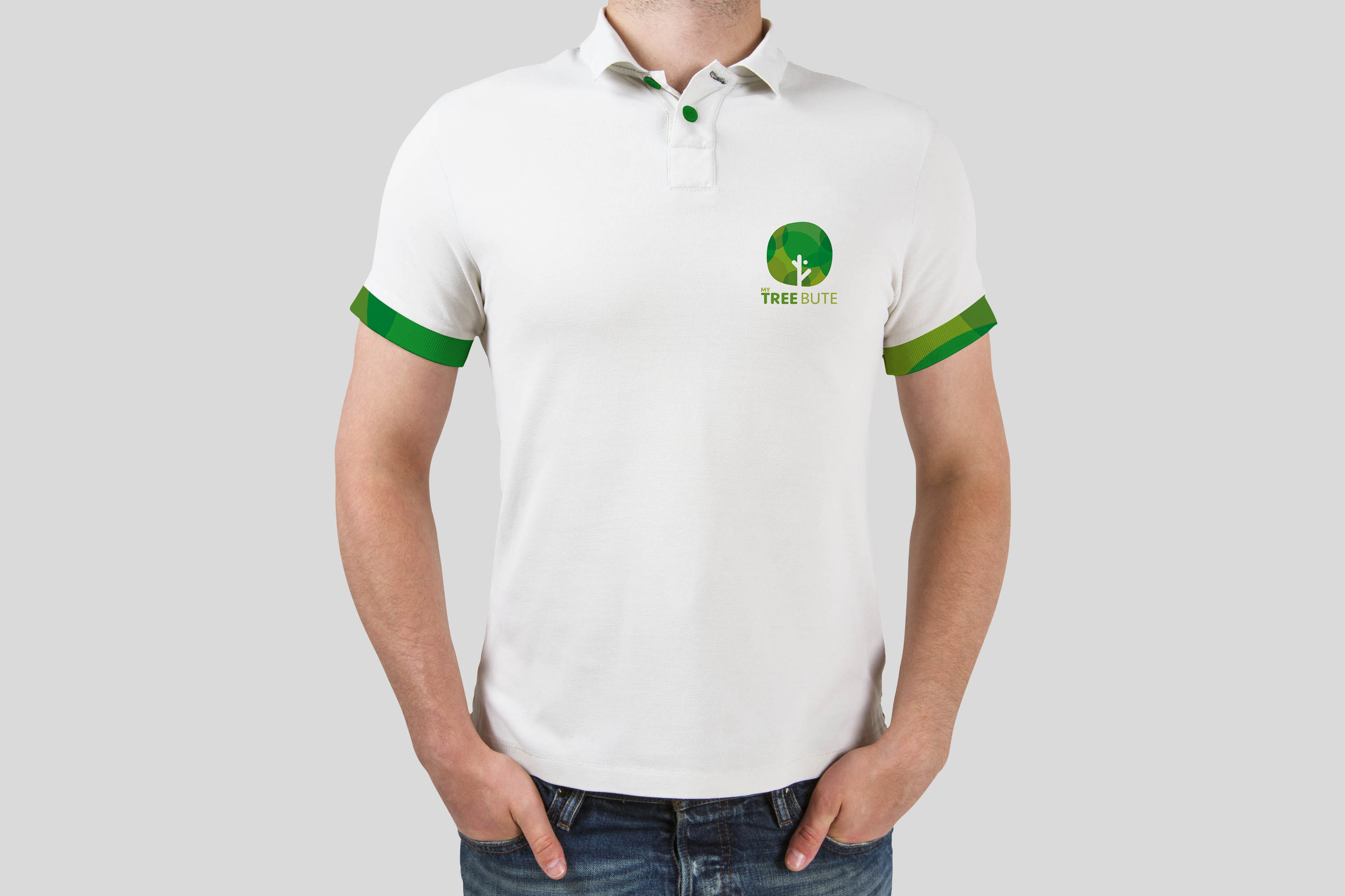
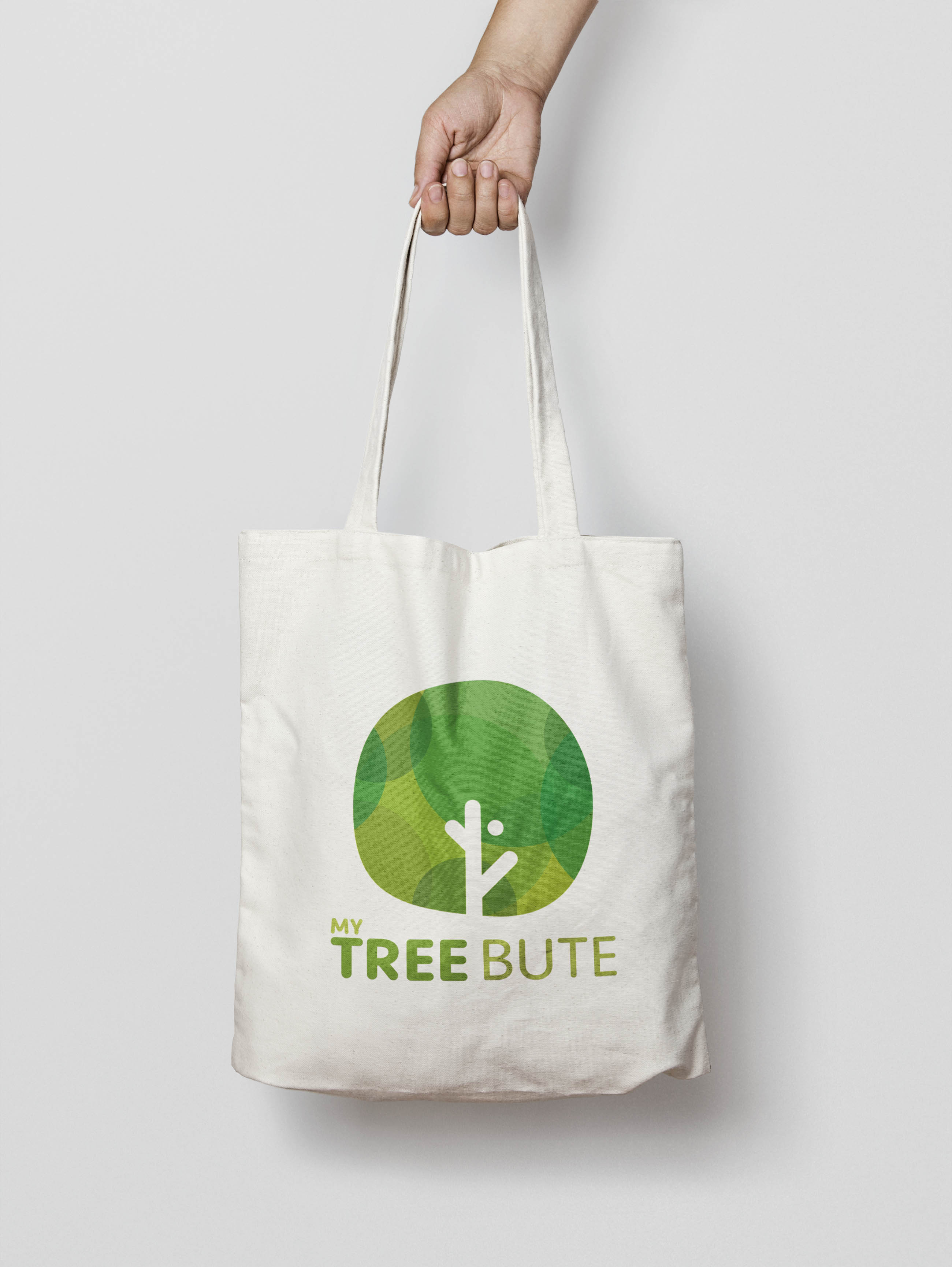
On this section you can find the final logo designs. These include the normal vertical and horizontal versions as well as the white-monochrome version for coloured backgrounds.
I have also created a small motion graphic piece for the introduction of the logo. You can find my inspirations for this giff on a presentation we created on week 9 about «Trends in digital media and who influences you». You can find my influences and inspirations on slide number 16
This was definitely as small challenge since I had not used Adobe After Effects since my degree in 2013. The more I used it, the more I got used to it and remembered – I feel like I managed to do alright.
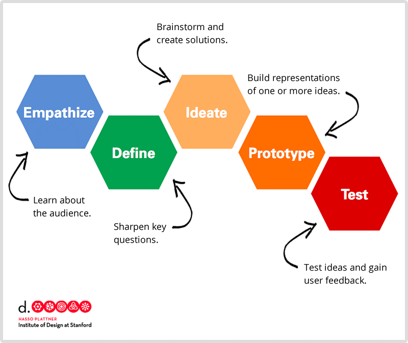
Methodology
I used the Standford’s institute of design thinking methodologies since it has already helped me organise my previous branding projects in semester 2. It has allowed me to plan ahead and avoid leaving anything behind. (Cooper,M,2018)
References
Leggett, O. (2019). 165 reasons why brand matters to your charity | IE Brand. [online] IE Brand. Available at: https://www.iebrand.co.uk/blog/165-reasons-why-brand-matters-your-charity [Accessed 4 Aug. 2019].
Cooper, M. (2018). Introduction to Design Thinking Workshop – Work In Progress. [online] Lancaster.ac.uk. Available at: https://www.lancaster.ac.uk/work-in-progress/introduction-to-design-thinking-workshop/ [Accessed 10 May 2019].
