DESIGN PRACTICE
App ideas & research
This module has definitely been challenging as I have never created an App before, but was eager to learn how to, not only because I find it really interesting but also because having this as a new set of skills on my CV opens a lot of opportunities towards new jobs and possibilities on my future career specially when its part of a fast-evolving industry.
I really enjoyed the brainstorming sessions we had as we all pitched new ideas and this definitely help me develop and mold my own.
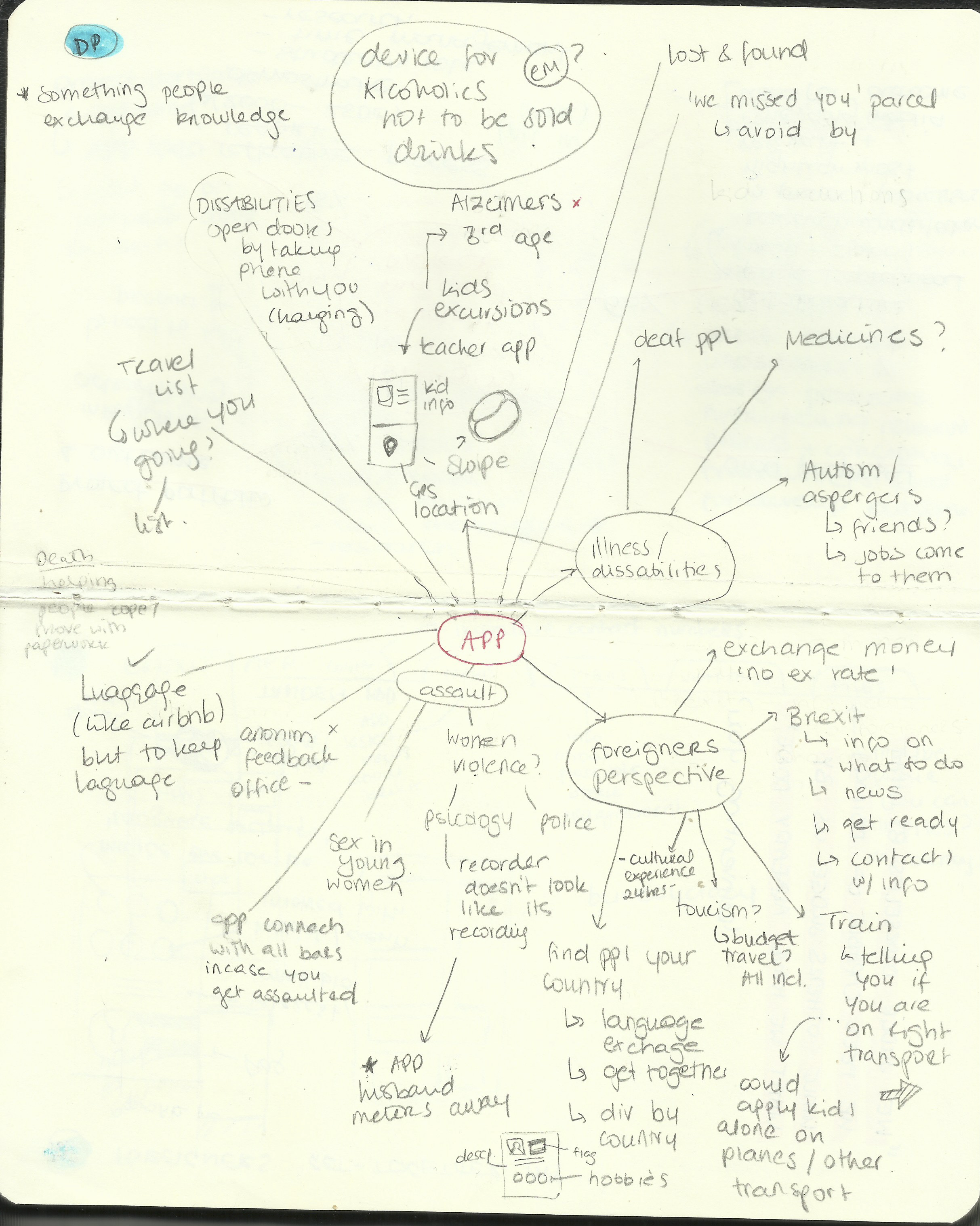
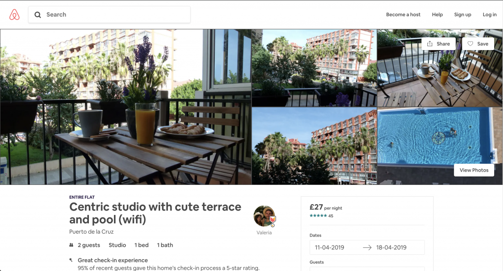
During these sessions I found myself focusing mainly on developing an App to help either foreigners or tourists. My way of thinking has obviously been influenced by being a foreigner in the UK, having lived all my life in a touristic environment and recently owning and renting an airbnb apartment. As I deal with tourists in almost a daily basis I am very aware of their needs while being abroad and I constantly think in possible ways which will help me offer them a better service.
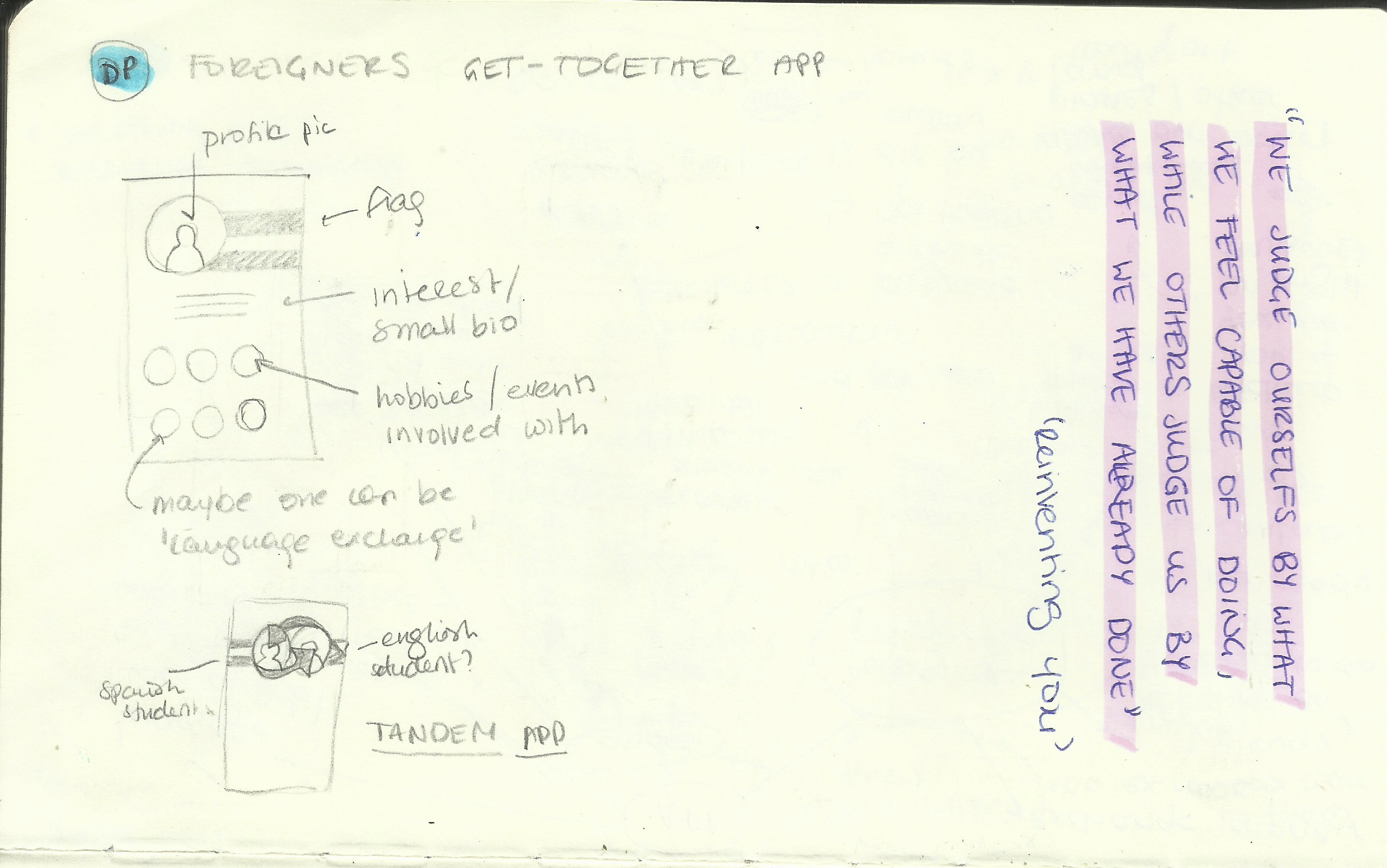
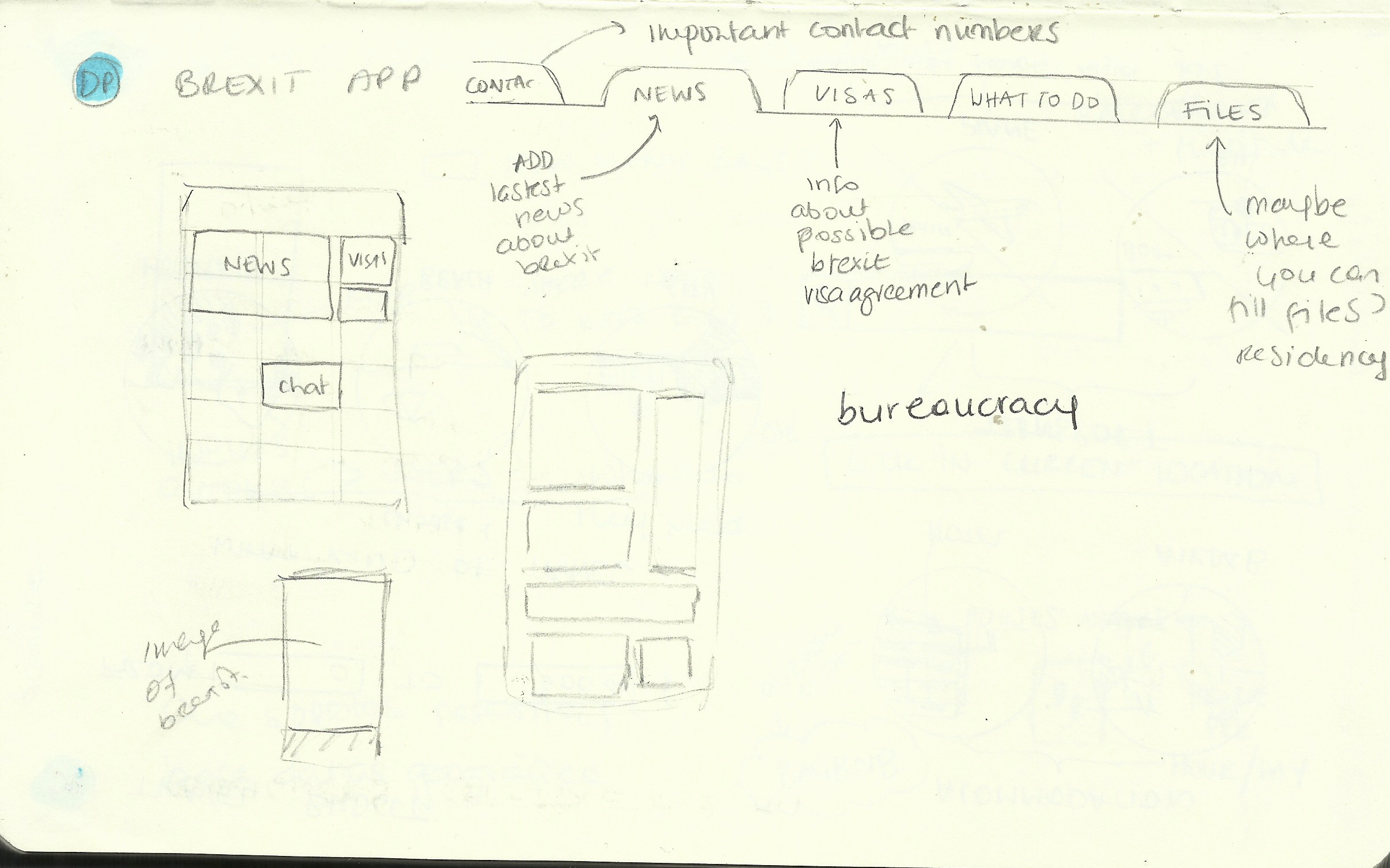
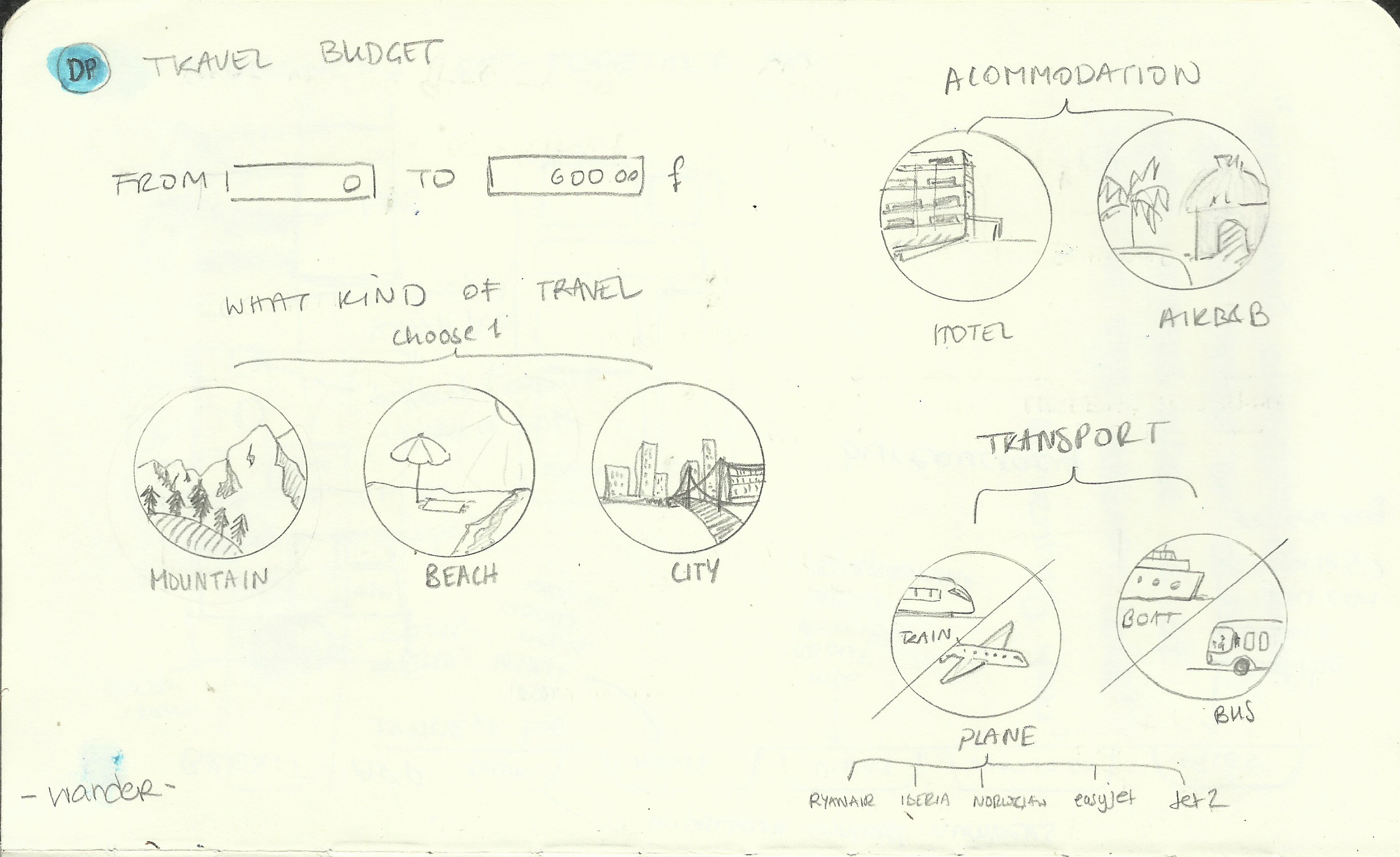
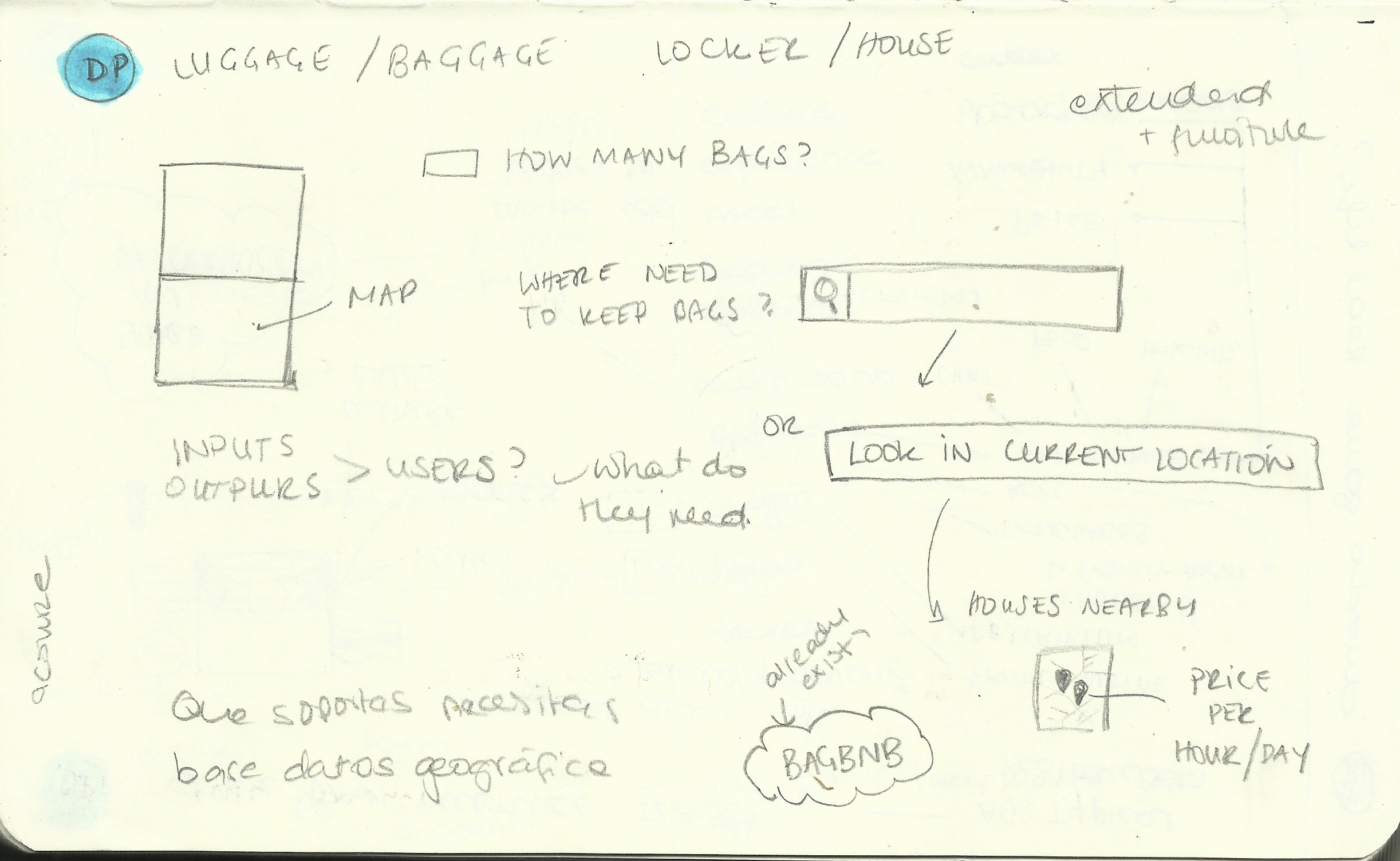
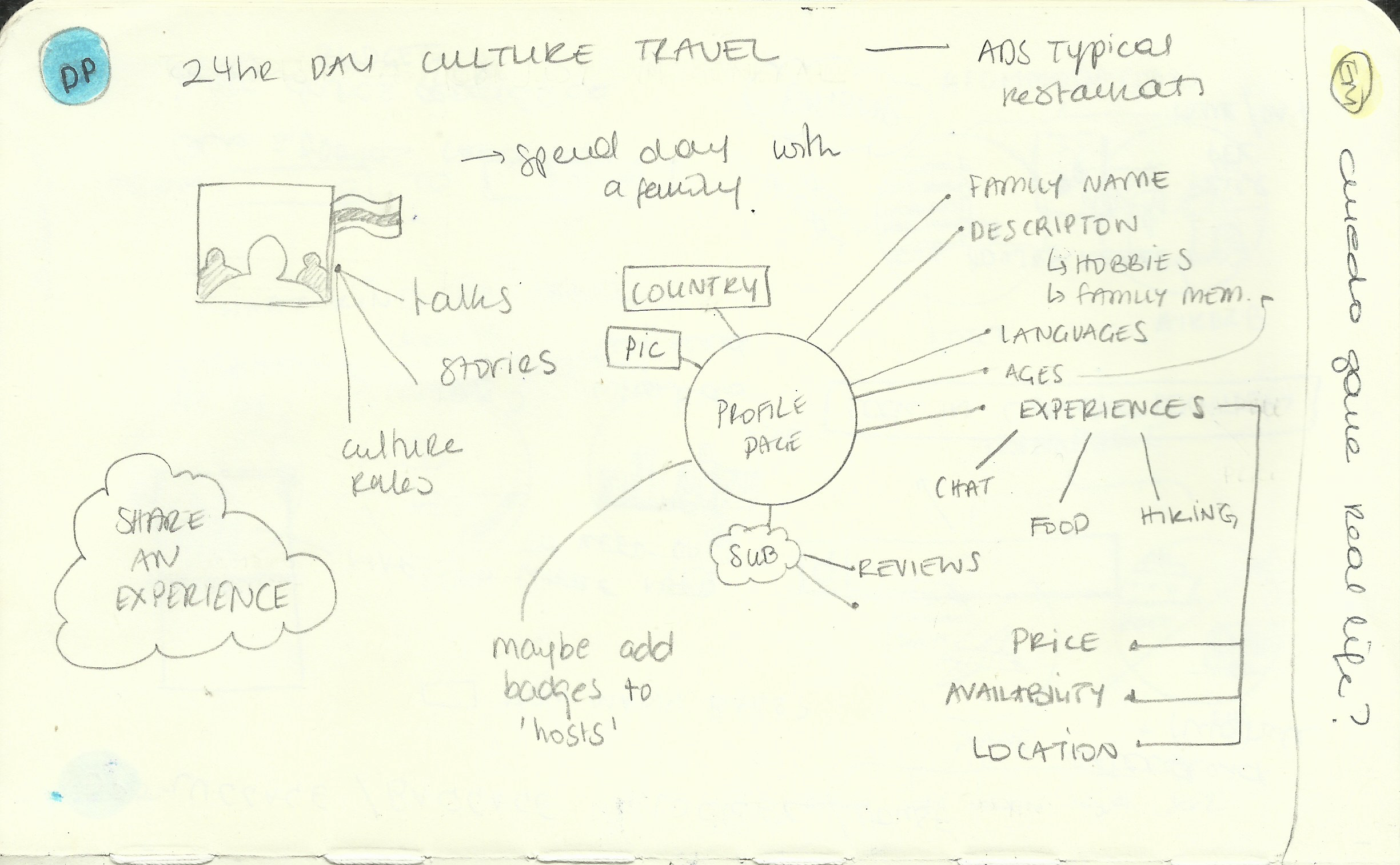
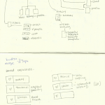
Beneath are some sketchbook examples of some ideas I started to develop.
LANGUAGE EXCHANGE APP The idea was to have an app which would allow people to learn different languages with exchange partners. When I first moved to Germany many of the people I later met were through Tandem friends but this was through webpages. After research I found an App called «Tandem» which offers exactly that worldwide.
BREXIT APP The feeling of instability that most of EU nationals living in UK feel is normal as there is still really no real information of what will happen to us once UK leaves the EU. The idea behind this App was to have a «centralized» point in which anyone could access the latest news, forums/chats, what to do (Visas? Driving license?…), as well as possible links to documents which will need to be filled (Application for citizenship form…). After some feedback from peers I decided it would not have such a big audience as possibly other applications.
TRAVEL BUDGET APP For students like us, finding a holiday within our budget can be challenging. This App would find trips (including transport, accommodation and food) depending on your preferences (beach, city, mountain…) and your budget. After research I found many websites and apps which would find accommodation or flights. After some research I found this very complete website which does exactly that: (Wander.am., 2018) I did not however find an App for travel within budget – this is why I kept this idea as my «option B».
LUGGAGE APP I have several times come across tourists who have sent me messages through airbnb asking me if I could do a special price just to keep their luggage safe for a few hours. This made me realise that locals could actually lend small places at their homes while still earning some money for it, which seemed to be a win-win situation for both the tourist and the local. While doing my research I came across a few Apps called: Bagbnb, Storeme or Luggagehero
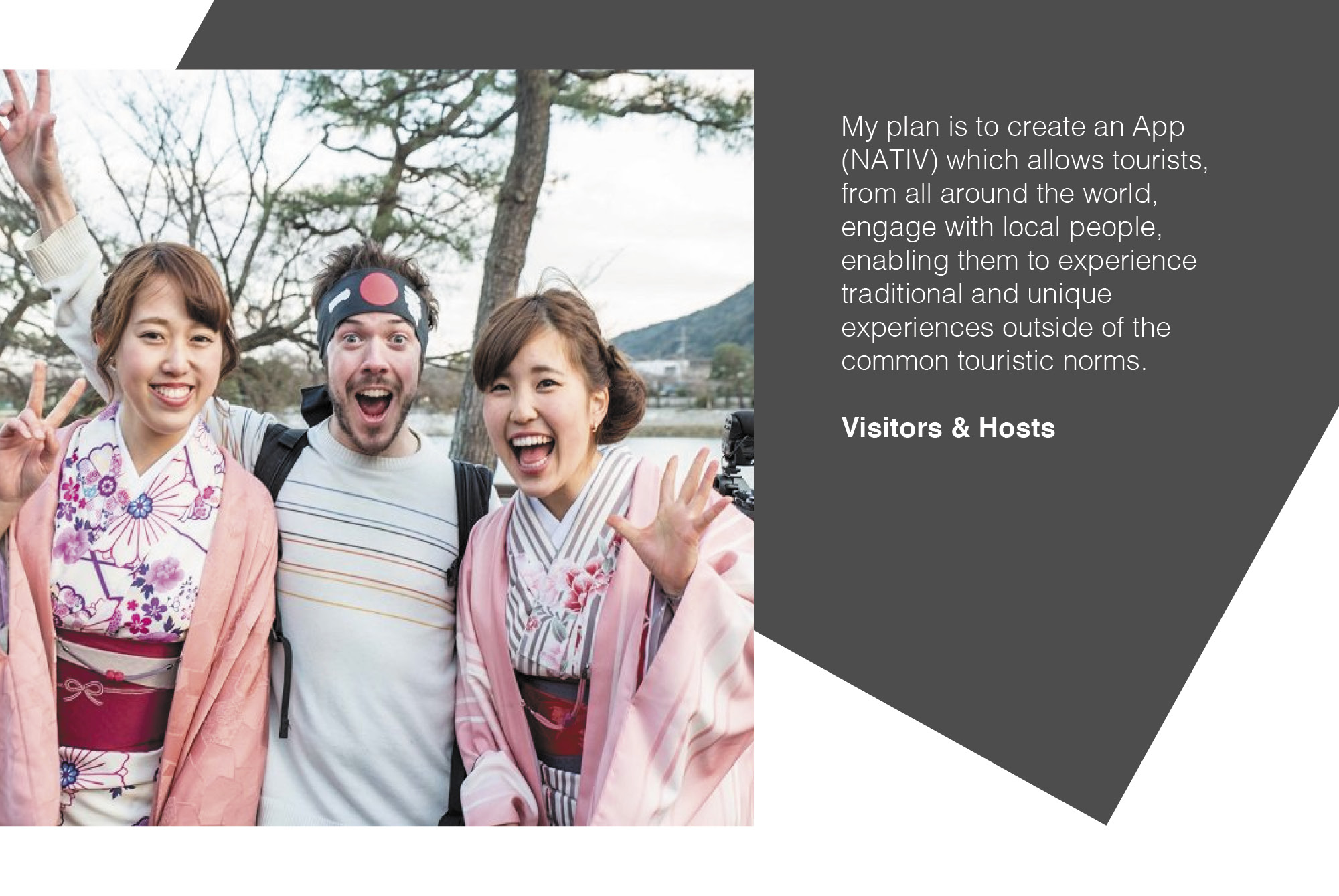
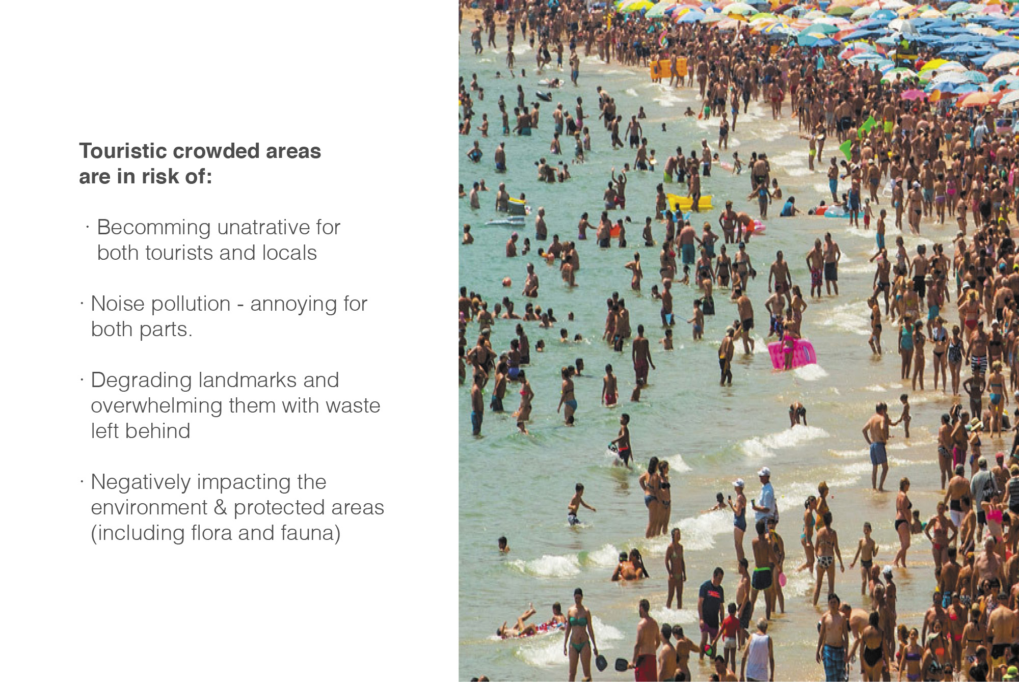
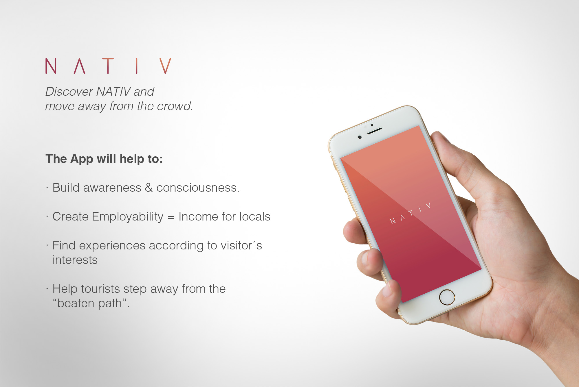
CULTURE TRAVEL APP Unfortunately it is not uncommon nowadays for places to have areas affected by mass-tourism, which is both unattractive for tourists and annoying for locals. The main purpose of this app is to connect tourists with locals to learn and experience real traditions and culture and therefore create awareness in how to follow responsible travel. I also really liked the idea of benefiting locals economically as well as helping tourists get their best out of their holiday. My research showed that there are many Apps out there (ie. Airbnb, Tripadvisor, Virgin airways..) offering experiences, but none of them are really based in traditional experiences offered by real locals.
FRAMEWORKS USED
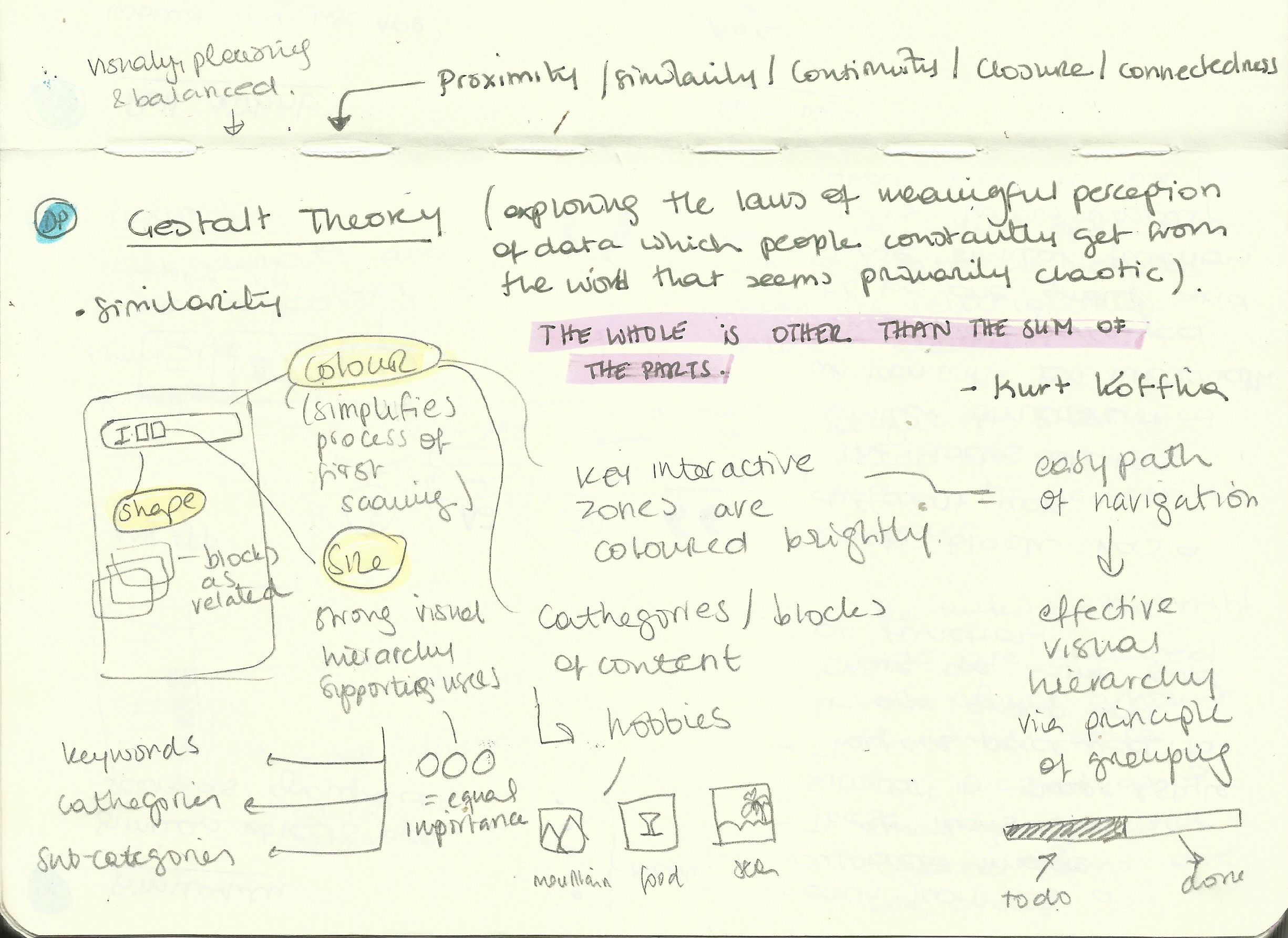
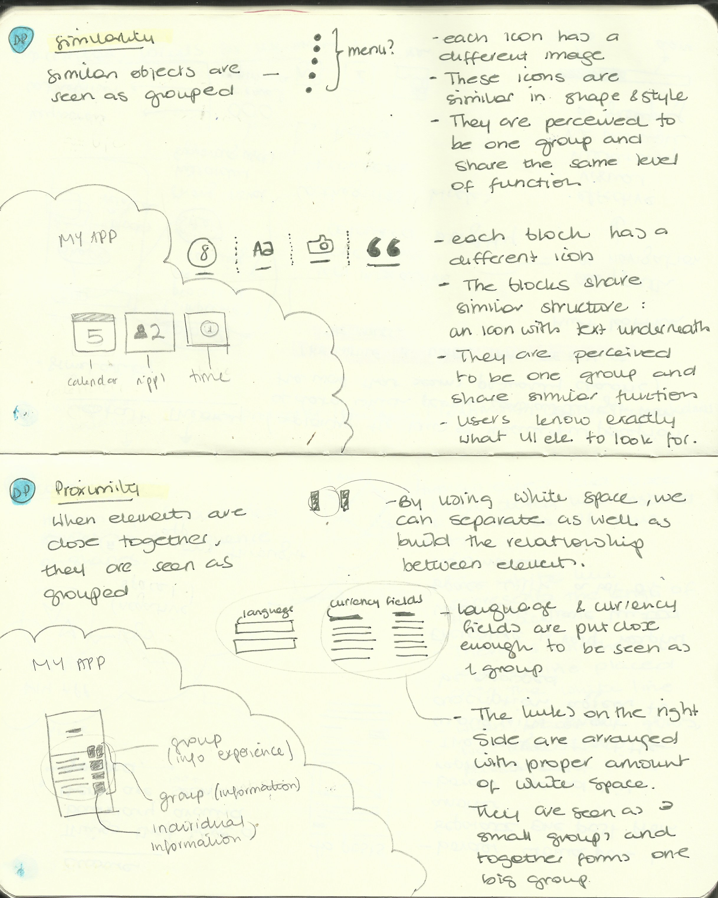
Following the design thinking and agile UX methods I ensured the users get what they need out of the App.
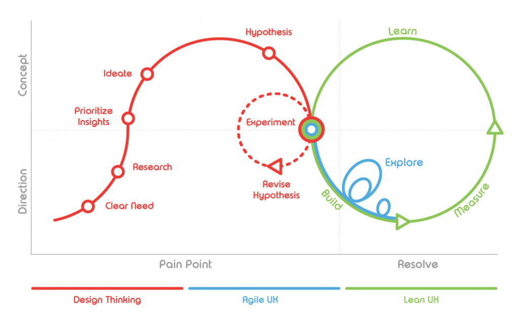
(Olivier Wouters, 2017)
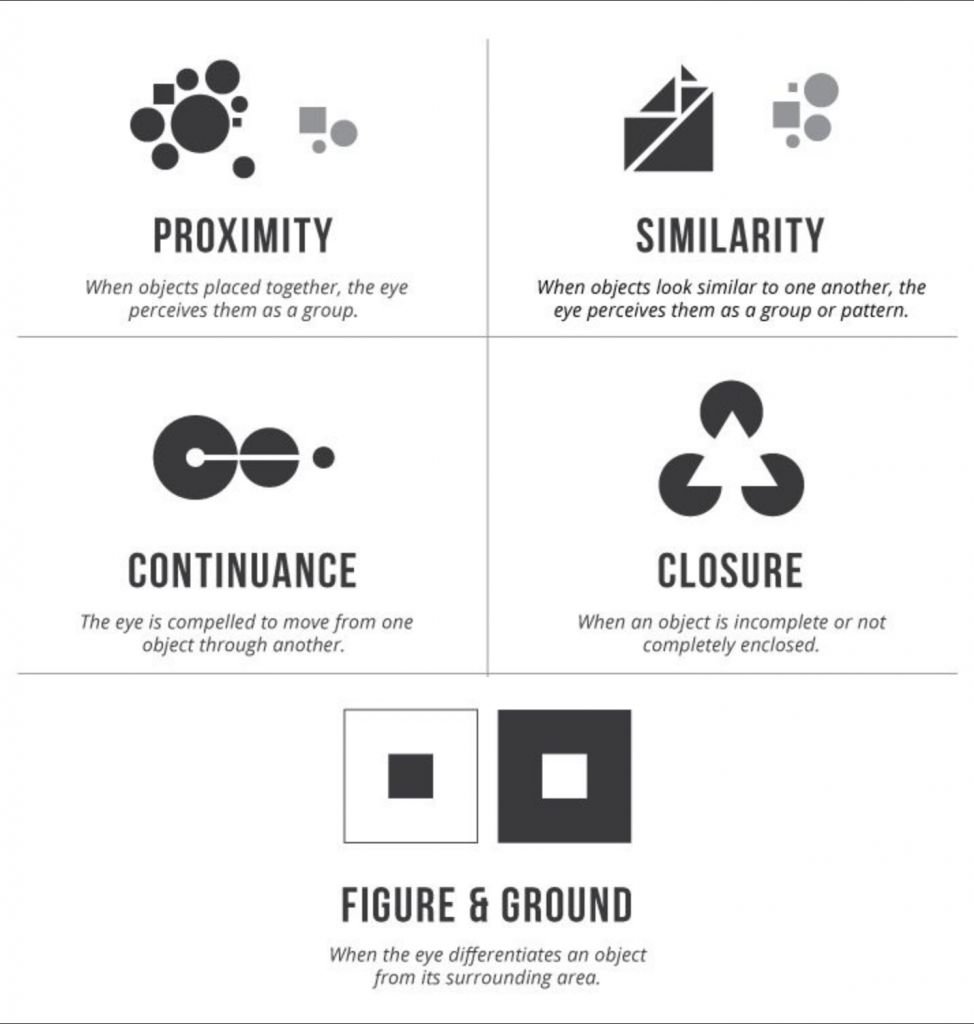
(UX Planet, 2017)
I tried to incorporate 3 principles of the Gestalt theory: Colour, similarity and size to help the user find its way throughout the app with no need of instructions, specially for older audiences.
BRANDING
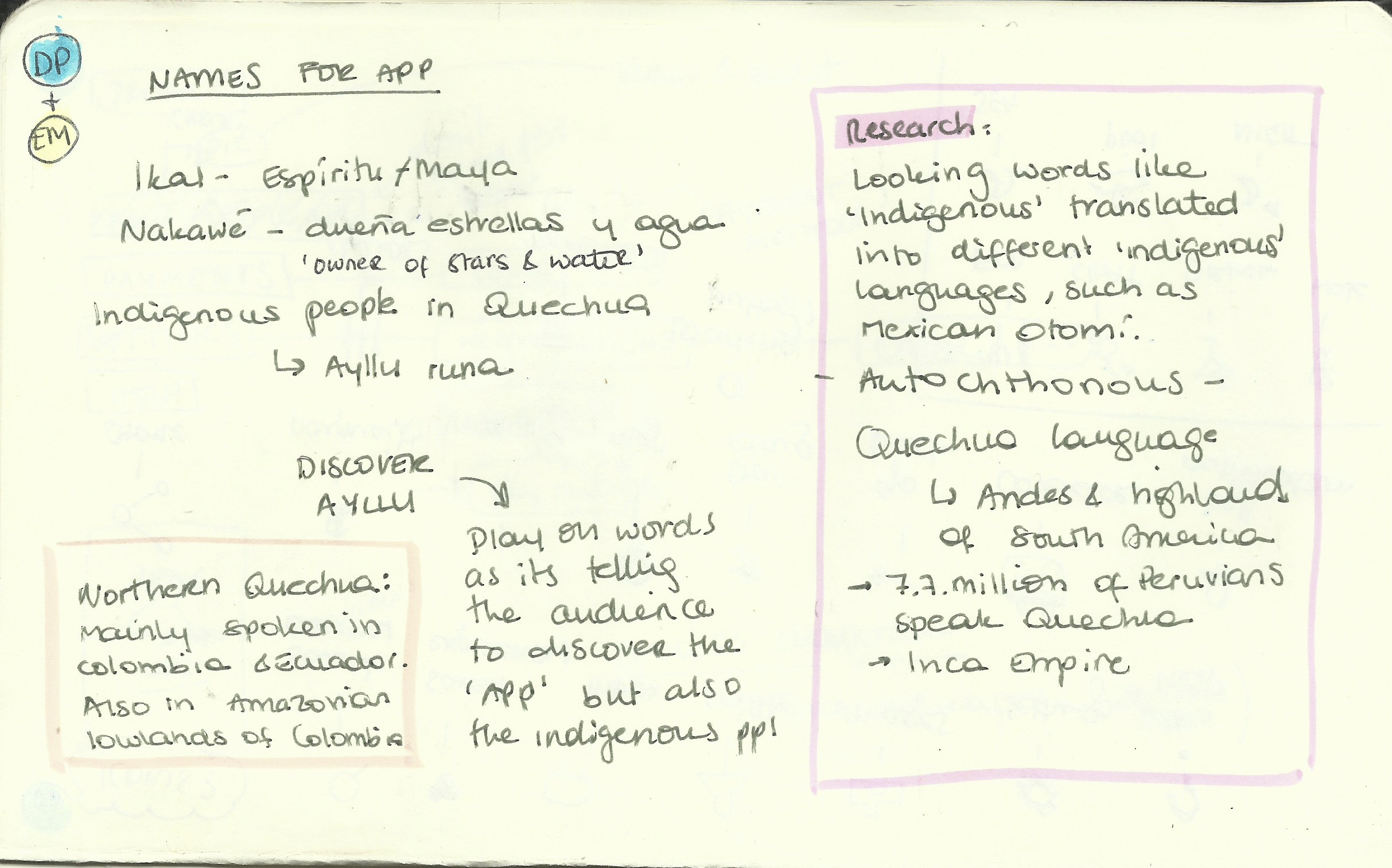
I really enjoyed this part of creating the App. I started investigating words which could help me find a good name. I also needed the name to transmit a sense of travel as well as it being something autochthonous and local. I also tried following tips on how to choose a good name for your app on (Rose, D., 2018).
- Don’t copy others
- Hint functionality
- Differentiate
- Use real words
- Stick to sentence case
- Take your time…
- but don’t take to long.
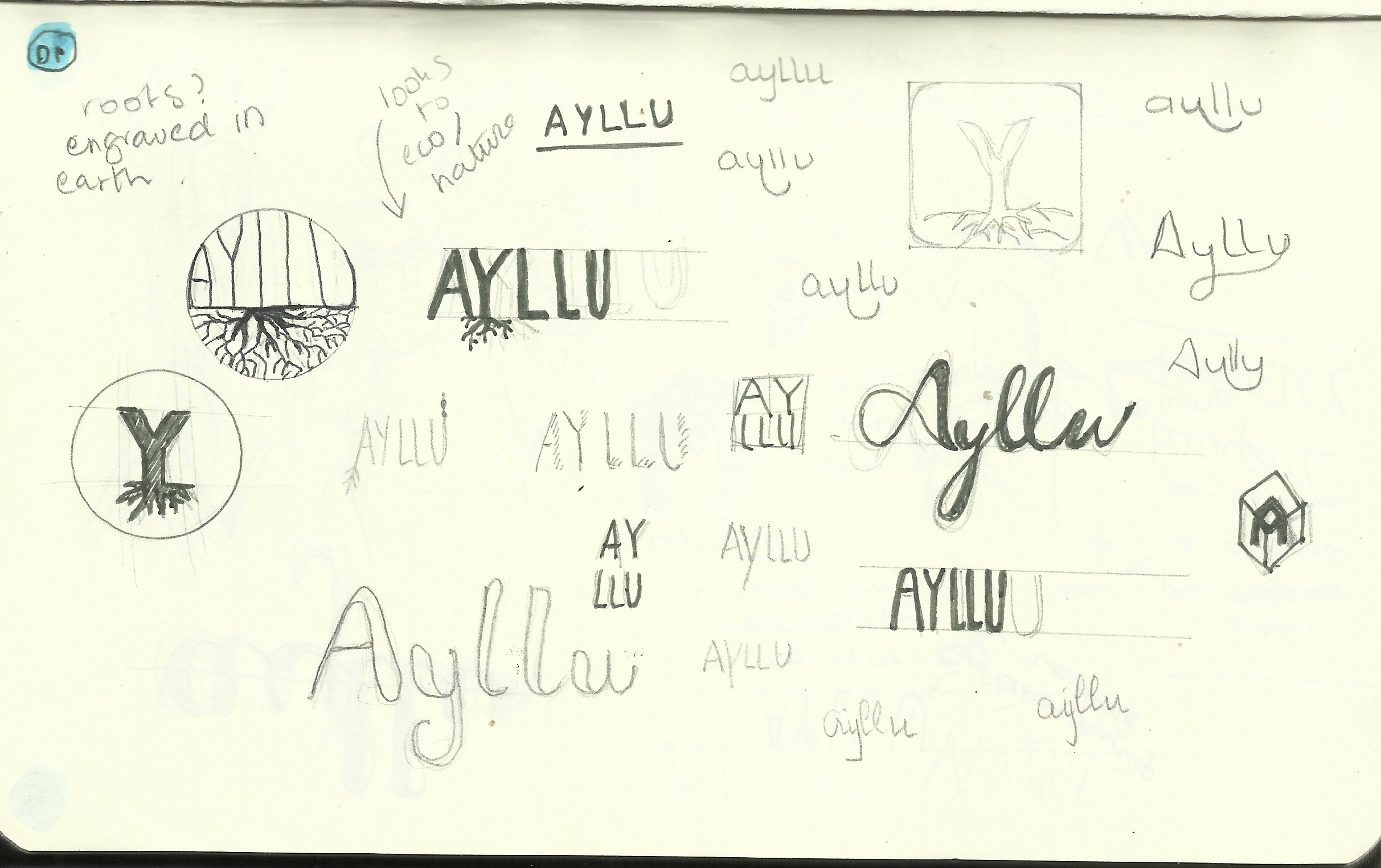
Name & Logo: As none of the words seemed to work for me, I thought it would be special to actually have a name which meant something local/ autochthonous. I started to look into words in indigenous languages and ended up translating the same word «indigenous» in Quechua – a language spoken mainly in Colombia and Ecuador. The word Ayllu came up. I thought that DISCOVER AYLLU was a great play on word, as it meant both: discover the App and the indigenous people. I started working on some logo designs on sketch and later on Adobe.
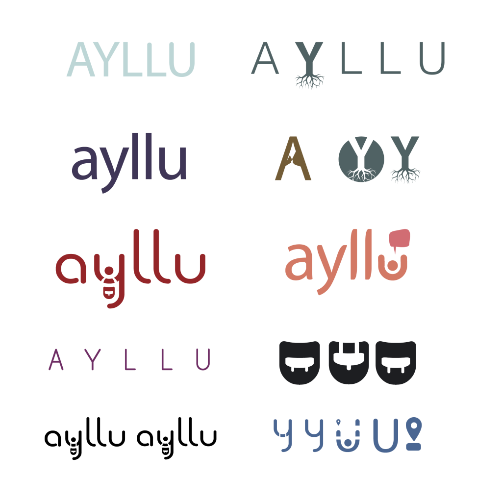
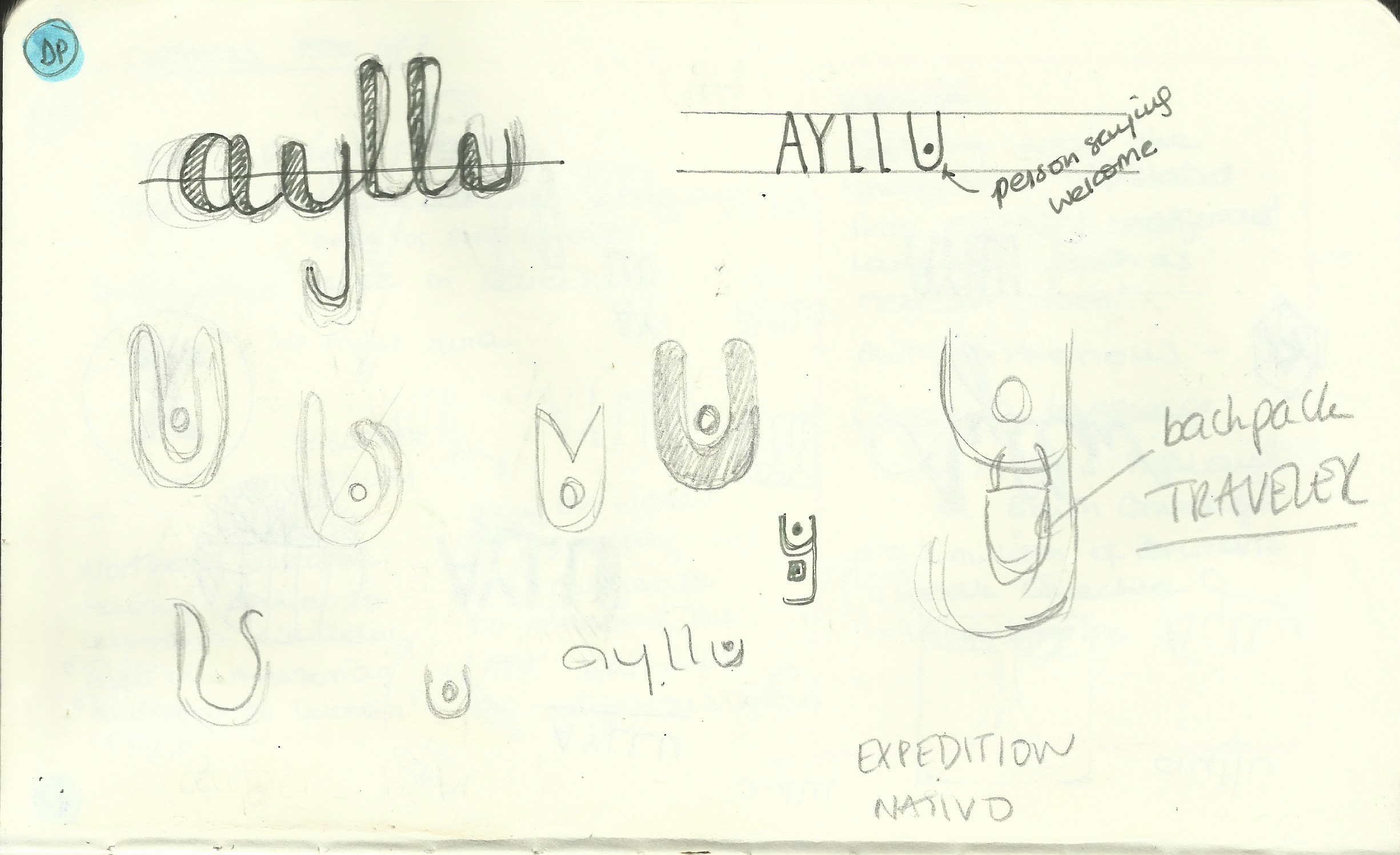
From all the examples I created I was most drawn by the one with the red version, as its «Y» represented a person wearing a backpack – which is easily recognisable for travel.
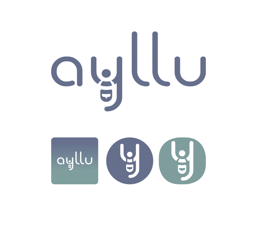
From all the examples I created I was most drawn by the one with the red one, as its «Y» represented a person wearing a backpack – which is easily recognisable for traveling
After showing showing my initial logo to people I quickly found a few big problems:
- First of all, it became really obvious that this word would have different pronunciations depending on the language, which made it a problem if I wanted it to be widely recognisable. I even had one person tell me it sounded like «loo» when pronounced in English – which completely put me off the idea of using it for my app.
- The second major problem was that I was finding myself explaining what the «backpack» was to a few people. So decided to move on from AYLLU and create a more direct and easy name.
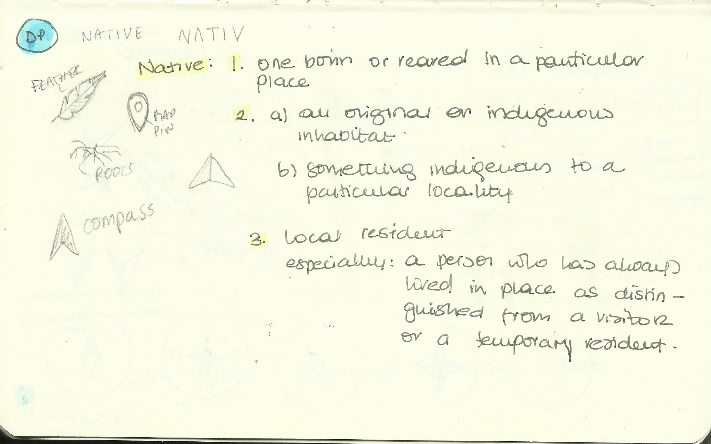
I then re-visited the words that were simple but represented more directly what I wanted to transmit to people when first seeing the logo and thought of the word native.
This word works in different languages as the pronunciation is basically the same and its meaning is:
- Native: Relating to, or describing someone‘s country or place of birth or someone who was born in a particular country or place.
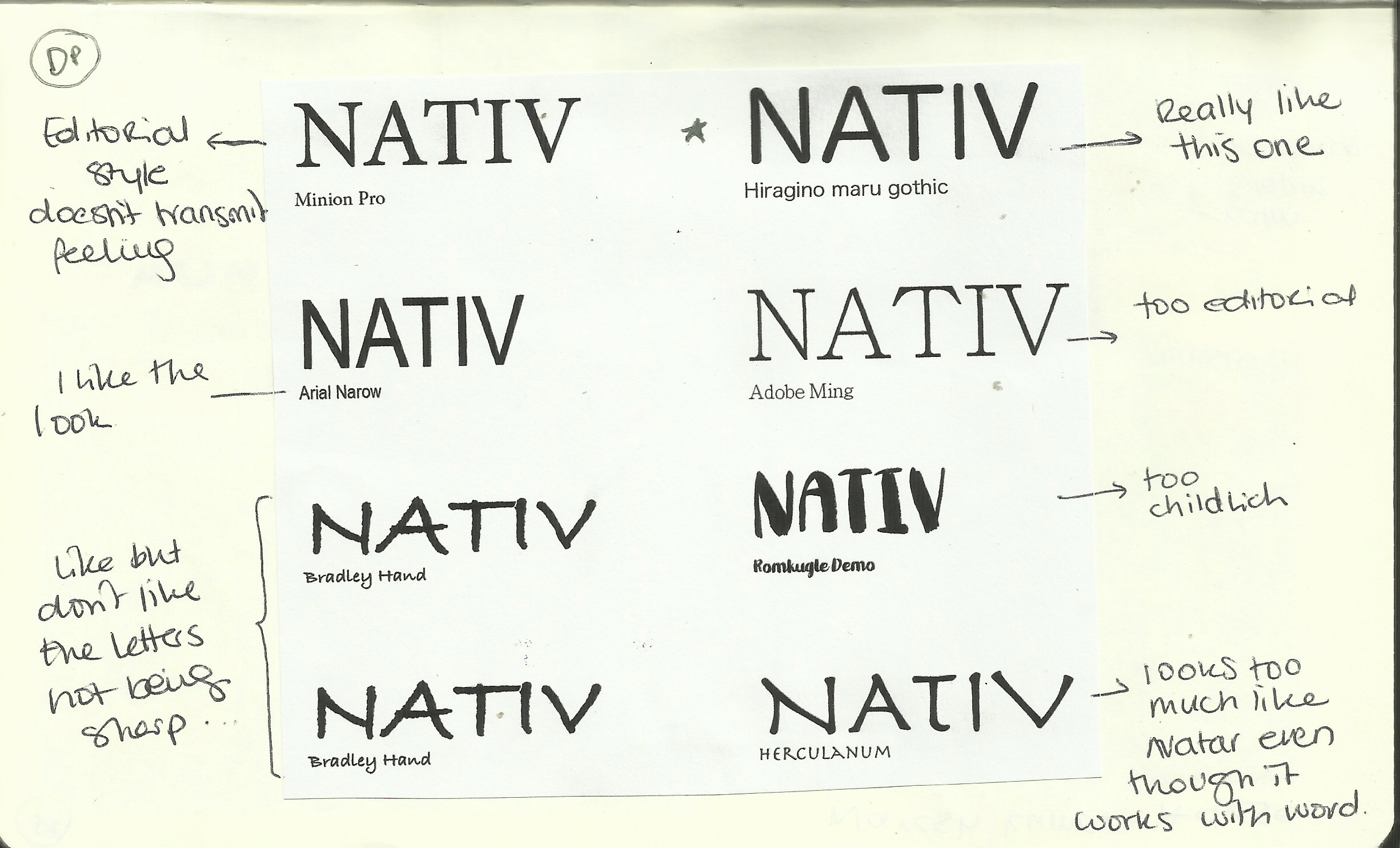
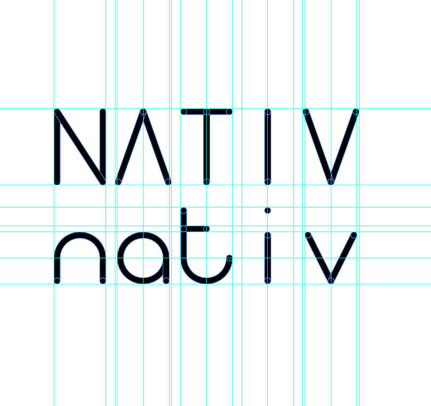
Font: By using just the name as the logo, I avoided any unnecessary extra elements and I also thought that the name was powerful enough to stand by itself.
As the Apps name was going to stand on its self I decided to create a font which I could then use in my App prototype if I needed.
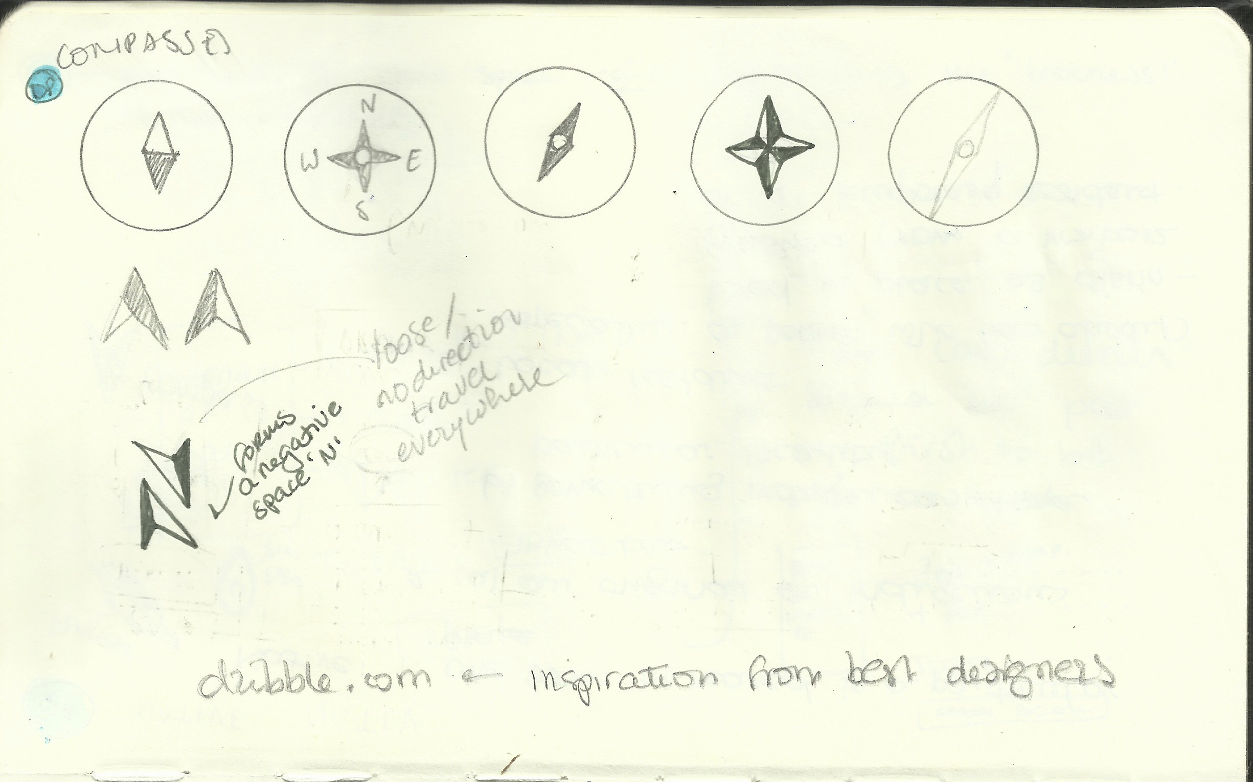
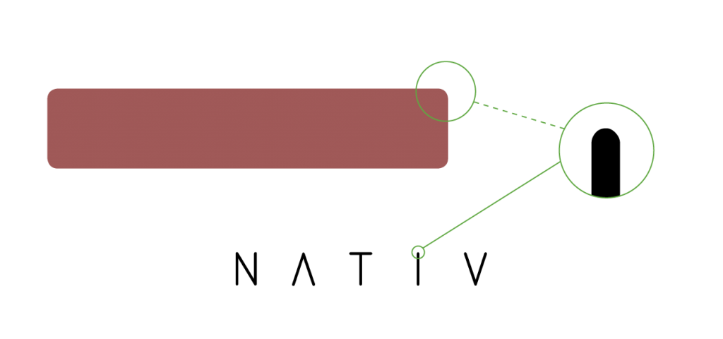
I have used negative space to create the App´s icon. I was trying to make the arrows look like the ones on a compass to represent travel.



Colour: Once I had the name and the logo, I started researching Colour schemes I could use. I started by researching what feelings some colours evoked. (Arttherapyblog, 2018)
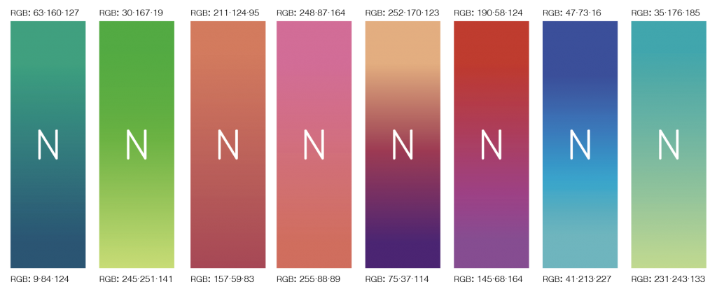
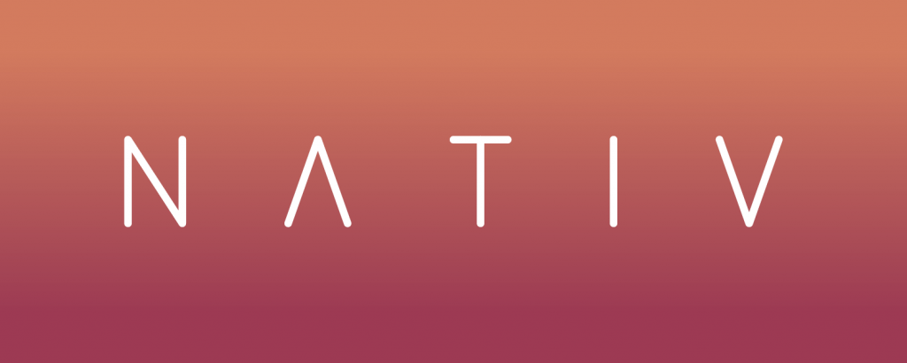
After trying with different gradients I decided that the Orange/Red gradients worked the best, as it also transmitted a sense of earth/nature to it. Beneath you can see the final look fo the logo with the gradient colours.
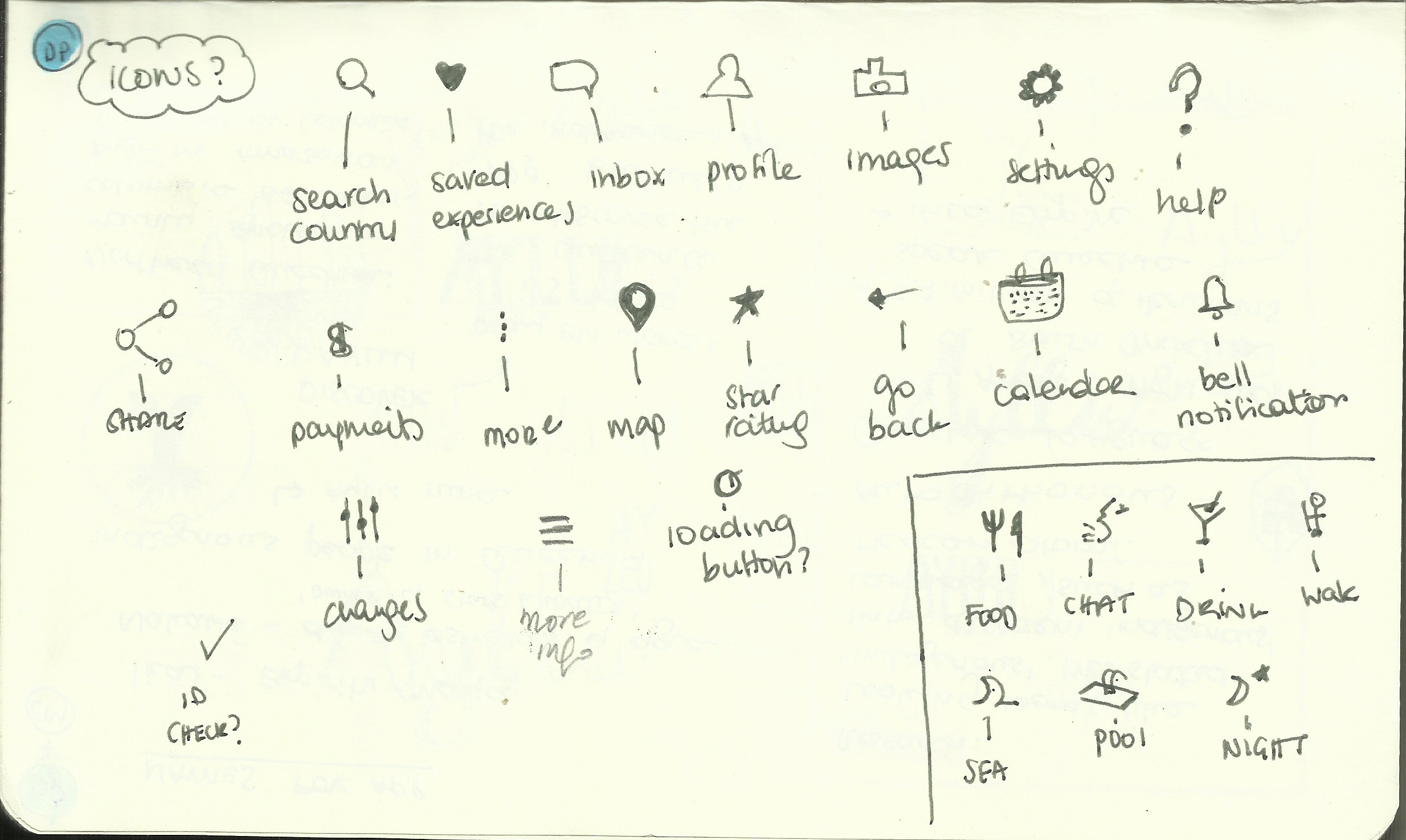
Icons: After choosing the colours I created all the Icons that would then be used on the App prototype.
Buttons: To keep up with the style of the logo, I decided to make the buttons have a rounded edge.
WIRE-FRAMING
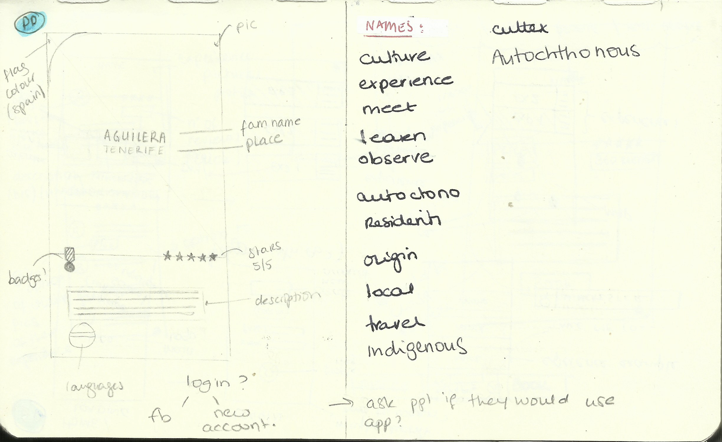
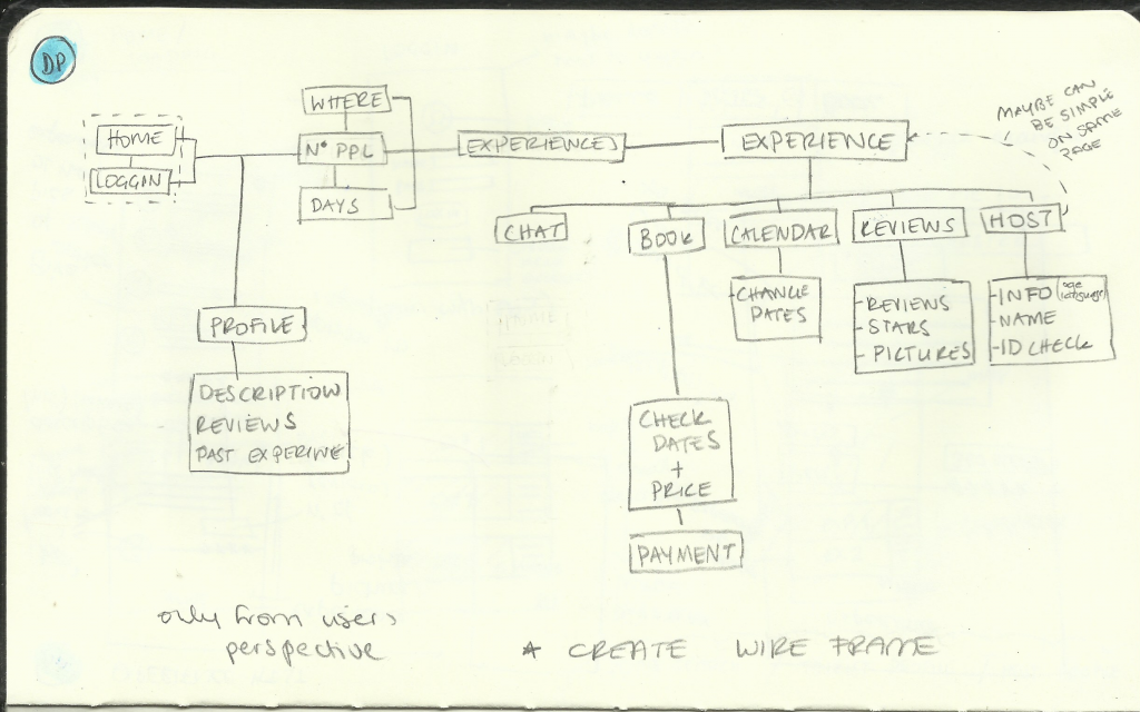
Soon after completing the branding side of this project I moved on to start creating wireframes. During this process I used a sketchbook, Adobe XD and Axure.


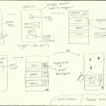
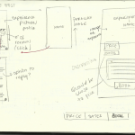
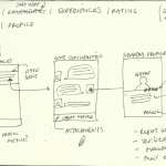
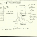
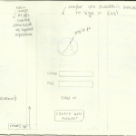
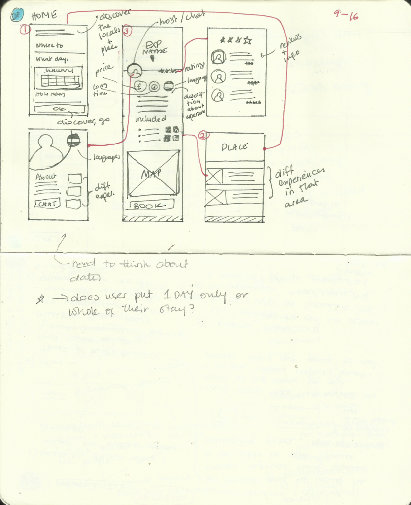
Below you can see the process of wireframing planning on my sketchbook.
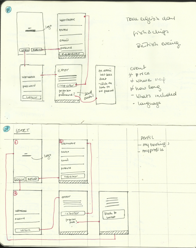
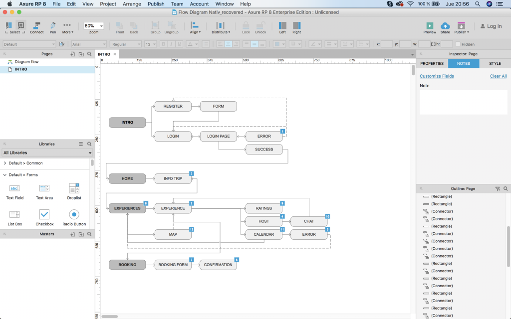
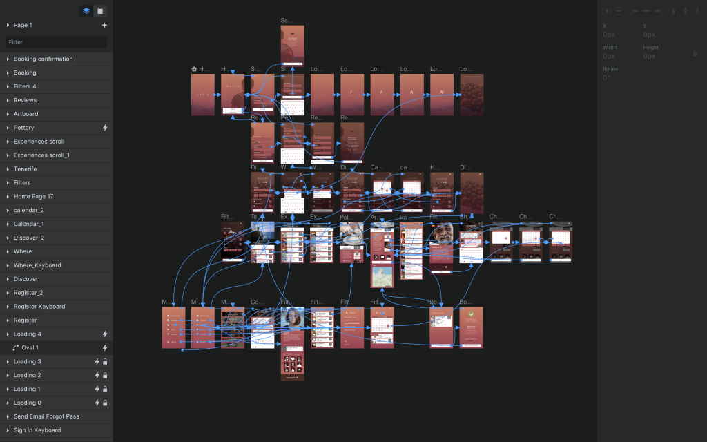
I found several tutorial online were I was able to learn how to use axure to create the first initial basic flow diagram. Each element has its own comments depending on what was to be included in that screen.
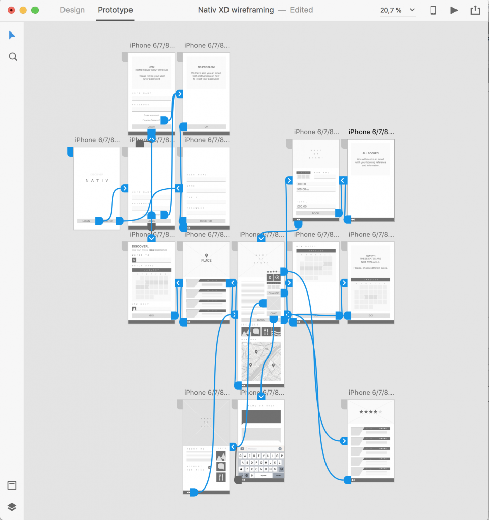
Click on the button bellow to see the first basic prototype of the App created with Adobe XD.
PRESENTATION
During week 7 we did a presentation on the plan for our project. And received some good feedback.
- Overall, everyone in class seemed to like the idea of creating an app which would help tourists stay away from crowded areas and immerse themselves into the place‘s culture.
- Some of them even suggested that they would be keen on using the app when going abroad. There was someone in particular that mentioned they had a brother living outside the UK and enjoyed going to visit him as he was able to see parts of the country that other normal tourists might not get to see.
- There were some concerns on how this app would create awareness – I explained that while creating close interaction/relationships between the locals and the tourists, people will feel more pressured into respecting and valuing where they live and the places which are significant to them. As an example, I always image thinking someone littering in front of someone´s house – I think it makes a huge different if they know who owns the house they simply would not litter it.
SURVEYS
To create the first prototype I have created two different surveys.
One of them, I will send through airbnb to the guests who have stayed at my apartment. unfortunately airbnb does not support website links, this is why I will sent them a text asking them about their thoughts on having an App which will allow them to spend a day with a Local.
The second survey was done through Surveymonkey. and sent to people from different countries, to see their views on booking an experience and offering one.
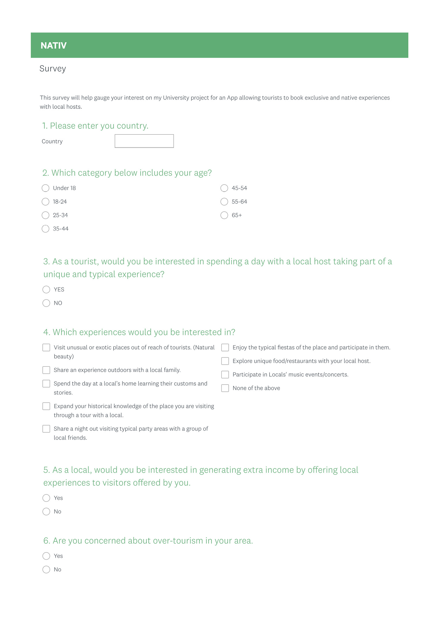
Here is the Survey: https://www.surveymonkey.com/r/X2B7ZHB
Click on image below to see the questions.
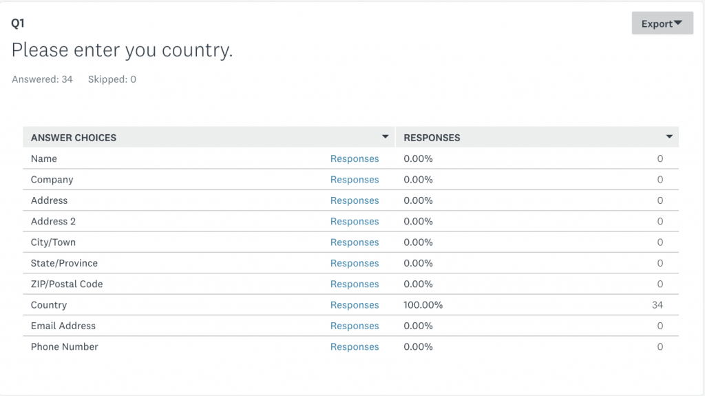
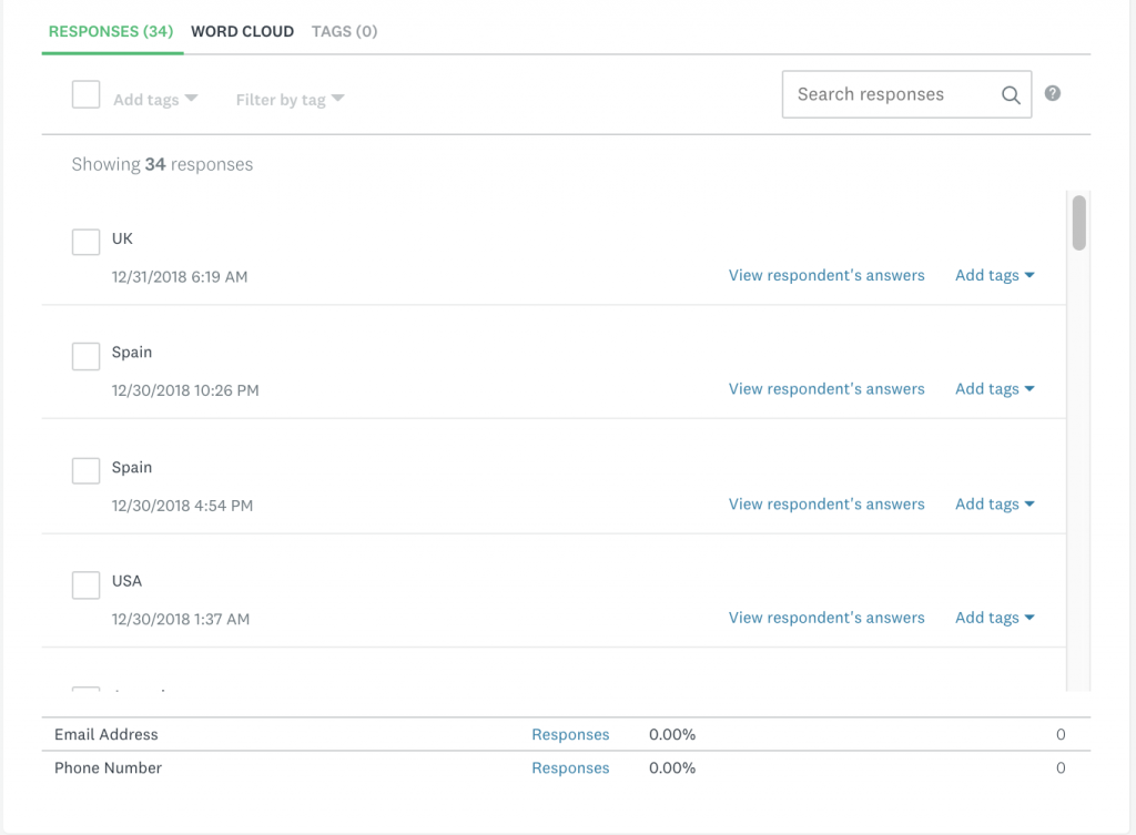
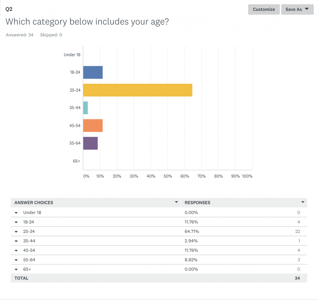
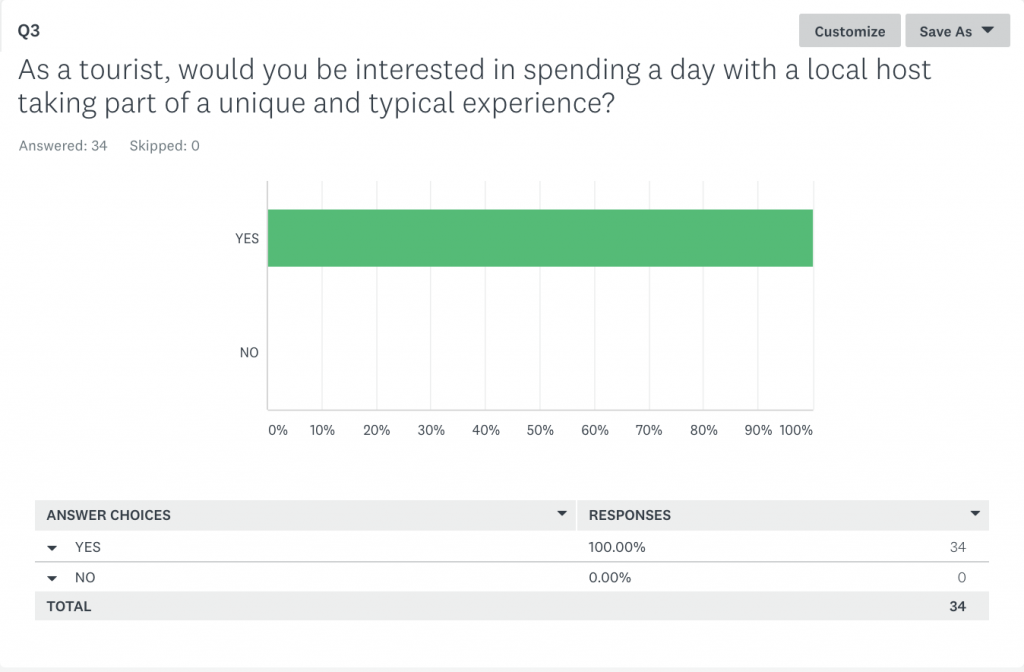
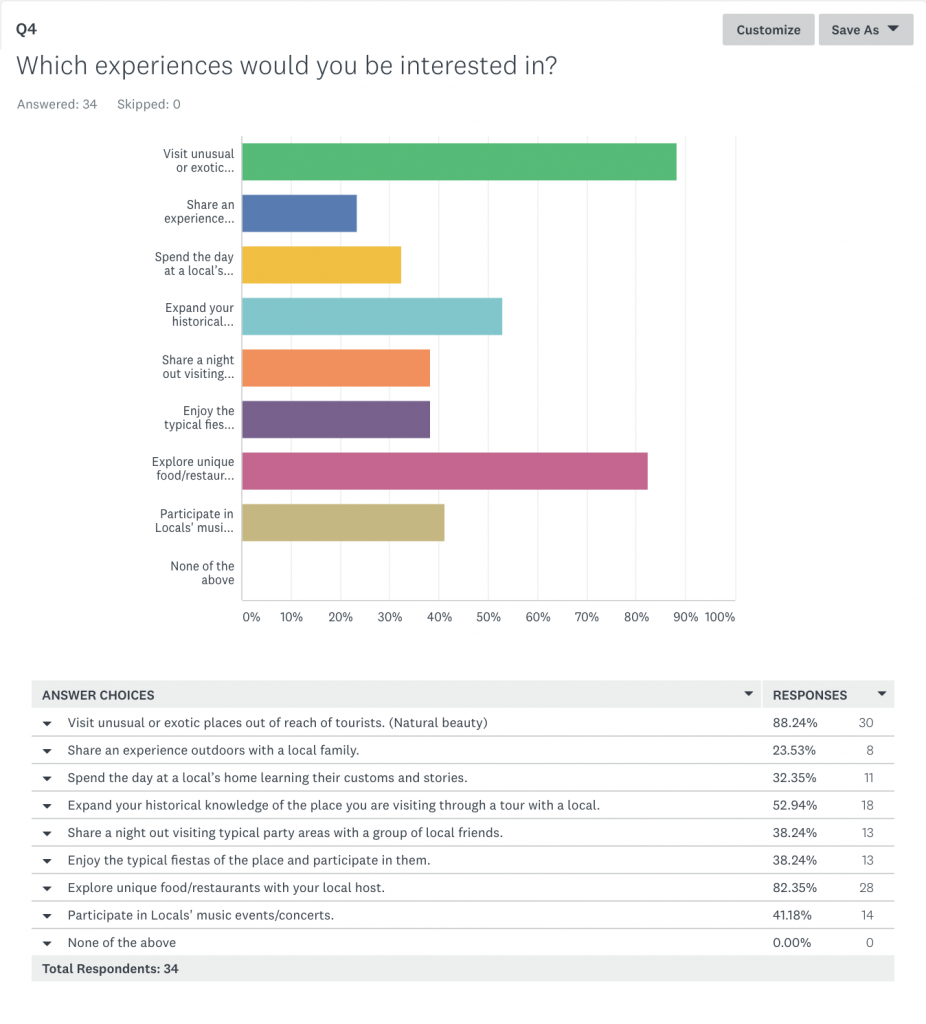
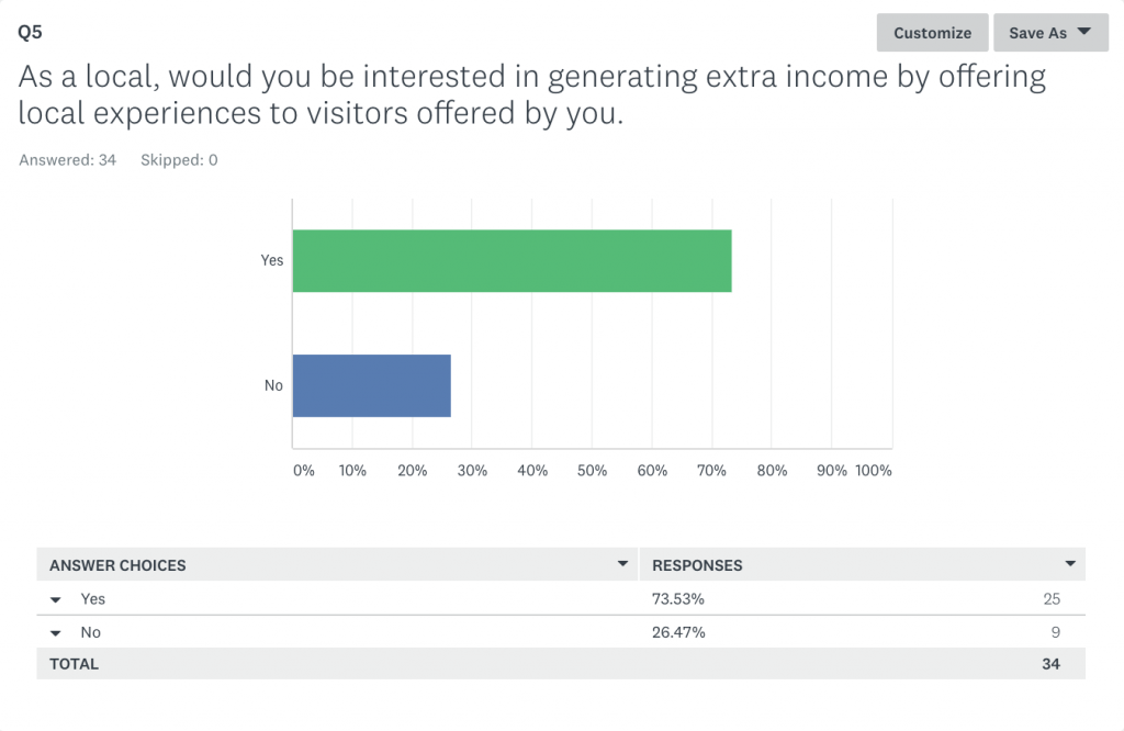
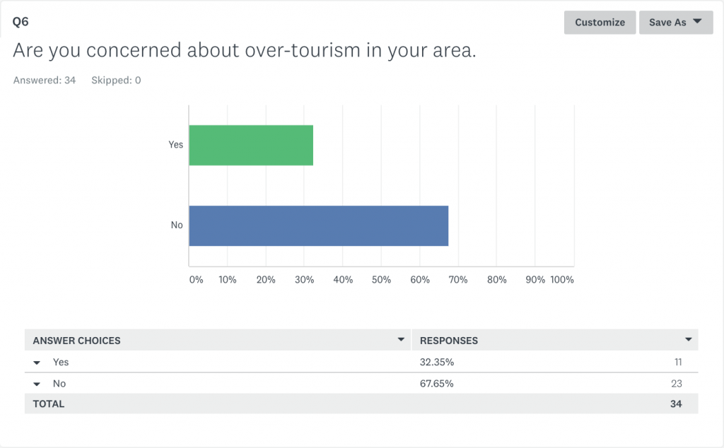
Below are the results of the survey. I thought it was great as I managed to get nearly 40 responses from people around the world, some of the countries included:
United Kingdom, Spain, Argentina, USA, Uruguay, Germany and Colombia.
I will analyse and present the results in my reflective report. Below you can find each section separately.

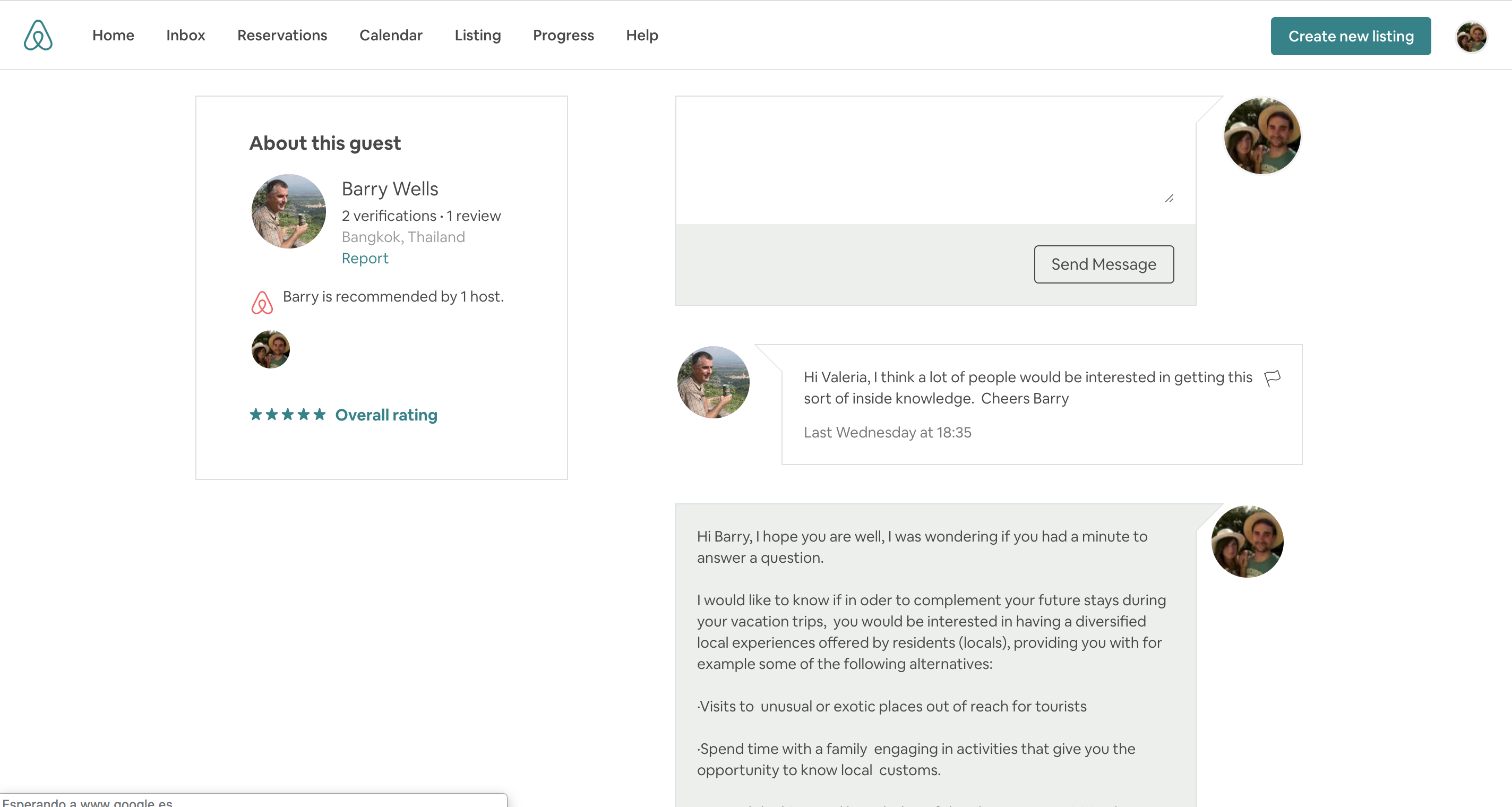
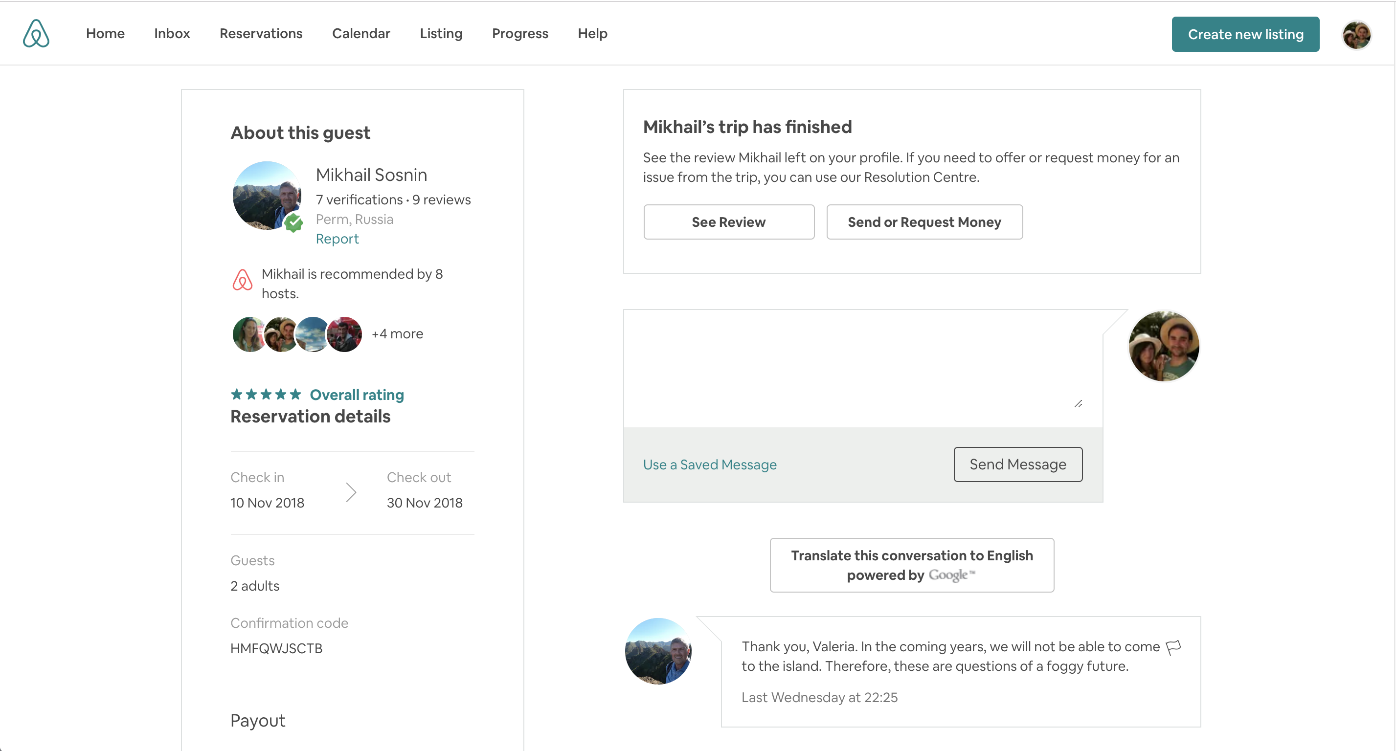
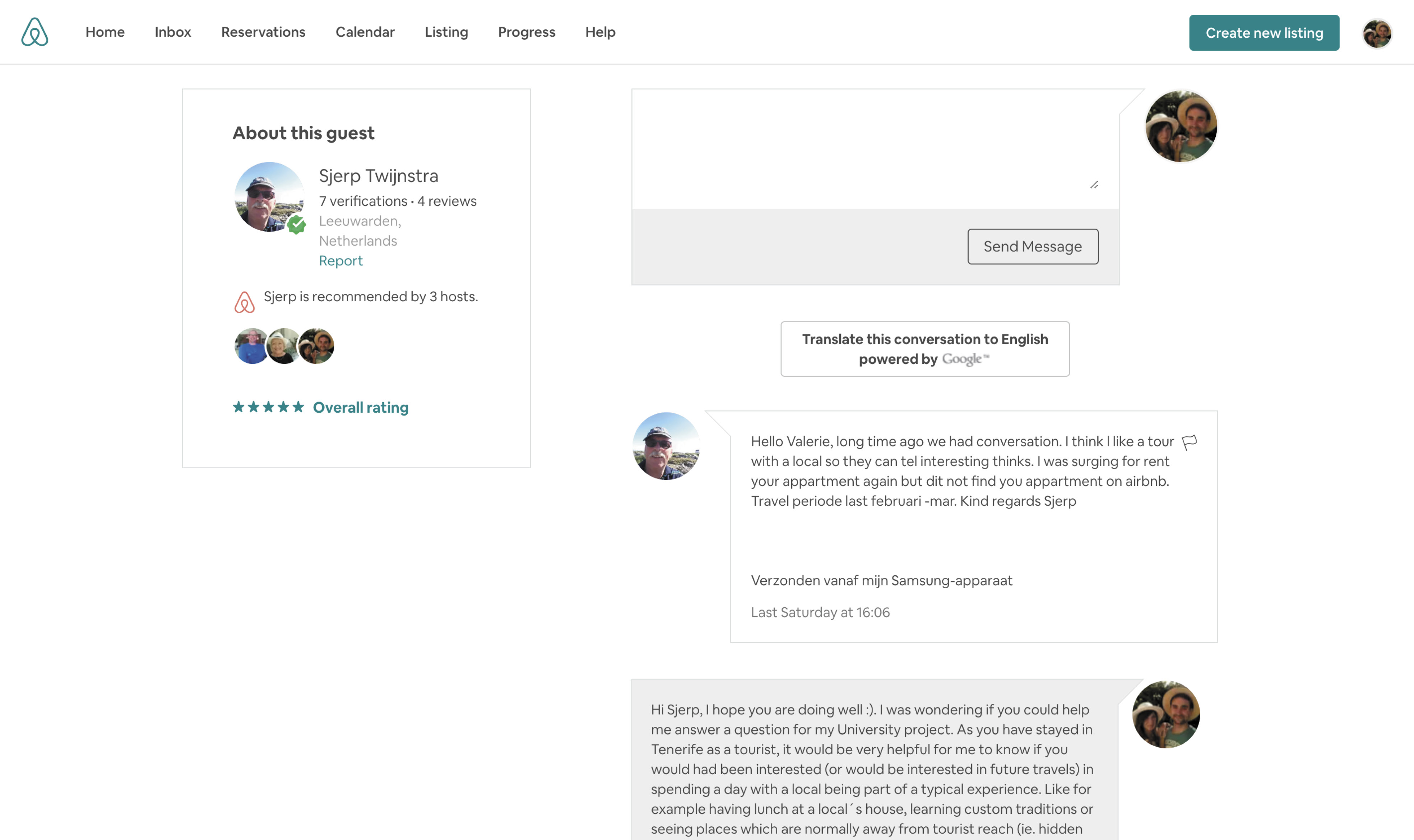
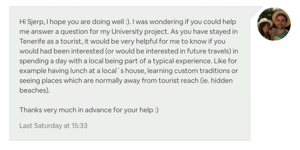
Here is one example for one of my guests who replied to the question on airbnb, unfortunately, my past guests were not very keen on replying to my questionare even though it was short. I sent one first question which made people think I was trying to sell them something:
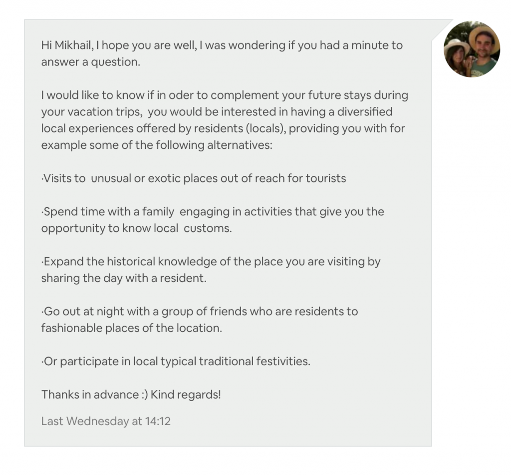
I then changed the question to something more personal and direct:
FINAL PROTOTYPE

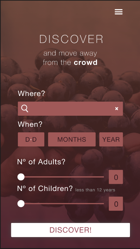
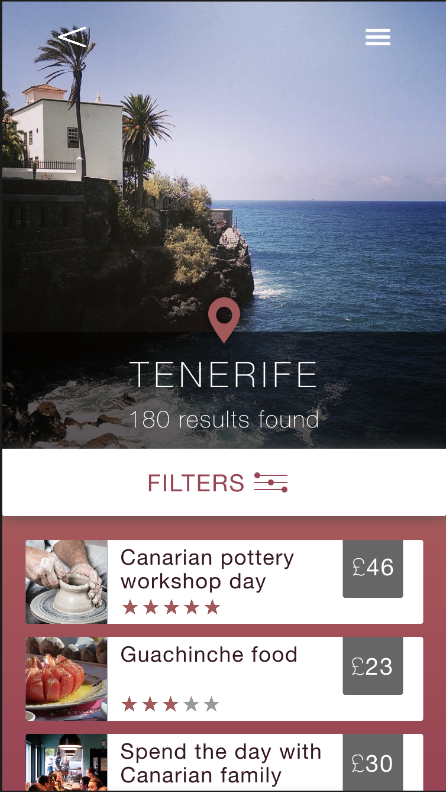
While viewing the final prototype, please find the menu example (on the little hamburger at the top right) on both; the first «discover screen or on the «Discover search» (left screen) or on the «Tenerife results» screen (right).
NOTE: Please be patient when opening prototype, as for some reason, sometimes Invision seems to take a while to load.
REFERENCES
- Wander.am. (2018). Cheap Flights, Hotels and travel packages that matches your budget | Wander. [online] Available at: http://www.wander.am [Accessed 12 Dec. 2018].
- Olivier Wouters (2017) Agile UX & Lean UX – Buzz Words Or Different Strategies?, Available at: https://www.innotain.me/tutorial/agile-ux-lean-ux/ (Accessed: 16 October 2018).
- UX Planet (2017) Gestalt Theory for Efficient UX: Principle of Similarity., Available at: https://uxplanet.org/gestalt-theory-for-efficient-ux-principle-of-similarity-827c20c175f5 (Accessed: 15 October 2018).
- Rose, D. (2018). How to name your app. [online] Creative Bloq. Available at: https://www.creativebloq.com/apps/tips-naming-app-9112818 [Accessed 16 Nov. 2018].
- Arttherapyblog (2018). Color Psychology: The Psychological Effects of Colors. Available at: http://www.arttherapyblog.com/online/color-psychology-psychologica-effects-of-colors/#.XCBrWc_7TOQ. [Accessed 15 Dec. 2018].
